Areeka Brand
Brand Identity
Areeka, Arabic for sofa, is a bilingual identity for a digital product in the psychological-clinic space: a symbol of uneven halos drawn from a real patient’s answer, “a maze, confusion, halos”, in purple, pink and gold.
A bilingual identity for a digital product named after the clinic sofa: a symbol drawn from what waiting feels like (a maze, confusion, halos).

Overview
Areeka is Arabic for sofa, the one almost everyone has sat on in a clinic waiting room. It became the name of a digital product, and the starting point for an identity about how waiting feels.
The client chose the name and asked for an idea that was out of the box, not commercial: simple, expressive and unusual.
The answer came from a conversation with a real person on a clinic sofa, and grew into a bilingual logo system, a purple-and-pink palette, two typefaces, patterns, icons and app icons, documented in 28 pages.
Client
Areeka
Role
Brand Designer
Platform
Print & digital
Scope
Brand identity & guidelines
Deliverables
Logo system · 28-page guidelines
Tools
Figma · Illustrator
In this case study
Who didn’t sit on an Areeka waiting for their turn?
The brief
The name
Areeka translates to sofa, a common item in the majority of clinic halls, and a moment almost everyone recognises.
The product
Areeka is a digital product. The client decided on the name, and the identity had to make it his own.
The ask
An idea that’s out of the box and at the same time not commercial: simple, expressive and unusual.
Three ideas, one answer.
Discovery
The obvious ideas came first, and were set aside because they told the wrong story.
A sofa
The first idea any designer could think of. But a sofa gives the impression of a furniture store, not a clinic, and not a psychological clinic.
A figure on a sofa
Closer to the moment of waiting, but, in the guidelines’ words, “Umm, still representing a furniture store.”
How it feels
MOOOO. went to a clinic and interviewed a real person sitting on a sofa. The answer to one question became the identity.
A maze. Confusion. Halos.
The idea
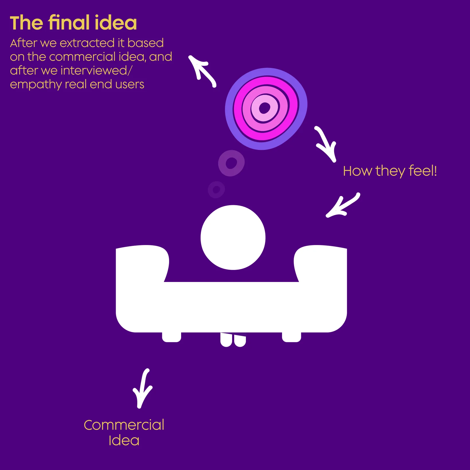
“Describe your pain that derives your arrival to a psychological clinic.” The answer: the patient feels like he’s in a maze, in confusion, with halos inside his head. The symbol is a person sitting on a sofa in confusion and disturbance, seen from inside.
- From the commercial idea (a figure on a sofa) to how they feel, and from there to the final idea.
- Uneven, hand-drawn rings in light purple and three pinks, around a dark centre.
- Simple enough for an app icon; unusual enough not to look like any clinic logo.
From the sofa to the halos
The concept diagram: from the object to the feeling.
English, Arabic, or both.
Logo
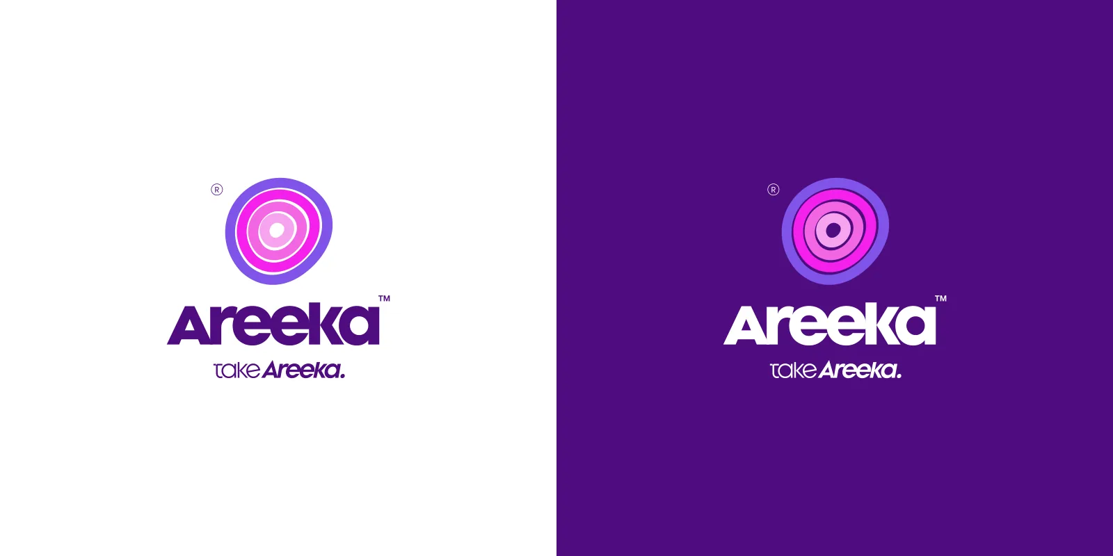
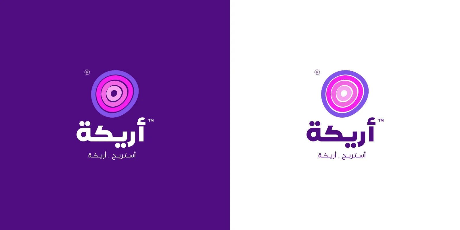
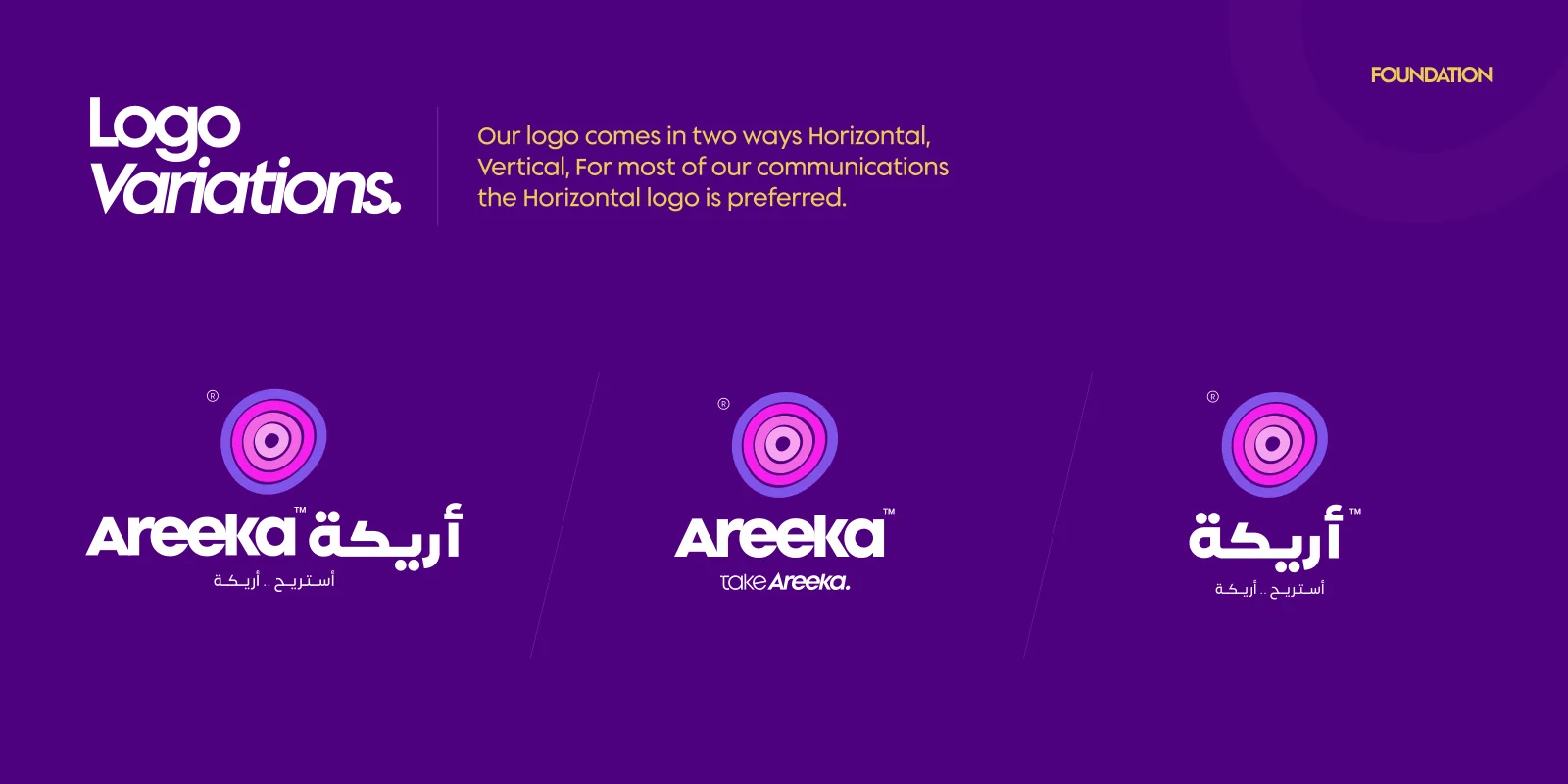
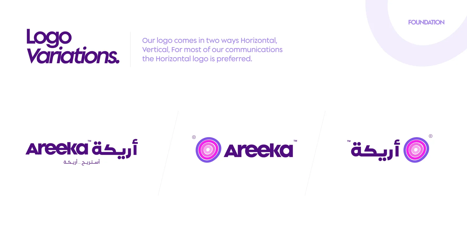
The symbol pairs with an English wordmark, an Arabic one, or both, with the slogans “أستريح .. أريكة” and “take Areeka.” Switch backgrounds. Each edition has its own approved artwork.
Dark purple
White
Horizontal first
The logo comes horizontal and vertical; for most communications the horizontal logo is preferred.
Never modified
Never change the logo’s colour, form, or the relationship between the wordmark and the symbol.
Two languages
English and Arabic wordmarks are drawn on matching grids, so either, or both, can lead.


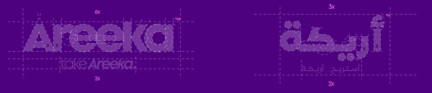
Two wordmarks, one grid.
Construction
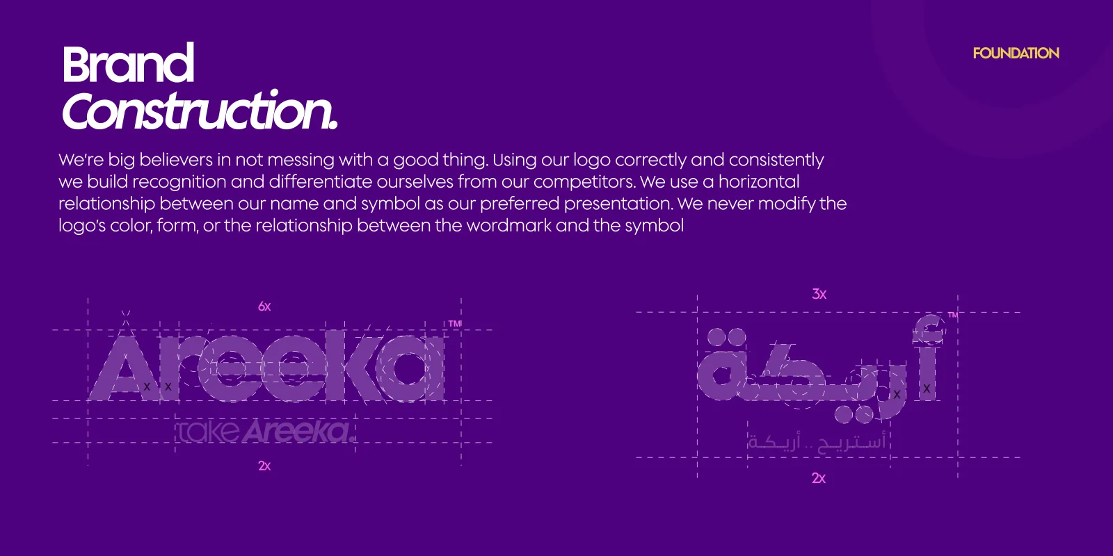
The English and Arabic wordmarks are built on measured grids (6x and 3x wide, 2x for the slogans) so they hold the same weight side by side.
Both wordmarks share one grid of x units.
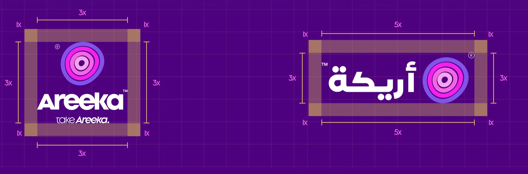
Room around the halos.
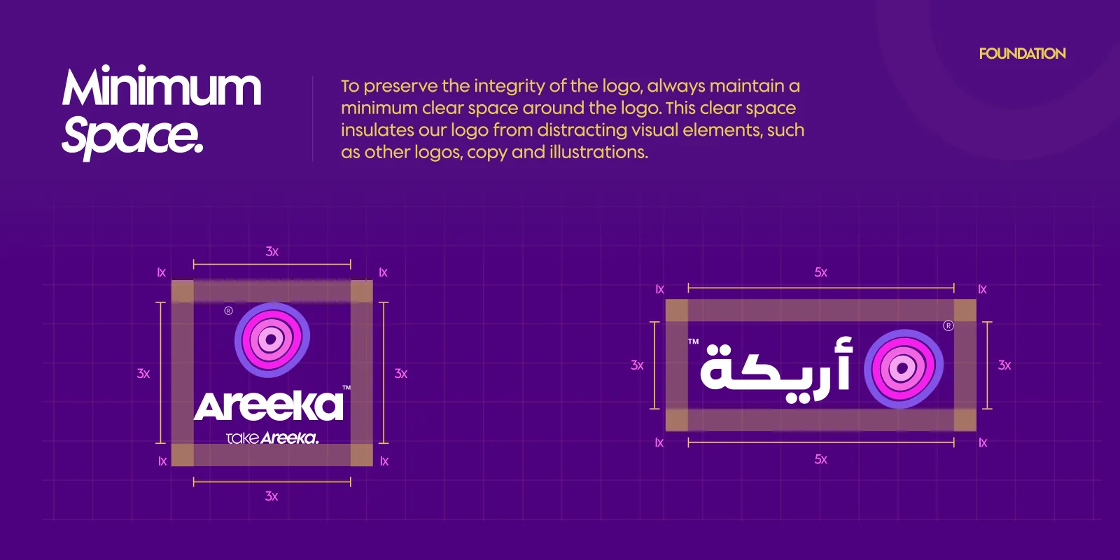
Clear space
1x clear space on every side, inside a 3x × 3x field around the vertical lockup and 5x × 3x around the horizontal one.
Purple calm, pink feeling, a touch of gold.
Colour & type
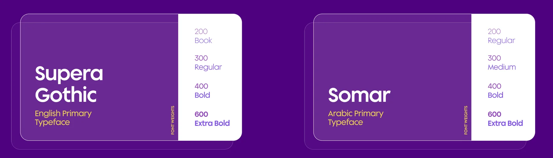
Dark purple carries trust, the pinks and light purple carry the halos, white keeps it simple and gold adds warmth. Supera Gothic and Somar set English and Arabic from small banners to billboards.
Seven primary colours with the documented values. Six families are divided into ten swatches from dark to light, for illustrations, icons and data visualisation.
Areeka Dark Purple
RGB 79 13 128 · CMYK 84 100 13 7
Areeka Light Purple
RGB 129 83 233 · CMYK 64 72 0 0
Areeka Pink 1000
RGB 245 37 237 · CMYK 26 82 0 0
Areeka Pink 900
RGB 244 103 228 · CMYK 17 67 0 0
Areeka Pink 800
RGB 248 164 239 · CMYK 8 40 0 0
Areeka White
RGB 255 255 255 · CMYK 0 0 0 0
Areeka Gold
RGB 233 204 83 · CMYK 10 16 80 0
D. Purple
1000
900
800
700
600
500
400
300
200
100
L. Purple
1000
900
800
700
600
500
400
300
200
100
Pink 1000
10
9
8
7
6
5
4
3
2
1
Pink 900
10
9
8
7
6
5
4
3
2
1
Pink 800
10
9
8
7
6
5
4
3
2
1
Gold
1000
900
800
700
600
500
400
300
200
100
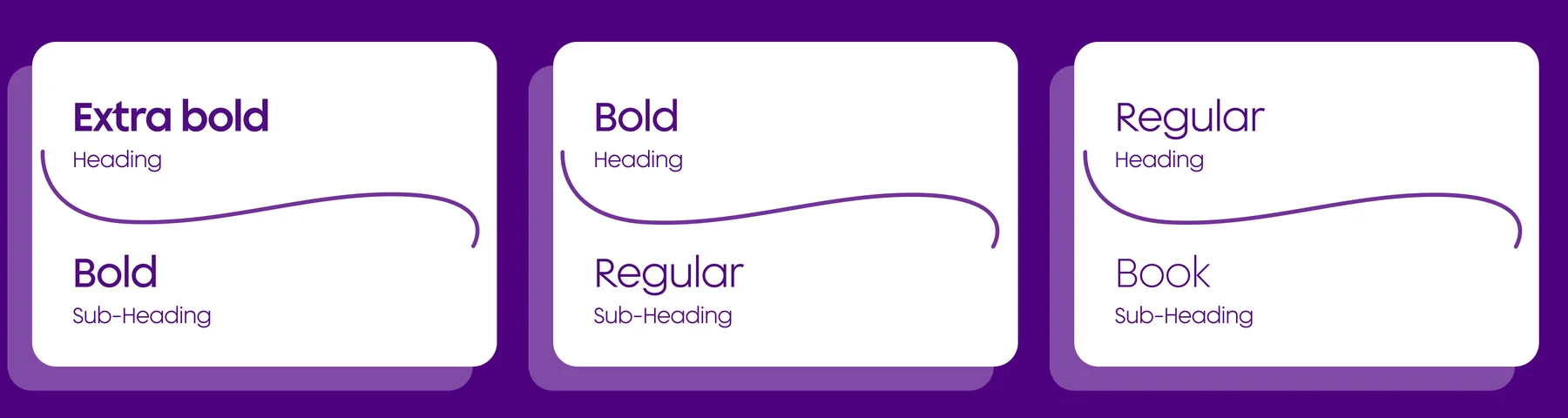
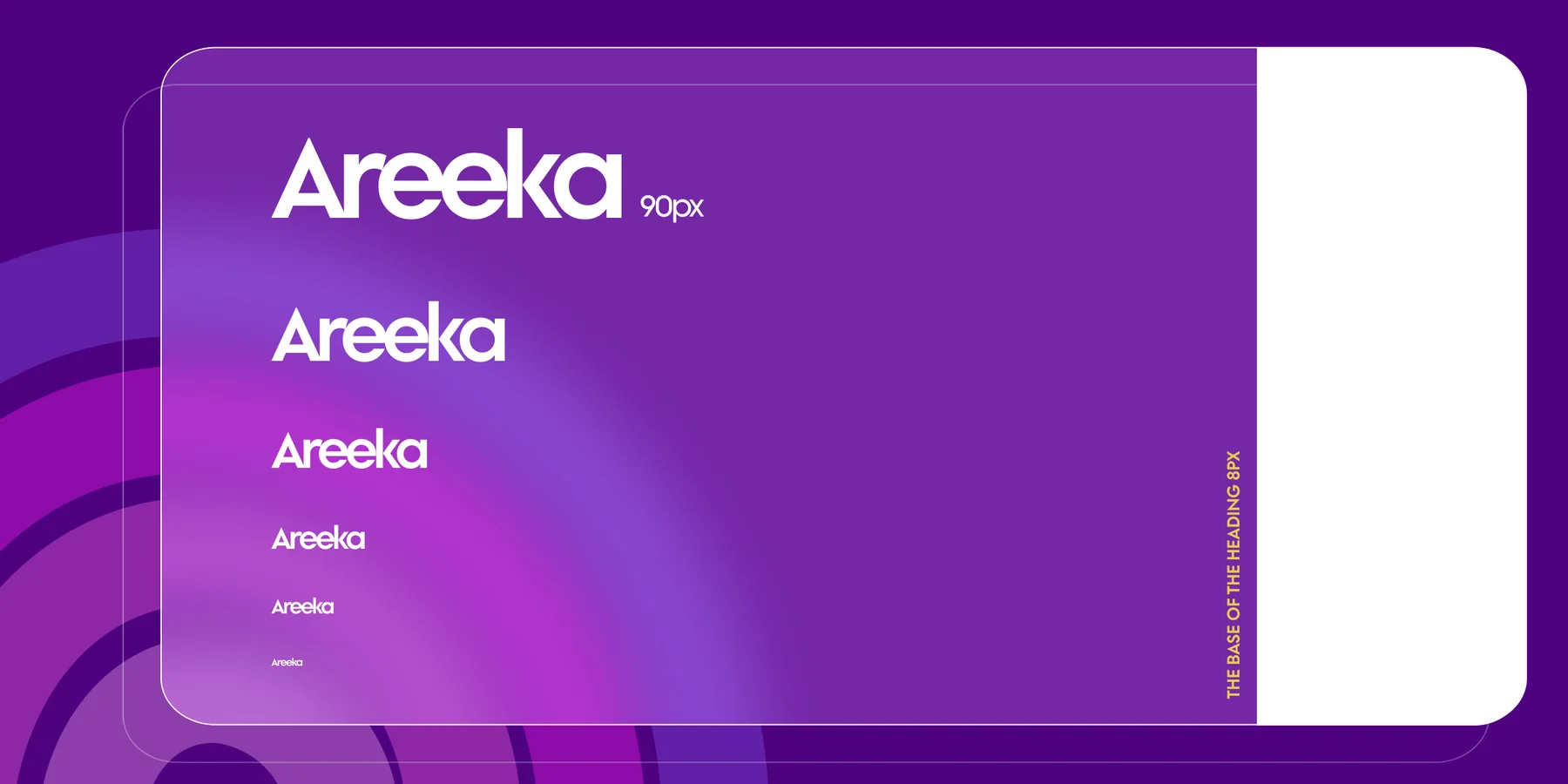
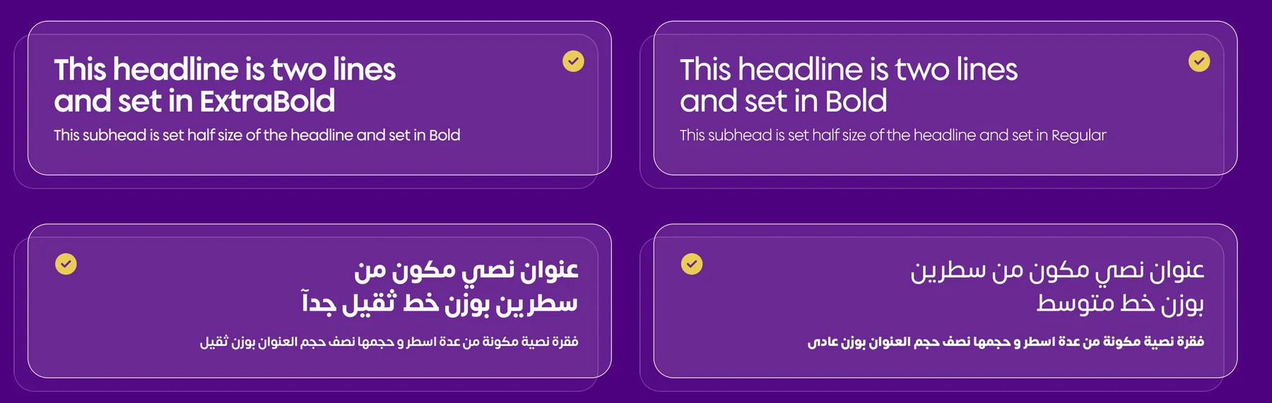
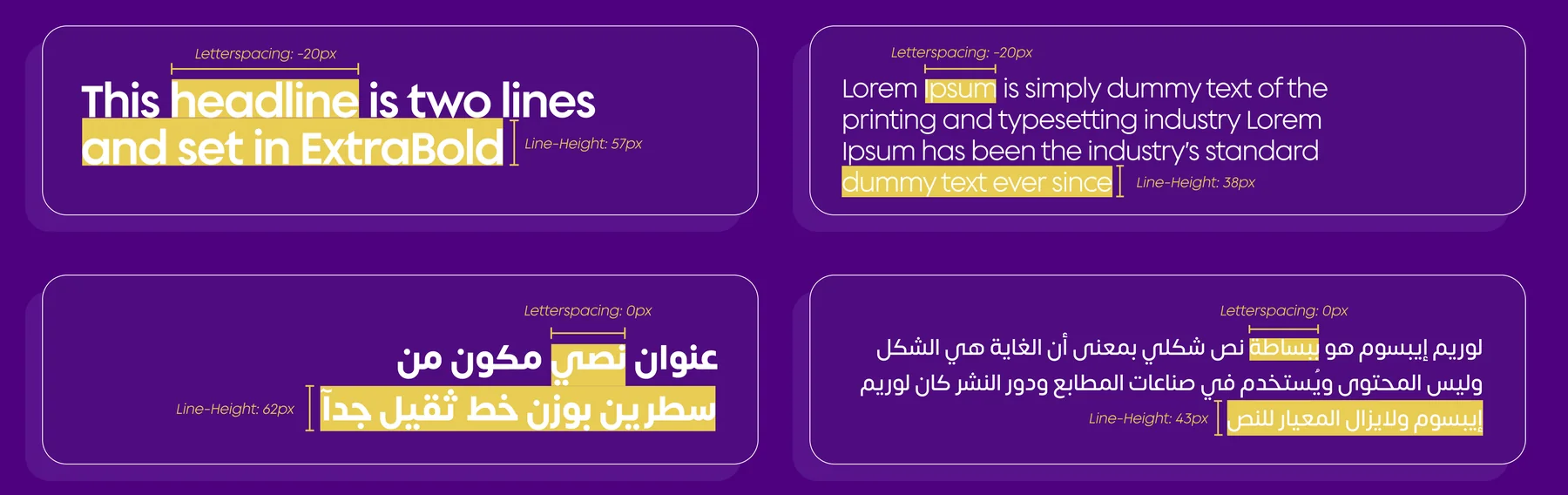
Supera Gothic for English and Somar for Arabic. Extra Bold pairs with Bold, Bold with Regular, Regular with Book. Sizes follow a 1.3 scale from an 8 px base up to 90 px; English headings use −20 letter-spacing, Arabic 0, each with its own line height.
Supera Gothic
English primary
Somar
Arabic primary
Typefaces
Pairings
Type scale
Hierarchy
Line height
Fifty-two line icons with rounded ends, each in a soft circle. Twelve shown here; the full set is on the guidelines page.
Halos everywhere.
Patterns
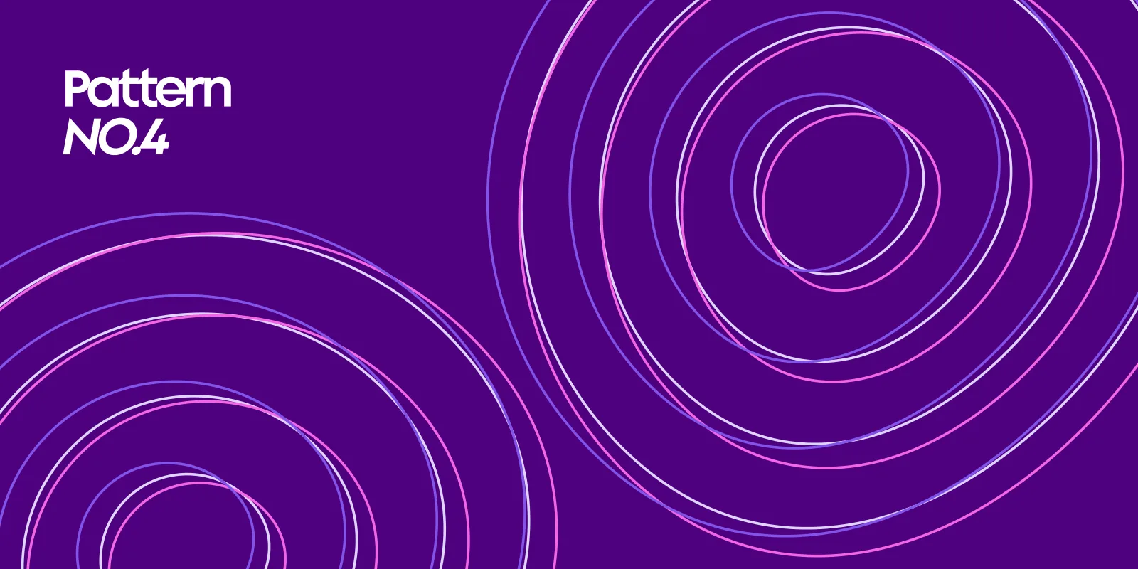
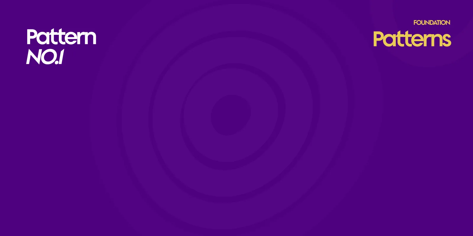
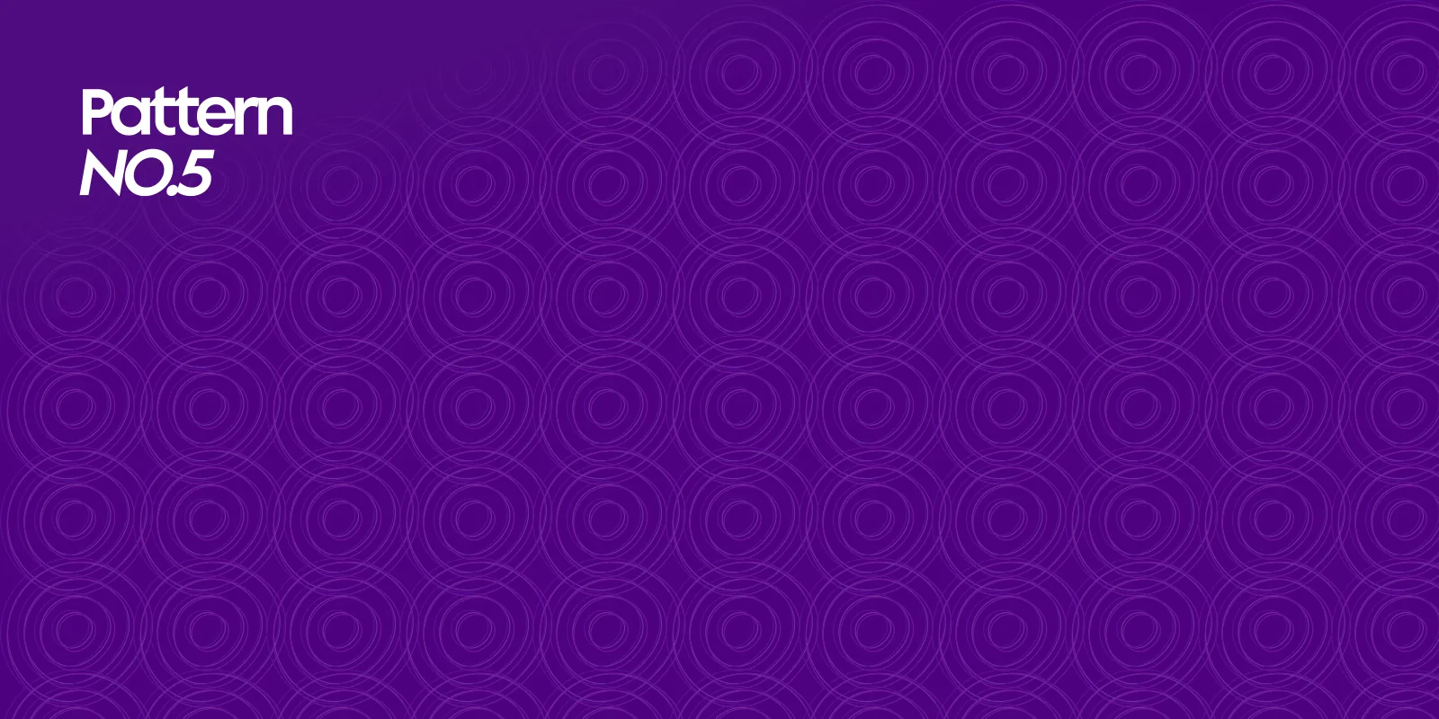
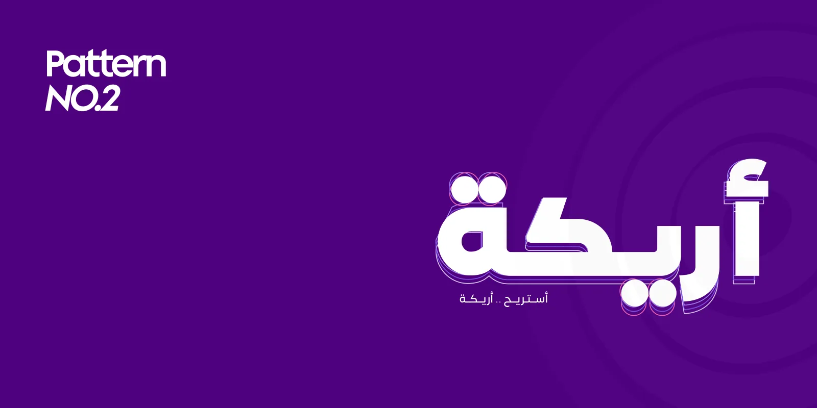
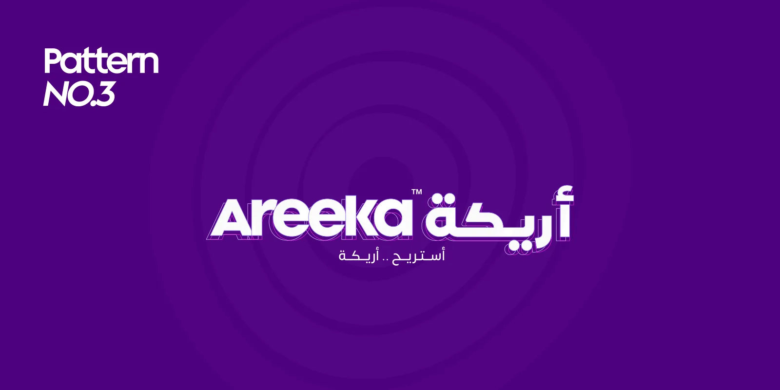
Five patterns grow out of the symbol and the wordmarks: soft halos, echoing outlined wordmarks, line rings and a repeating tile.
No.4 · Rings
The halos as lines, in light purple, pink and white.
No.1 · Soft halos
No.5 · Halo tile
Typographic patterns
No.2 · Arabic echo
The Arabic wordmark, outlined and repeated behind itself.
No.3 · Bilingual echo
The bilingual lockup, echoed over soft halos.
From the home screen to the business card.
Applications
The identity applied: the bilingual lockup where there’s room, the symbol alone where there isn’t, and the halo patterns behind both.
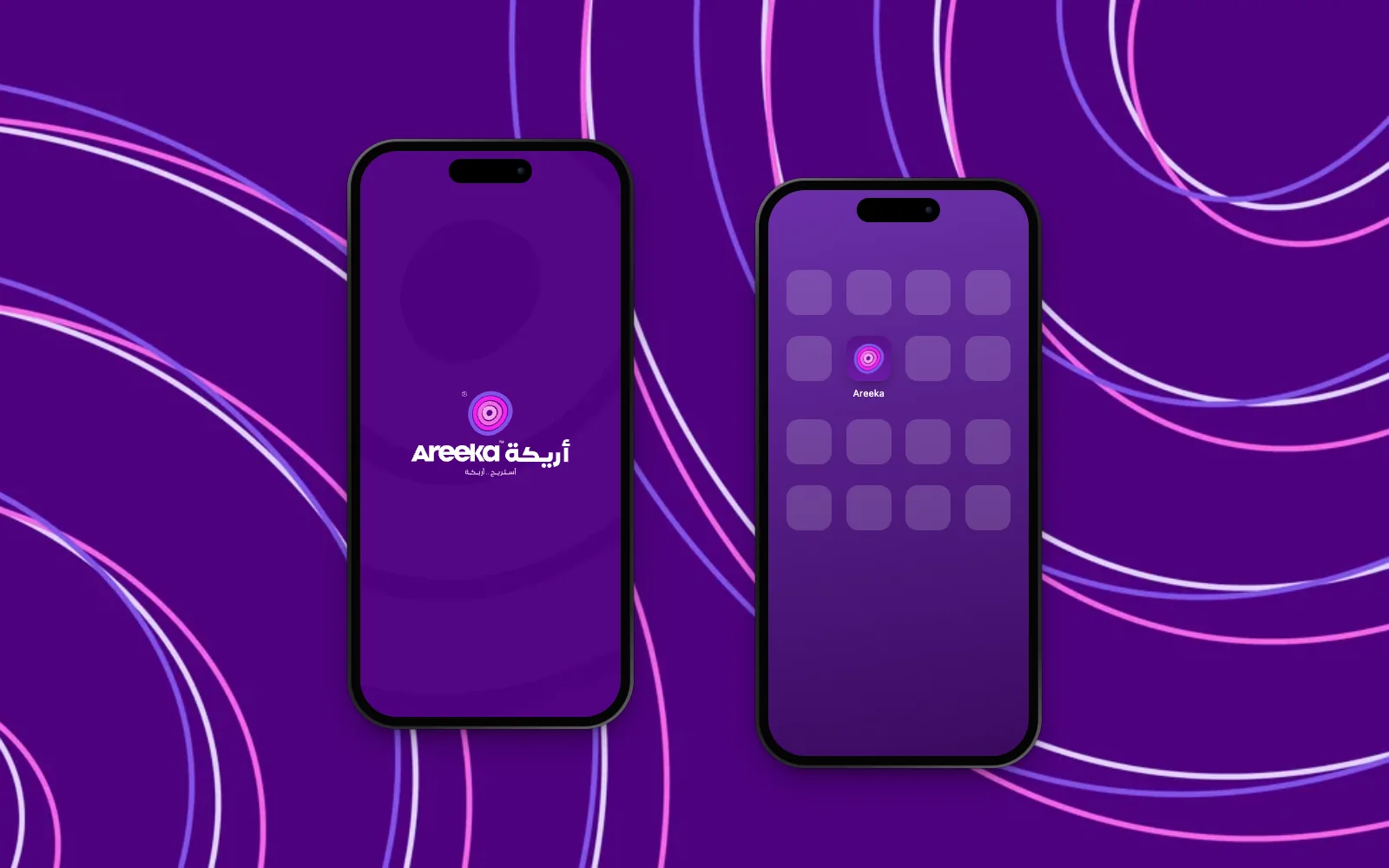
The app
A splash screen with the bilingual logo over the halo pattern, and the preferred dark-purple icon on a home screen.
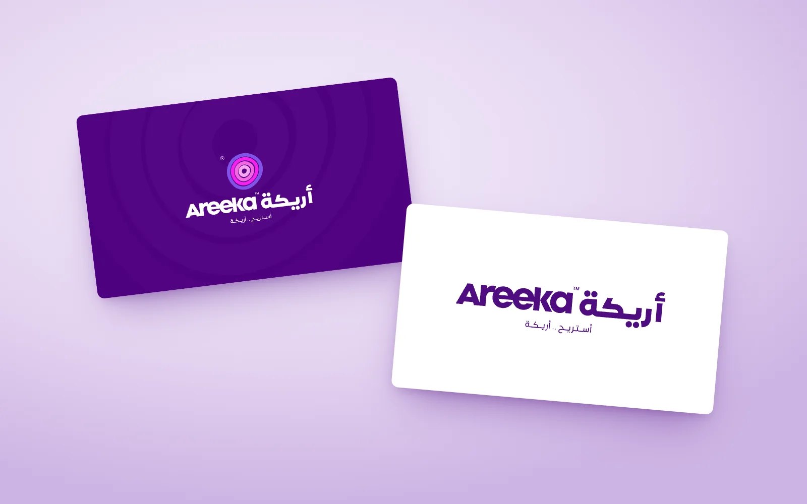
Business cards
Bilingual logo on dark purple; the bilingual wordmark and slogan on white.
Social tiles
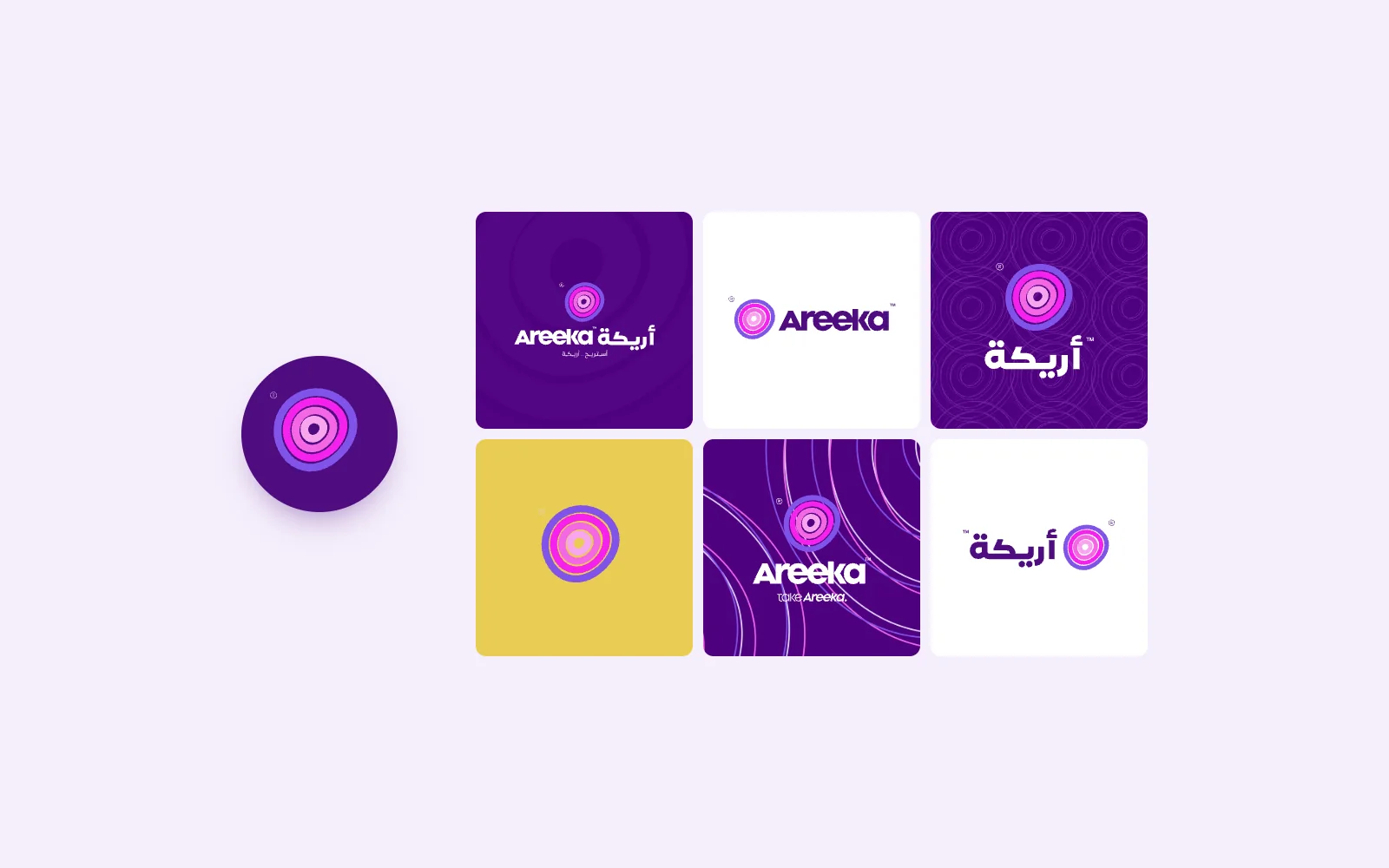
The symbol as the avatar; lockups on purple, white and gold, over three of the patterns.
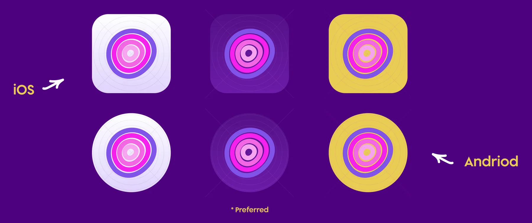
App icons
Two documented types: solid dark purple (preferred) and solid white, shown for iOS and Android, with a gold version alongside.
Logo preview
Bilingual
English
Arabic

Every page.
The guidelines
All 28 pages of the Areeka brand guidelines, grouped by section. Select a page to see it large.
Idea
Logo
Typography
Colour
Icons & patterns




What the identity delivers.
Results & impact
A calm, human identity for a product about waiting, equally at home in Arabic and English.
A name with a meaning
Areeka, a sofa, becomes a brand about the feeling of waiting, not the furniture, so it can belong to a psychological-care product.
Empathy you can see
The halo symbol speaks to how patients feel before they speak, giving the product a calm, human first impression.
Equal in Arabic and English
Two wordmarks on one grid, with matching slogans, let the brand lead in either language without one feeling secondary.
Ready to apply
Six colour families, 52 UI icons, five patterns and app icons, documented in 28 pages, cover the product and its print from day one.
How success shows up
People who meet the product as calm and caring before they read its name, in either language.
The system, counted.
Scope
Pages of guidelines
Colour families, ten swatches each
UI icons
Patterns
Drawing a feeling, not a sofa.
Closing reflection
The strongest decision in Areeka was to stop drawing the object in the name and draw the feeling behind it, and the only way to find that feeling was to ask someone sitting on the sofa.
- One honest answer from a real person was worth more than any number of sketches: “a maze, confusion, halos” gave the symbol its form.
- A symbol without a literal sofa can carry a name that means sofa: the name tells the story, the mark tells the feeling.
- Designing the English and Arabic wordmarks on matching grids lets the brand lead in either language without one feeling secondary.
- The halo symbol with English and Arabic wordmarks and two slogans.
- A purple-and-pink palette with gold, set in Supera Gothic and Somar.
- Five patterns, 52 UI icons and app icons for iOS and Android.
- A 28-page guide covering construction, clear space and applications.