Brainboxd Brand
Brand Identity
Brainboxd is the identity of a marketplace where students sell their notes, slides and summaries: a box with a green B, dark blue with a green spark, Poppins, motion principles, 156 icons and 36 pages of guidelines.
A brand identity for a student marketplace: a box of knowledge, a confident dark blue with a green spark, and a system that runs from icons to motion.

Overview
Brainboxd is a marketplace where students sell their learning materials (a slide, a summary, their notes) to students all over the world who study the same subjects.
Its mission is to make students’ lives simpler, more pleasant and more productive. Its vision: help new students benefit from their predecessors, and help graduates make money from what they already wrote.
The identity puts that exchange in a box: a symbol, a wordmark, two typefaces, four colour families, motion, icons, illustrations and photography, documented in 36 pages.
Client
Brainboxd
Role
Brand Designer
Platform
Print & digital
Scope
Brand identity & guidelines
Deliverables
Logo system · 36-page guidelines
Tools
Figma · Illustrator
In this case study
Your notes can help someone else.
The brand
The challenge: a marketplace has to earn trust from two sides at once (students buying another student’s notes, and graduates selling their own) while feeling friendly enough for both.
What it is
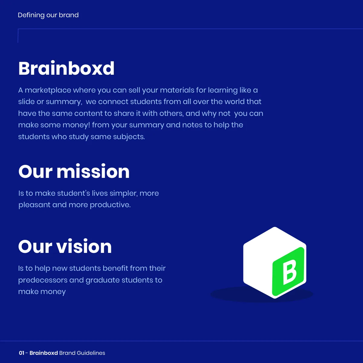
A marketplace that connects students who share the same content, so a summary written once can help many, and earn its author some money.
Our mission
To make students’ lives simpler, more pleasant and more productive.
Our vision
To help new students benefit from their predecessors, and graduate students to make money.
Universal, precise, functional.
Design principles
Three principles from the guidelines that every design decision answers to.
Universal
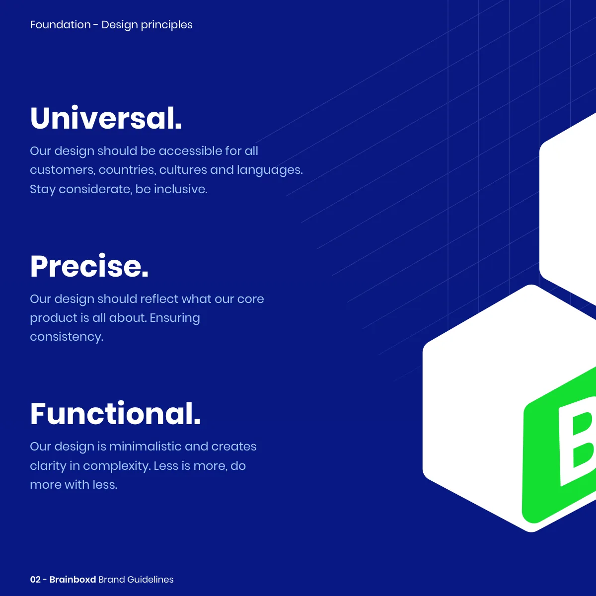
Accessible for all customers, countries, cultures and languages. Stay considerate, be inclusive.
Precise
Reflect what the core product is all about, ensuring consistency.
Functional
Minimalistic, creating clarity in complexity. Less is more. Do more with less.
A box of knowledge.
The symbol
The symbol is a box seen in three-quarter view, with a green B on its face: Brainboxd’s initial, and the box of materials one student passes to the next. The wordmark beside it is set in a rounded geometric sans, its i dotted in the same green.
- A horizontal relationship between name and symbol is the preferred presentation.
- The green dot of the i ties the wordmark to the symbol’s face.
- The logo’s colour, form and the symbol–wordmark relationship are never modified.
Symbol + wordmark
The box, its green B and the wordmark’s green dot.
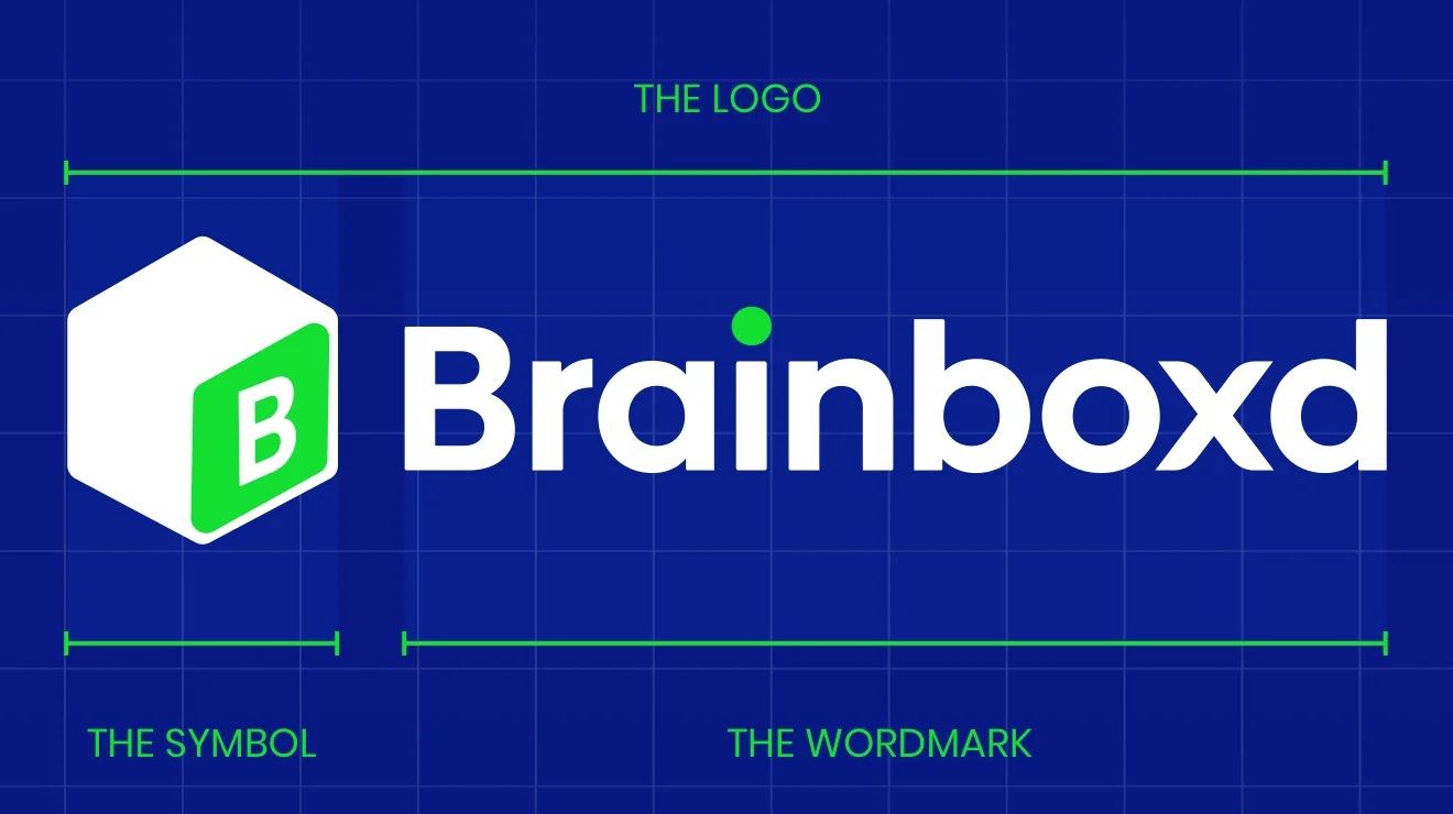
Horizontal, vertical, symbol.
Logo
The logo comes in three ways, in dark blue or inverted to white. Switch backgrounds. Each edition has its own approved artwork.
Dark blue
White
Horizontal first
For most communications the horizontal logo is preferred; vertical and the symbol alone cover the rest.
Dark blue or white
The correct versions are dark blue or inverted to white; only when that’s technically impossible, black and white.
Clear space
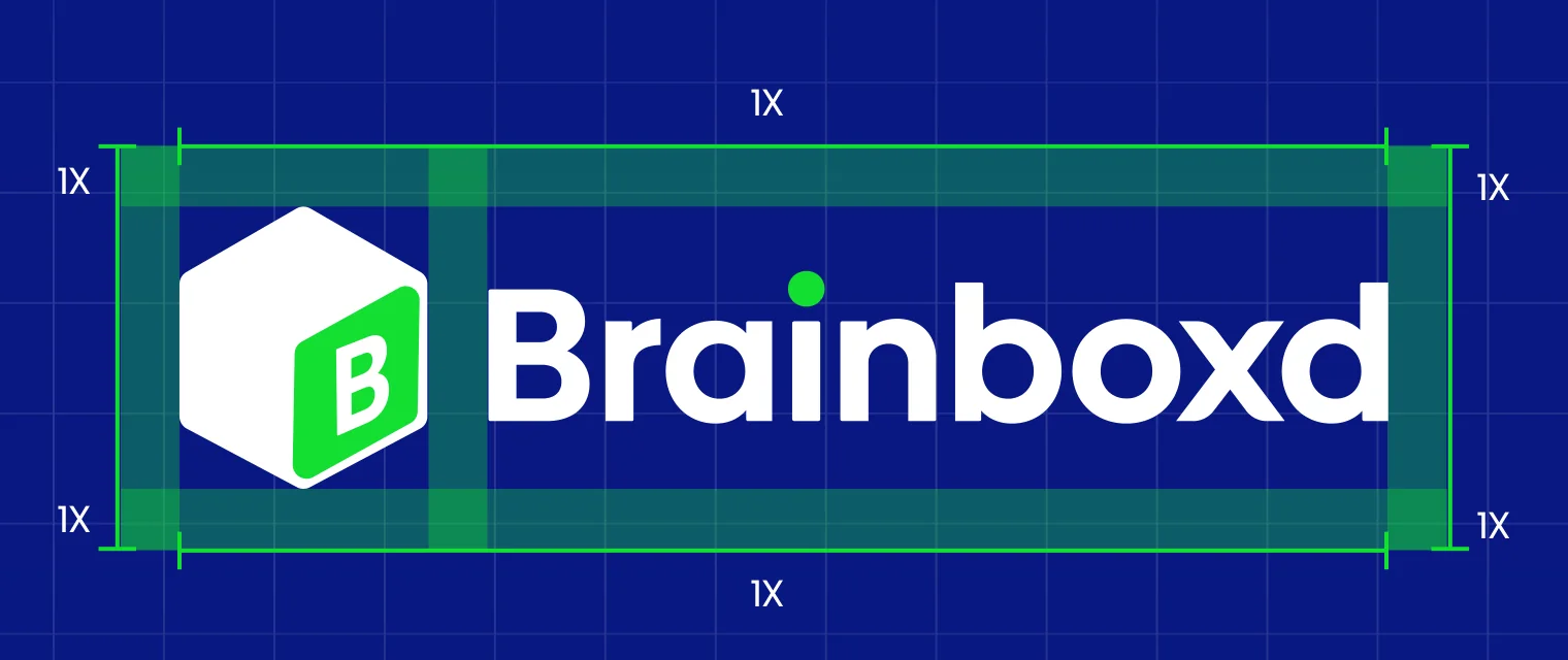
A minimum clear space of 1x on every side insulates the logo from other logos, copy and illustrations.



Room to think.
Clear space
1x of clear space around the logo.
Where the slogan belongs.
Usage
Five rules from the guidelines. The slogan “Marketplace” travels only with the full logo, and is never recoloured or used on small formats.
do
Use the full slogan lockup for external material: business cards, posters, merchandise.
dont
Don’t use the slogan with only the wordmark.
dont
Don’t use the slogan with only the symbol.
dont
Don’t change the colour of the slogan or the dot of the i.
dont
Don’t use the slogan lockup for social media, app icons or any other small format.
Dark blue to trust, green to grow.
Colour & type
Brainboxd Dark Blue, White and Green provide trust, simplicity and consistency; yellow and light blue join them in four families of ten. Poppins is the primary typeface, Biennale the alternative.
Three primary colours with their documented values, and the 1000 weights of the two supporting families. The 1000 weights work on light and dark backgrounds for maximum contrast, and colours are always opaque, never made with transparency.
Brainboxd Dark Blue
RGB 9 25 132 · CMYK 48 42 0 48
Brainboxd White
RGB 255 255 255 · CMYK 0 0 0 0
Brainboxd Green
RGB 20 224 51 · CMYK 80 0 68 12
Light Blue 1000
Palette swatch · gradients and highlights
Yellow 1000
Palette swatch · illustrations and gradients
Blue
1000
900
800
700
600
500
400
300
200
100
Green
1000
900
800
700
600
500
400
300
200
100
Yellow
1000
900
800
700
600
500
400
300
200
100
L. Blue
1000
900
800
700
600
500
400
300
200
100
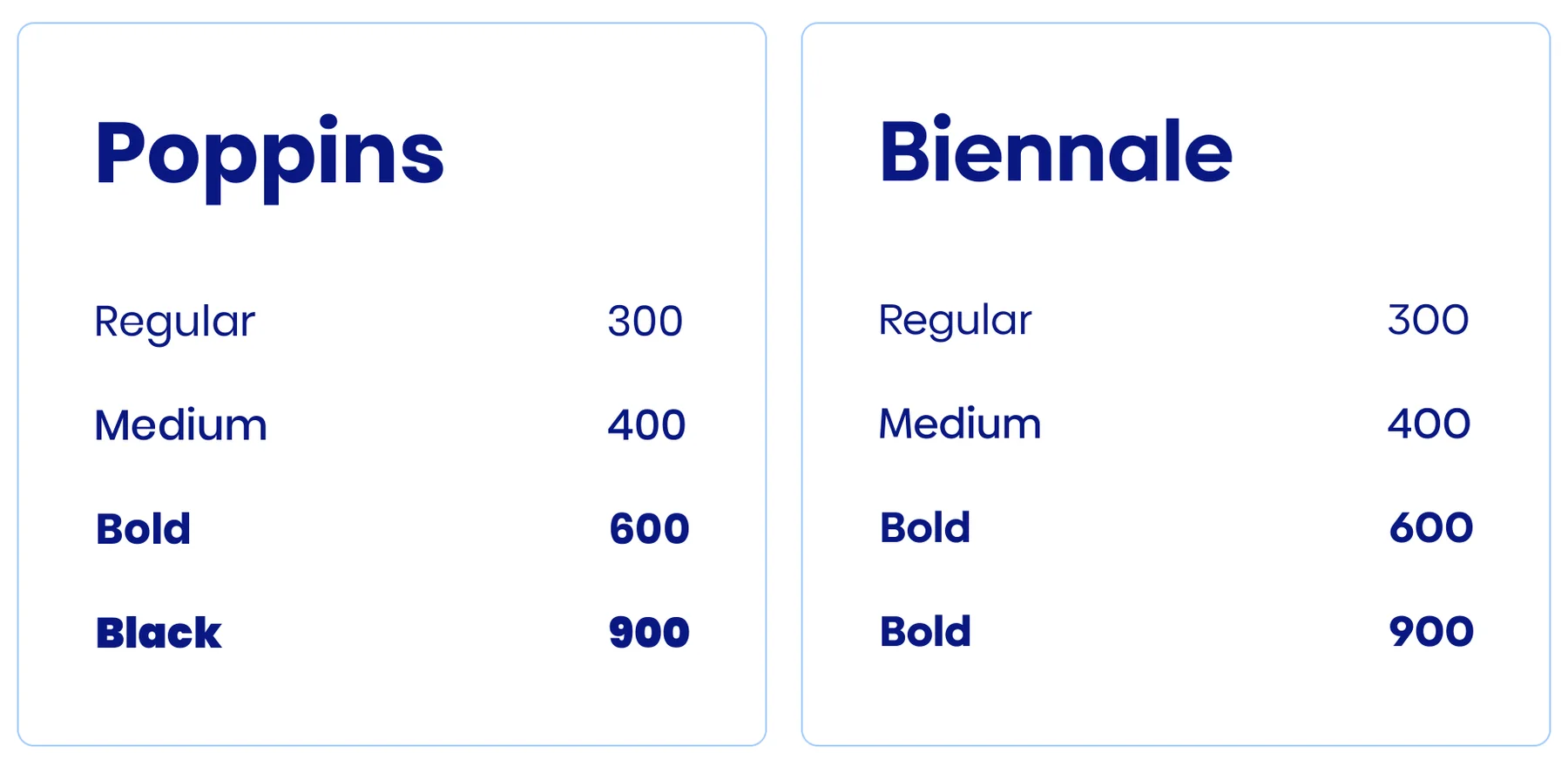
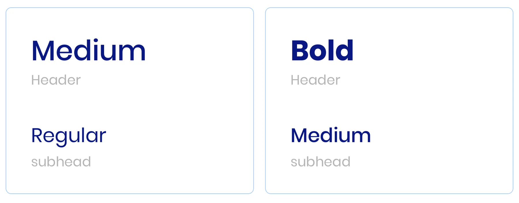
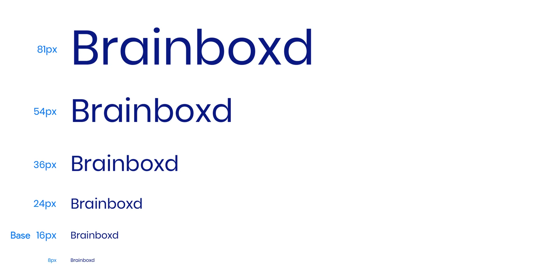
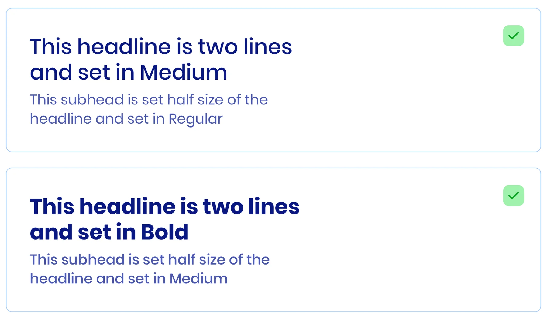
Poppins (primary) and Biennale (alternative), each restricted to Regular 300, Medium 400, Bold 600 and Black/Bold 900. Medium headers pair with Regular subheads, Bold with Medium. Sizes follow a 1.3 scale from a 16 px base (8 → 81 px); headings take line-height = size − 10 px, paragraphs size + 8 px.
Poppins
Primary typeface
Biennale
Alternative typeface
Font weights
Pairings
Type scale
Hierarchy
Line height
156 outline icons with rounded corners and a 2 px stroke, in dark blue on white or white and light blue on dark blue. Twelve shown here; the full set is in the guidelines.
Opaque, weighted, two at a time.
Colour in use
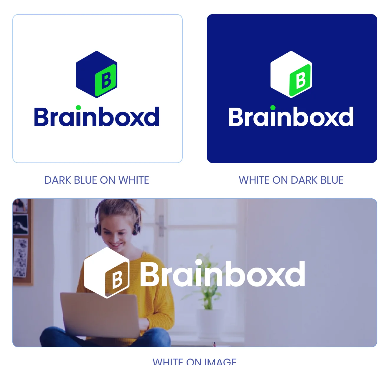
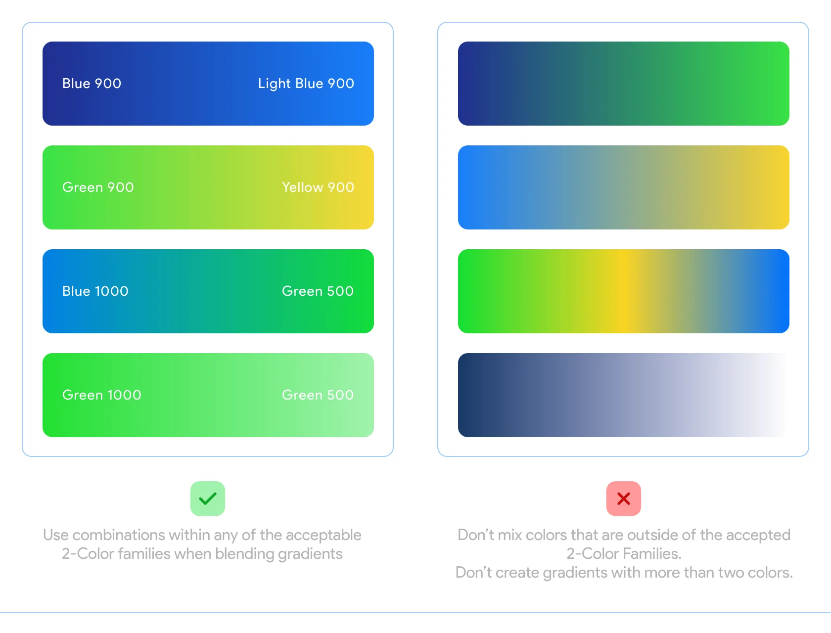
The logo appears in dark blue on white or white on dark blue and on images. Gradients blend values between 900 and 500 within an approved two-colour family, never more than two colours.
Colour versions
Gradients
Three ways to move.
Motion
In the real world, objects accelerate and decelerate. Brainboxd uses three easings, each with a job. The guidelines draw their curves; shown here with the standard CSS curves of the same name, live.
Ease-out
Best for fading and animating objects into view.
Ease-in
Best for objects exiting the screen or fading out of view.
Ease-in-out
Best for movement from place to place on screen.
Real students, cut out and confident.
Photography
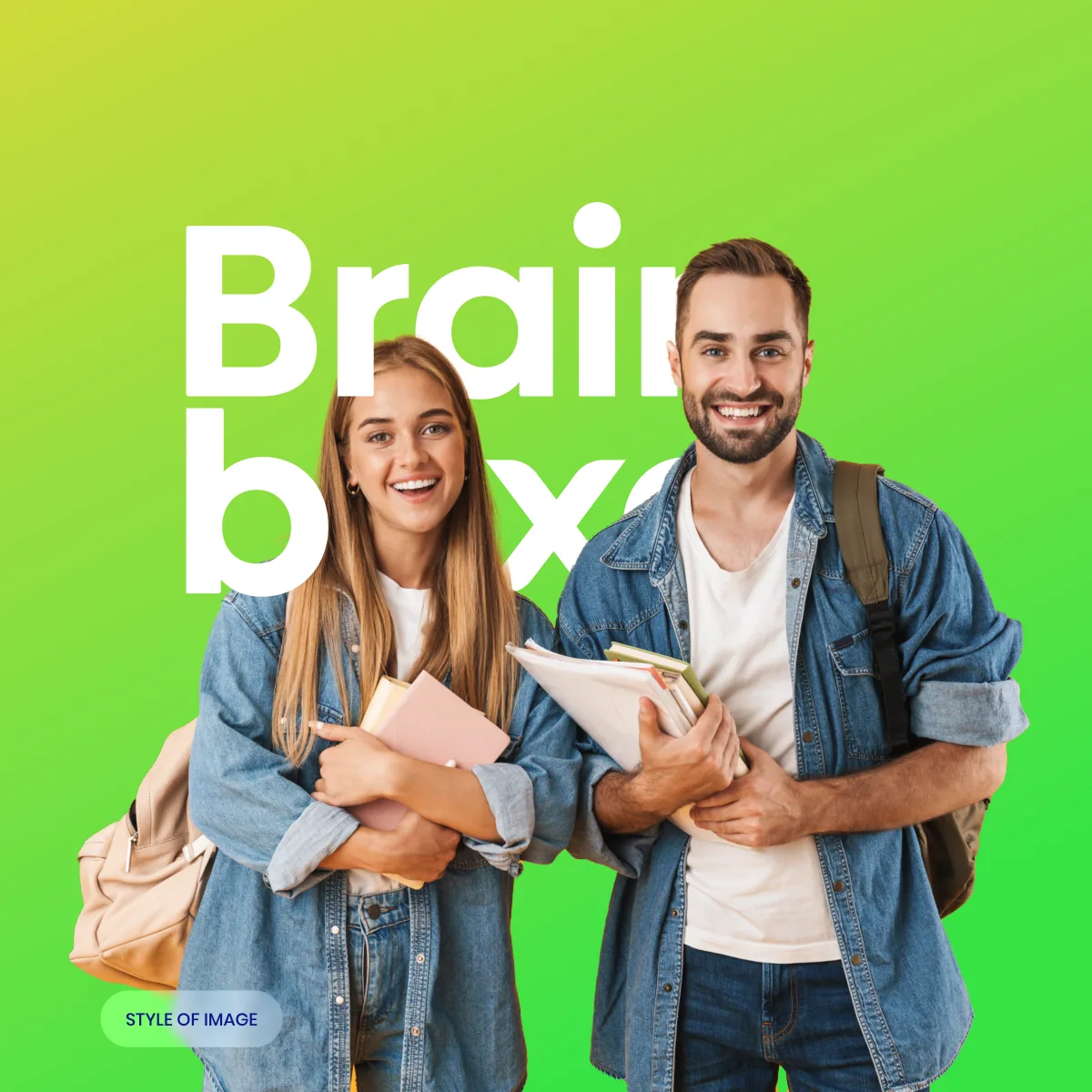
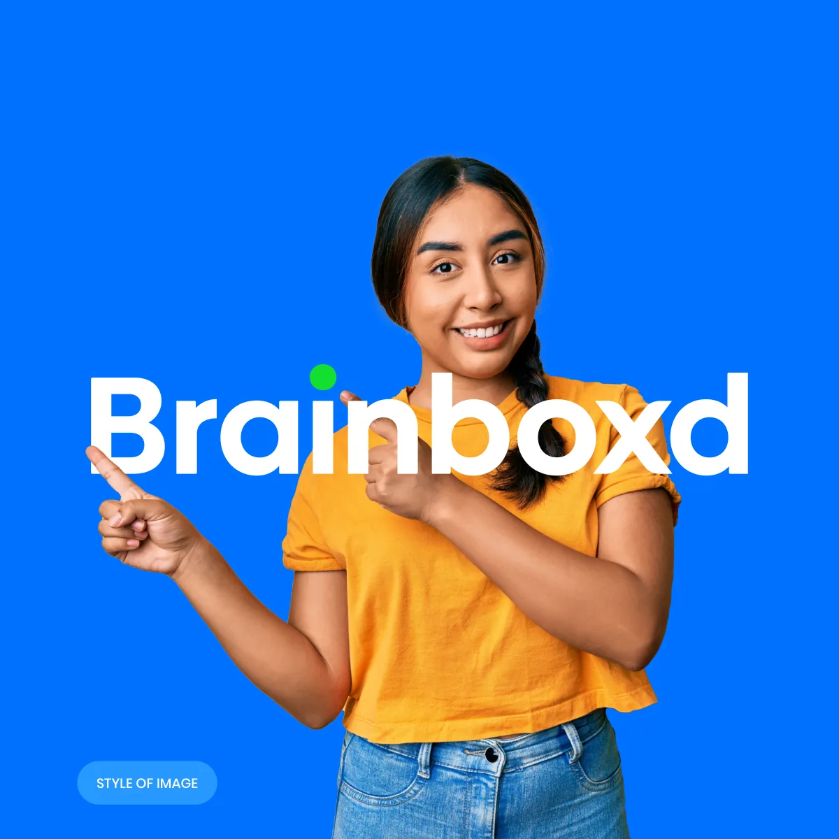
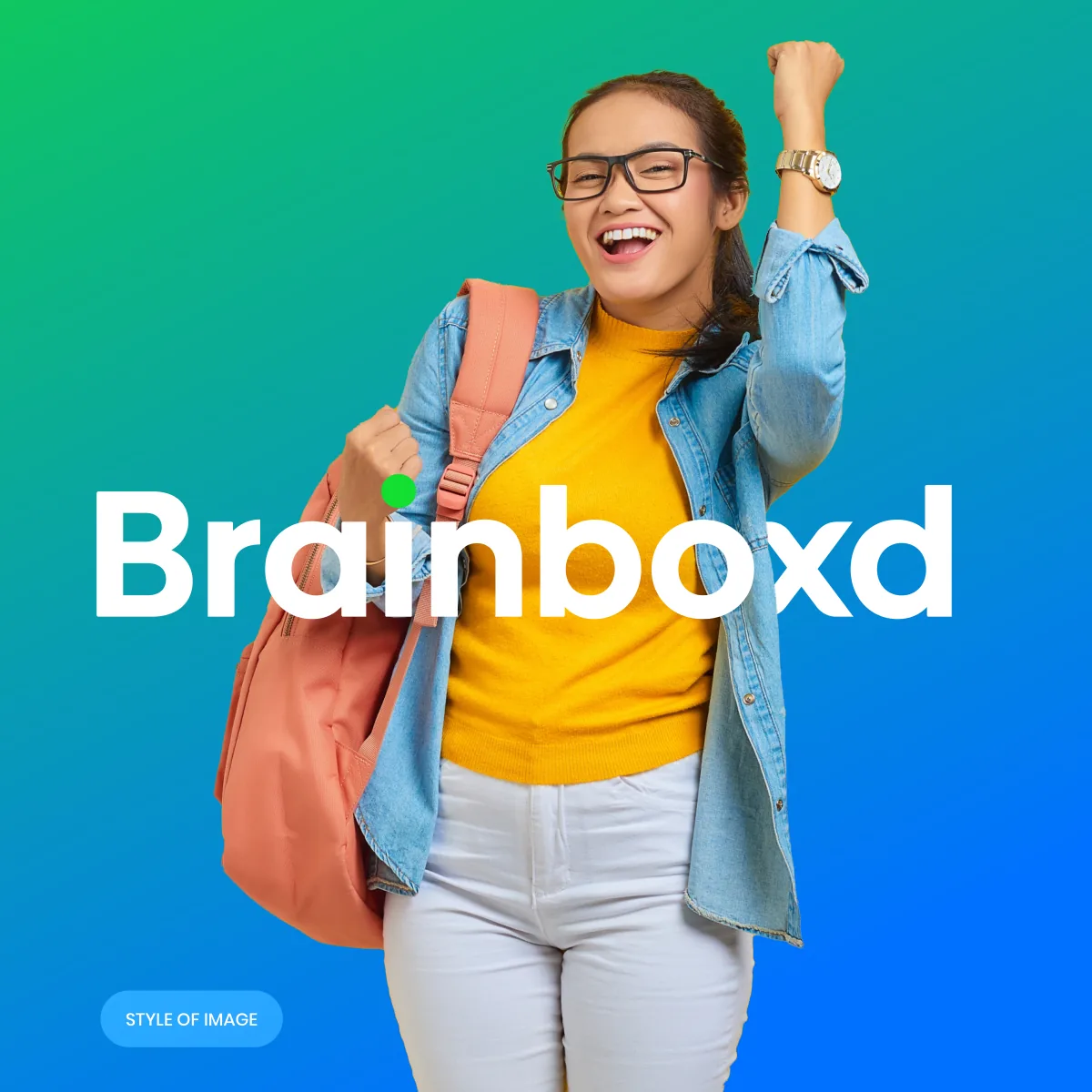
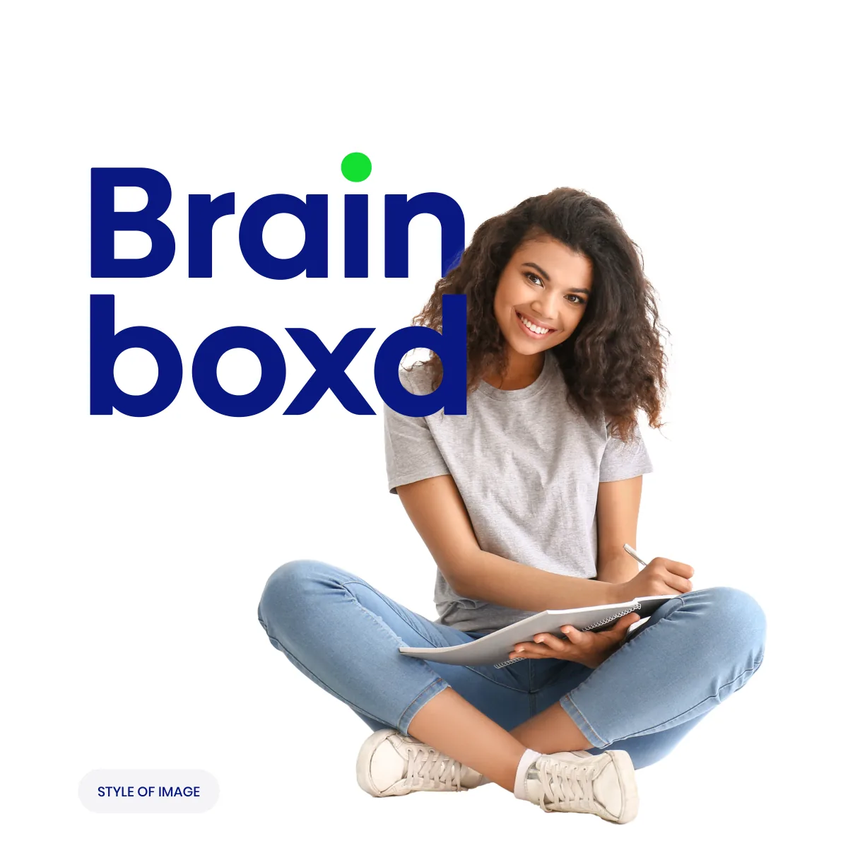
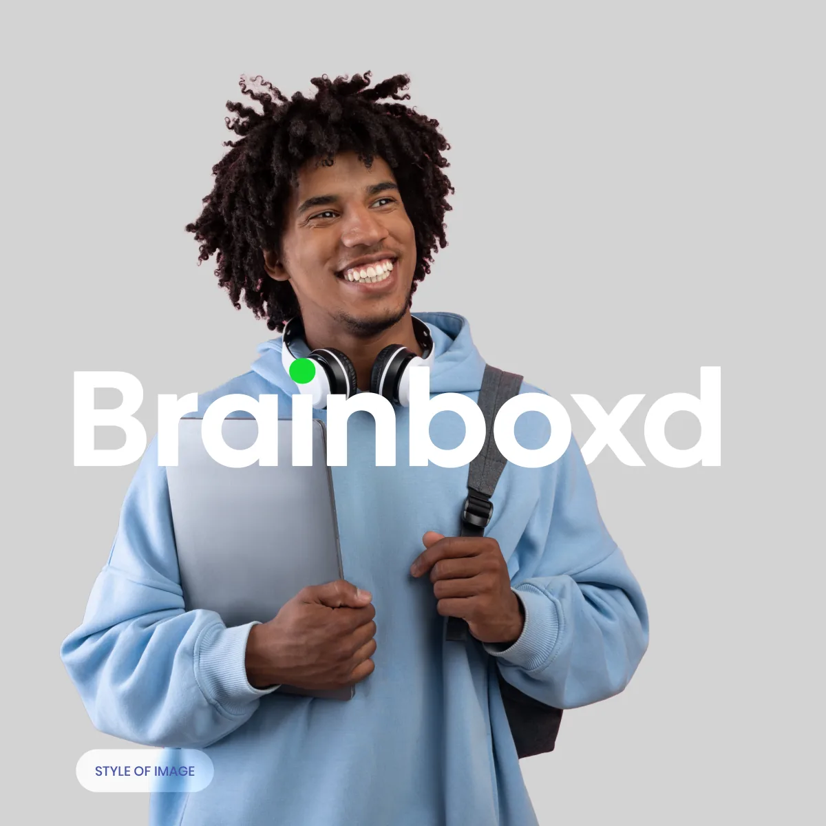
Smiling students, cut out against brand colour or gradients, with the white wordmark set large behind or beside them, the green dot of the i always in view.
Together
Two students with their books on a green gradient.
Pointing the way
Celebrating
Dark blue wordmark on white
White wordmark on grey
A student and a box.
Illustrations
Line illustrations of one student (reading, working, standing on a stack of books), always with Brainboxd boxes nearby, a soft cone of light and gradients from the palette.
Found it
Working on it
Reading up
Standing on it
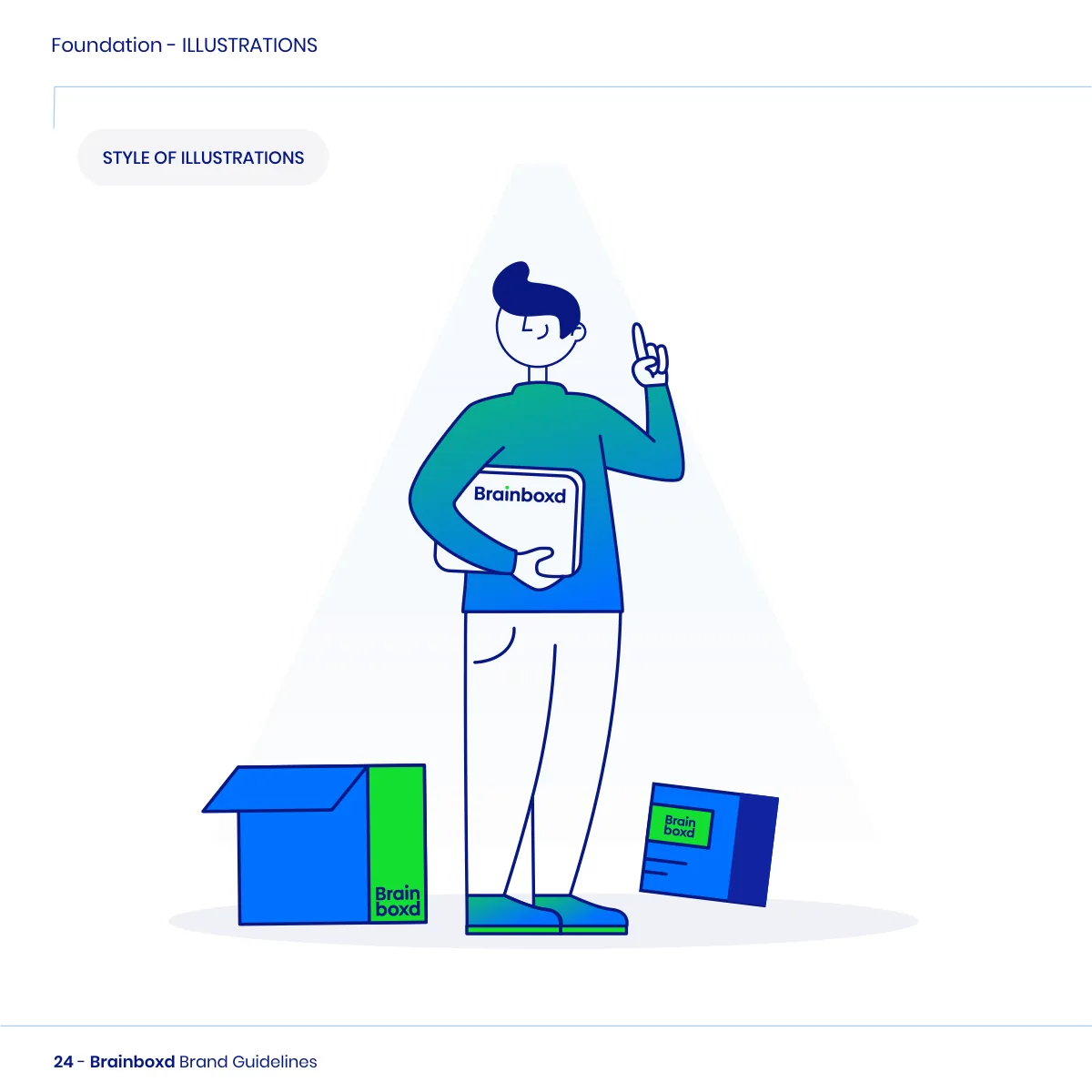
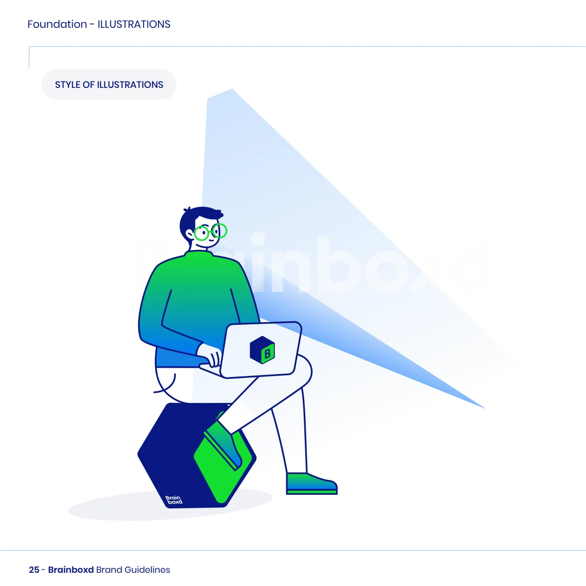
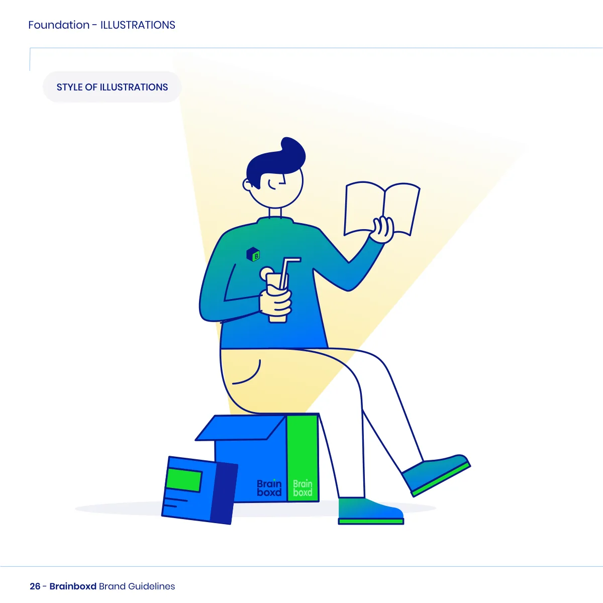
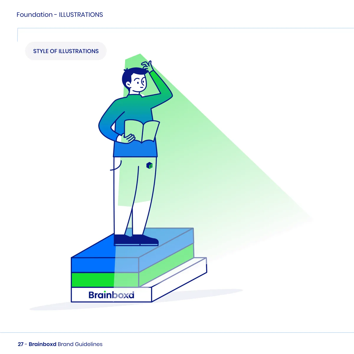
Boxes all the way.
Patterns
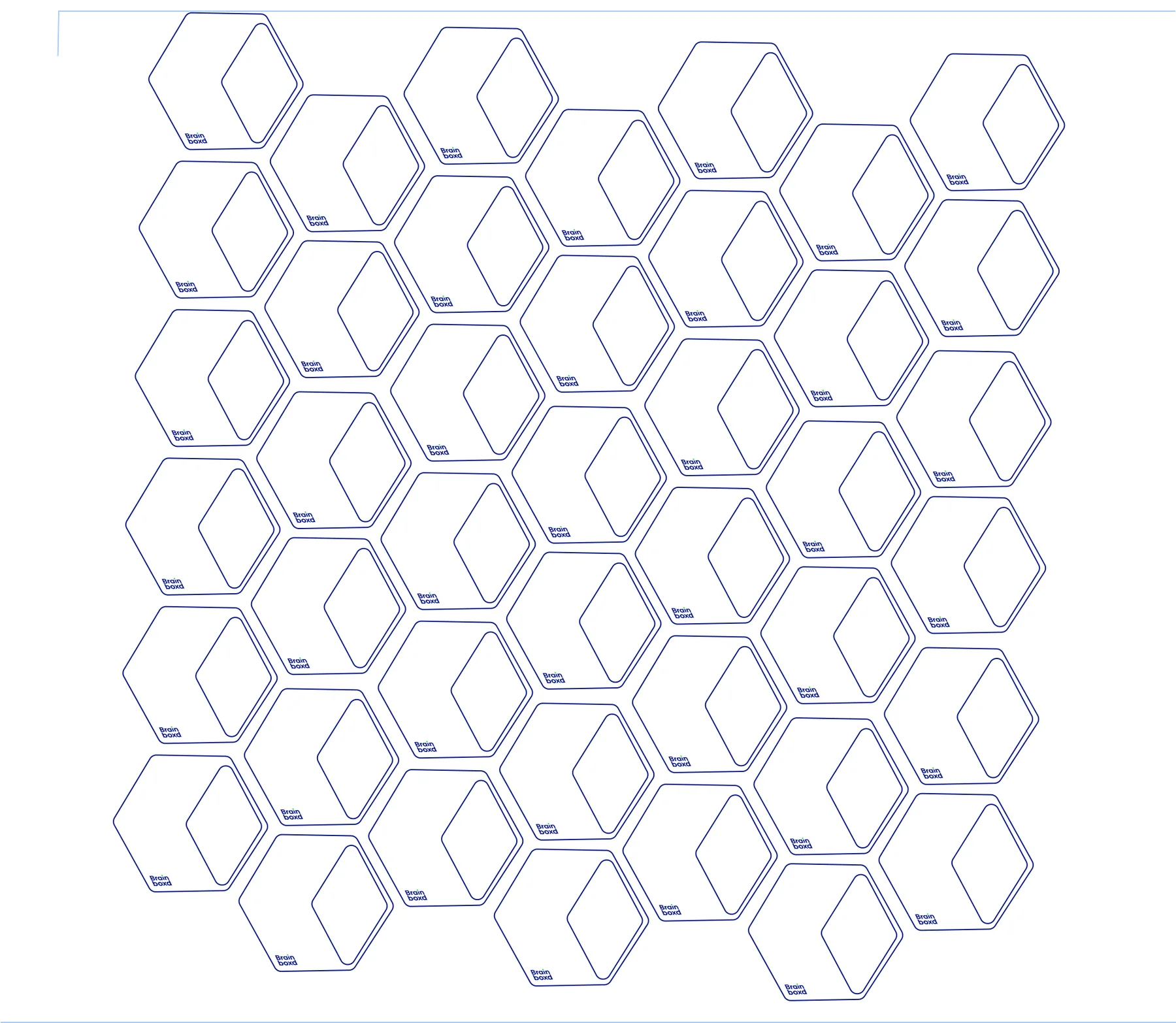
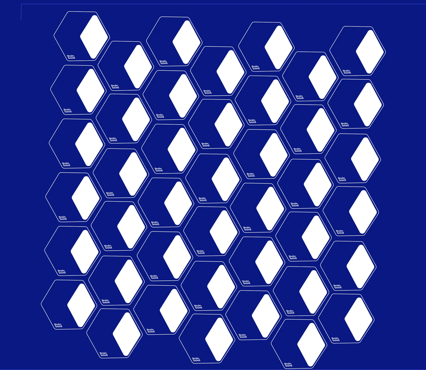
The symbol, outlined and tiled into a honeycomb of boxes, in dark blue line on white, or with white faces on dark blue.
Light
Dark
From the first summary to the business card.
Applications
The identity applied, following its own rules: the slogan only with the full logo, the symbol alone on small formats.
The app
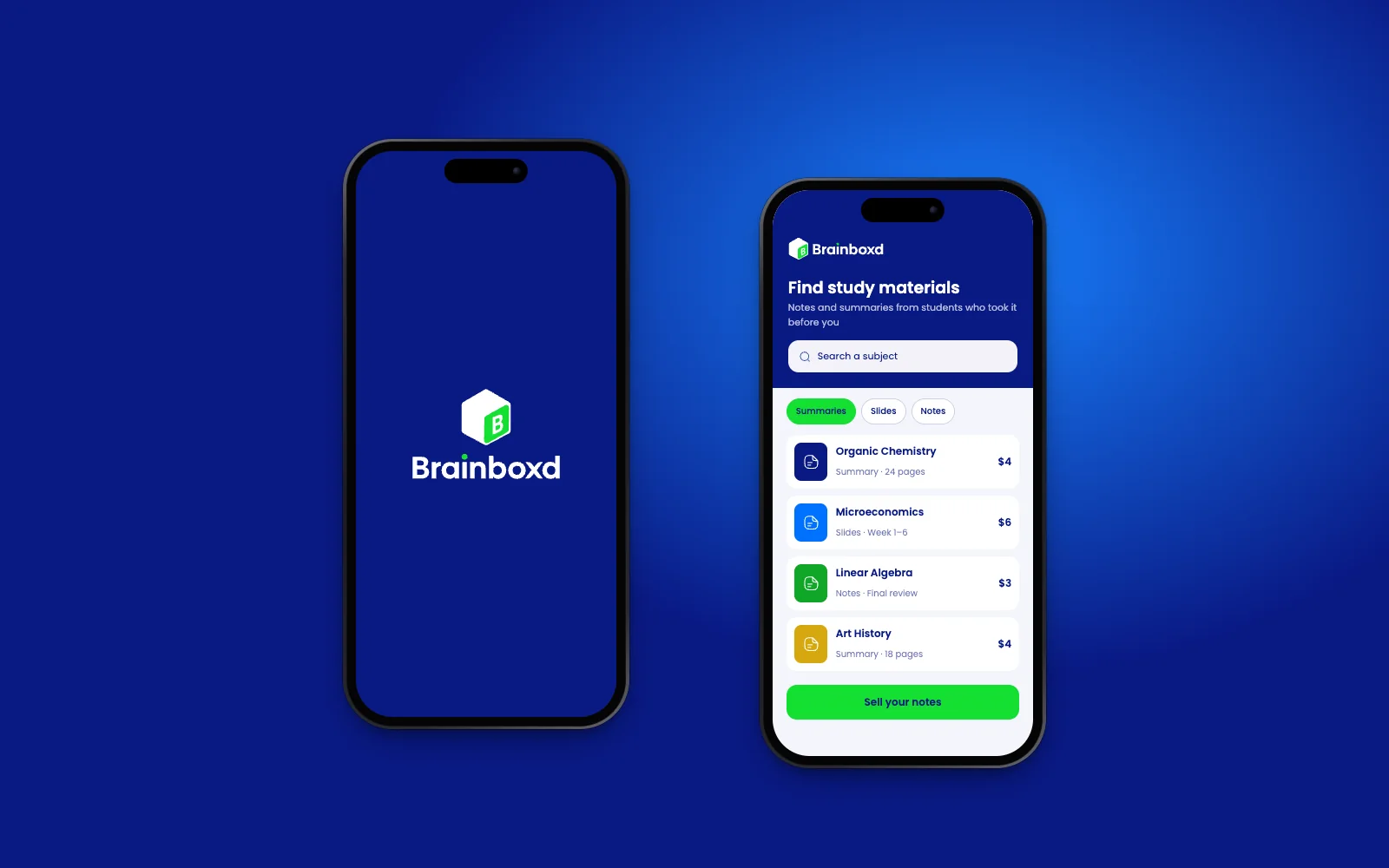
A splash screen with the vertical logo, and a marketplace of summaries, slides and notes, with a green “Sell your notes” action.
Business cards
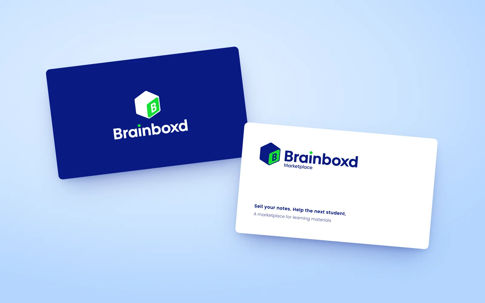
The vertical logo on dark blue; the full slogan lockup on white, as the rules ask for business cards.
Social posts
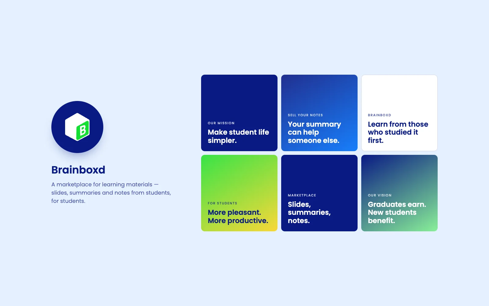
The symbol alone as the avatar (no slogan lockup on social), and posts carrying the mission and vision.
Every page.
The guidelines
All 36 pages of the Brainboxd brand guidelines, grouped by section. Select a page to see it large.
Brand
Logo
Typography
Colour
Icons & motion
Imagery & patterns
What the identity delivers.
Results & impact
A friendly, trustworthy identity for a marketplace with two sides, ready to become a product.
Trust on both sides
A confident dark blue and a clear, consistent system make buying and selling notes feel safe for students and graduates alike.
An idea students get at once
A box you can pass on: the symbol, the patterns and the illustrations all say that what you learned can travel to the next student.
Ready to become a product
Motion, 156 icons, illustrations and photography are defined alongside the logo, so the app and website can be built on-brand from day one.
A system measured in detail
40 swatches in four families and three easing curves, documented in 36 pages, give every screen the same colour and movement.
How success shows up
Students recognising the box on its own, in listings, the app icon and social posts.
The system, counted.
Scope
Pages of guidelines
Swatches in four families
Outline icons
Easing curves
Knowledge, boxed.
Closing reflection
Brainboxd’s identity works because the name gave it an object: a box you can pass on. The symbol, the patterns and the illustrated boxes all say the same thing: what you learned can travel to the next student.
- A single green detail (the B on the box, the dot of the i) is enough to carry the brand across logos, photography and illustrations.
- Defining motion alongside colour and type makes the product feel consistent long before it’s built.
- Restricting each typeface to a few weights keeps a large system easy to apply.
- A box symbol, wordmark and slogan lockup in horizontal, vertical and symbol-only layouts.
- Four colour families with 40 swatches, and two typefaces.
- Motion with three easing curves, 156 icons, illustrations, photography and patterns.
- A 36-page guide with logo usage rules.