StressFlow Plugin
Figma Plugin · Product Design
StressFlow is a Figma plugin that stress-tests a design in one click: nine tests on temporary copies, a score out of 100, issues you can locate or ignore, and a QA report, all inside Figma, in English and Arabic.
A Figma plugin that stress-tests a design in one click: nine tests on temporary copies, a score out of 100 and a QA report, without the design ever leaving Figma.

Overview
Designs are usually reviewed with perfect content. StressFlow is a Figma plugin that shows what happens with real content (long names, big prices, empty fields, Arabic) before a developer or a user finds out.
Select a frame, pick a preset or press Break My UI, and the plugin runs its tests on temporary copies placed next to the frame. The original stays exactly as it was.
It runs entirely inside Figma, in dark and light themes, in English and Arabic, and is published on the Figma Community.
Client
MOOOO. (own product)
Role
Product Designer & Developer
Platform
Figma plugin · 380 × 600 panel
Scope
Plugin design & development
Deliverables
9 stress tests · 91 screens
Tools
Figma
In this case study
Perfect content hides broken layouts.
The problem
Happy-path mockups
Frames are designed with short names, round prices and every image in place. Real content is longer, emptier and messier, and that’s where layouts clip, overflow and wrap.
Found too late
Most of these problems show up in development, in translation or in production, when fixing them costs more than designing for them would have.
Tedious to check by hand
Duplicating frames, pasting long text, swapping languages and deleting images for every screen is slow, so it rarely happens consistently.
What the plugin had to be.
The goal
For product designers who want to know a layout survives real content before it ships. Success means a confident answer in one click, without ever risking the original design.
One click to a verdict
Break My UI runs every test at once; presets cover the common questions: localization, accessibility, e-commerce, fintech.
Never touch the original
Tests run on temporary copies next to the frame, and one button removes them all.
Explain, don’t just flag
Each issue names the layer, the test and what happened, and links to the original and to its test copy.
Private by design
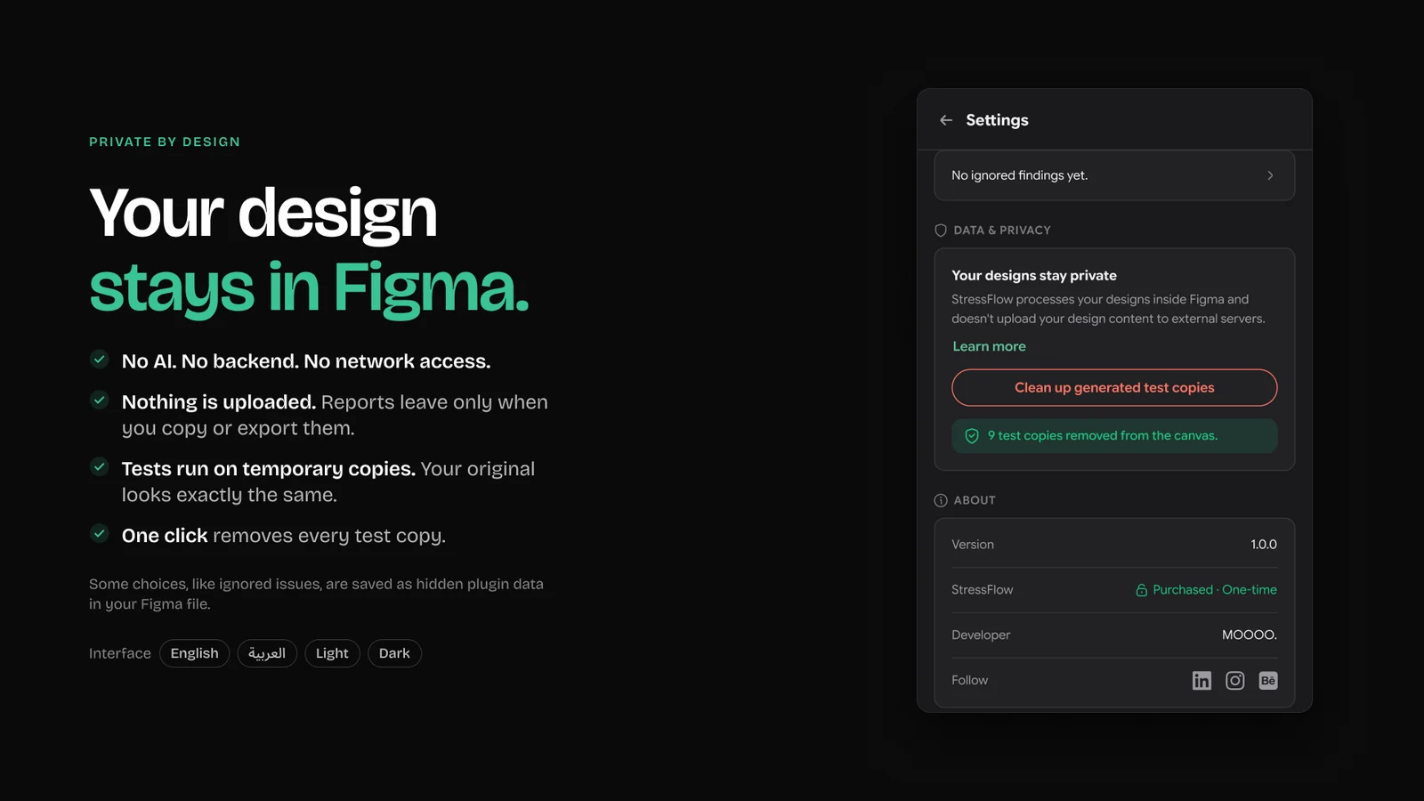
No AI, no backend, no network access. Reports leave Figma only when you copy or export them.
Fit Figma’s panel
Everything works inside a 380 × 600 plugin window, the size the plugin opens at.
Arabic and light, too
The plugin itself is designed in English and Arabic, dark and light, the same cases it tests for.
Beside the frame it tests.
In the workflow
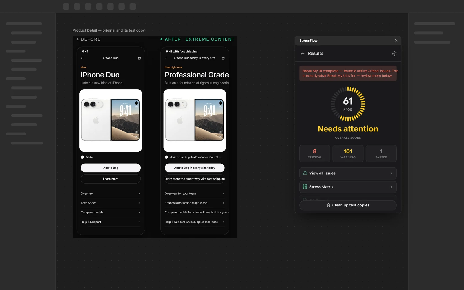
StressFlow opens as a plugin window over the canvas. Test copies are placed next to the original, so the result can be compared side by side and located from any issue.
The plugin in context
The Results panel beside a product frame and its Extreme Content test copy.
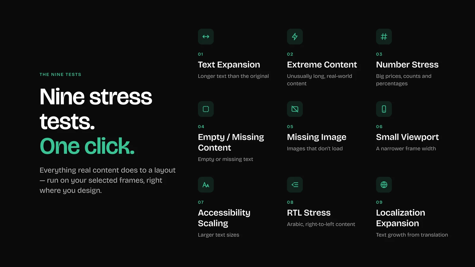
Nine ways content breaks a layout.
The nine tests
Text Expansion, Extreme Content, Number Stress, Empty / Missing Content, Missing Image, Small Viewport, Accessibility Scaling, RTL Stress and Localization Expansion, from the plugin’s own Community gallery.
Nine stress tests, one click
See what breaks
“Product Name” now extends beyond its container after Extreme Content.
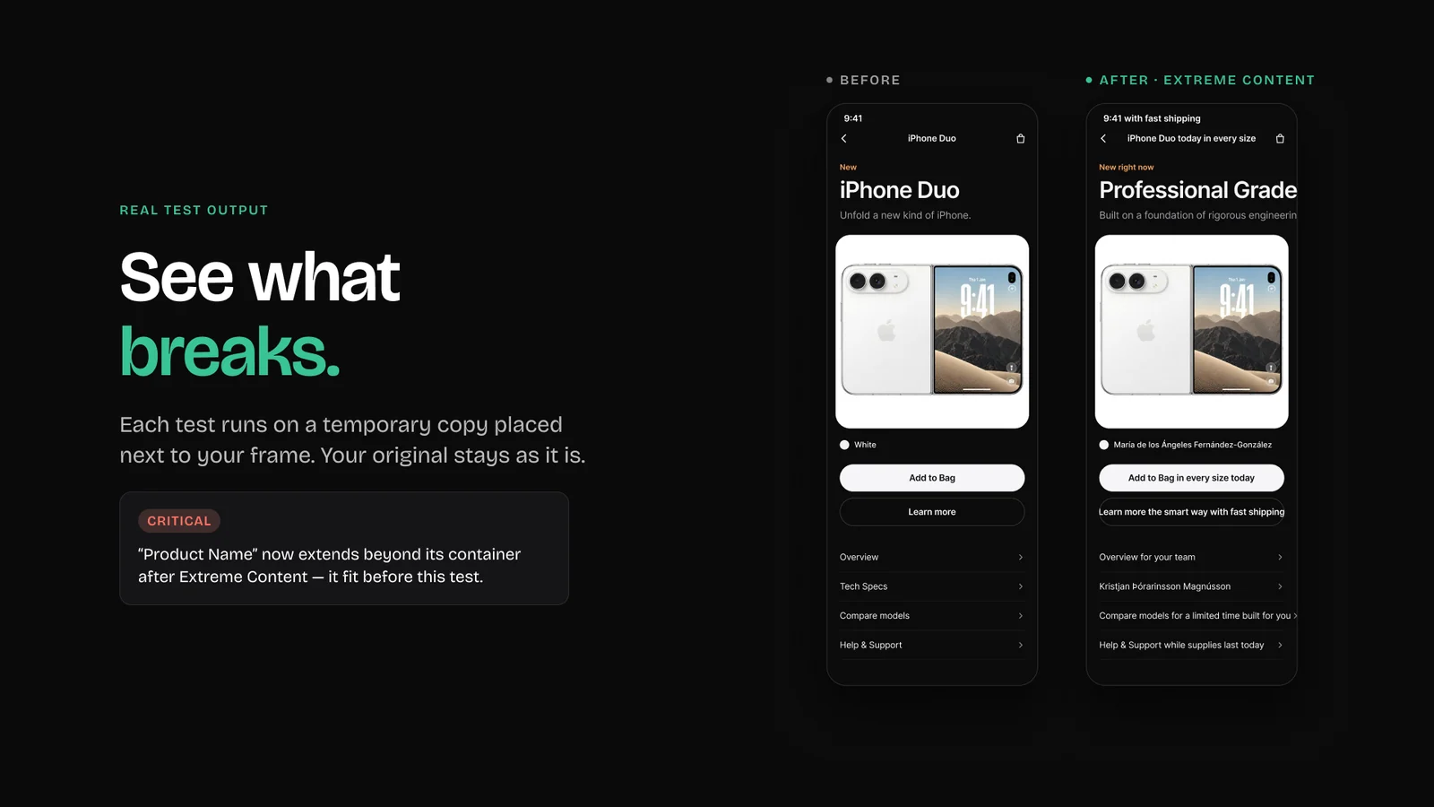
Select, break, fix.
How it works
The two paths through the plugin, step by step, with the real screens.
Run a stress test
Find out how a frame copes with real-world content.
A score out of 100, a list of issues and test copies next to the frame.
Select a frame
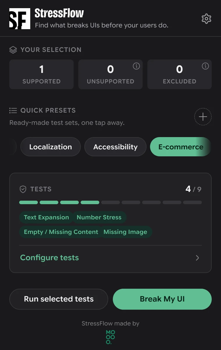
The selection card counts supported, unsupported and excluded layers.
Pick a preset
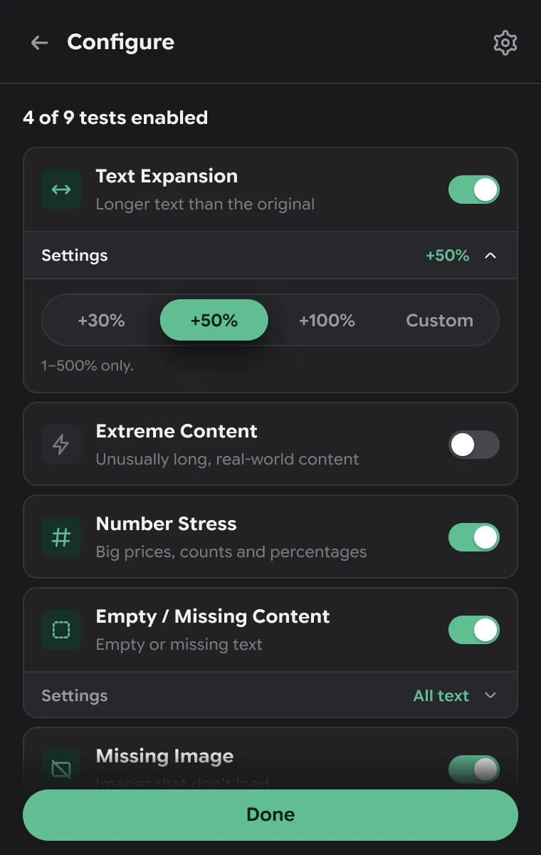
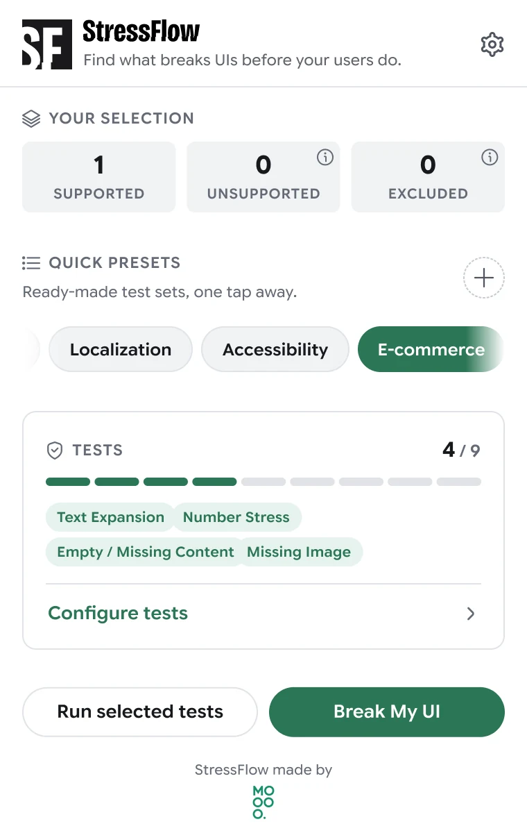
E-commerce turns on four tests; the bar shows 4 of 9.
Tune the tests
Each test has its own settings: here, how much longer text gets.
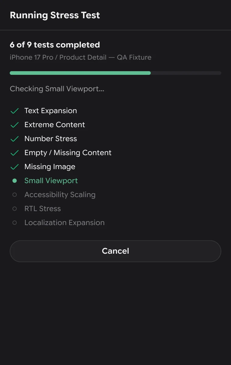
Run
Progress test by test, with Cancel always available.
Read the score
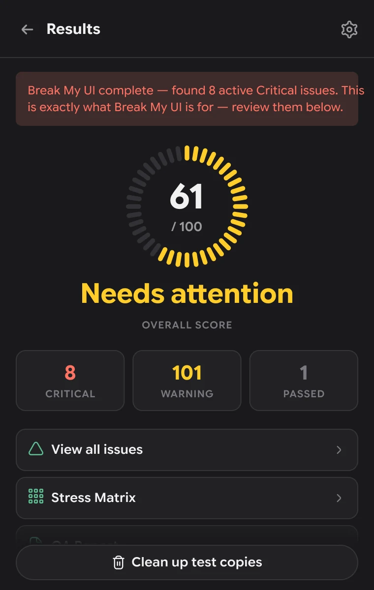
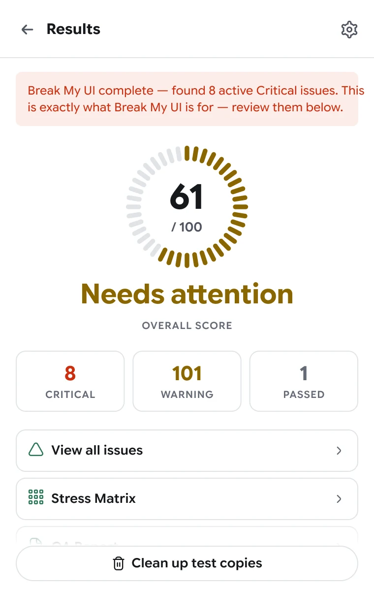
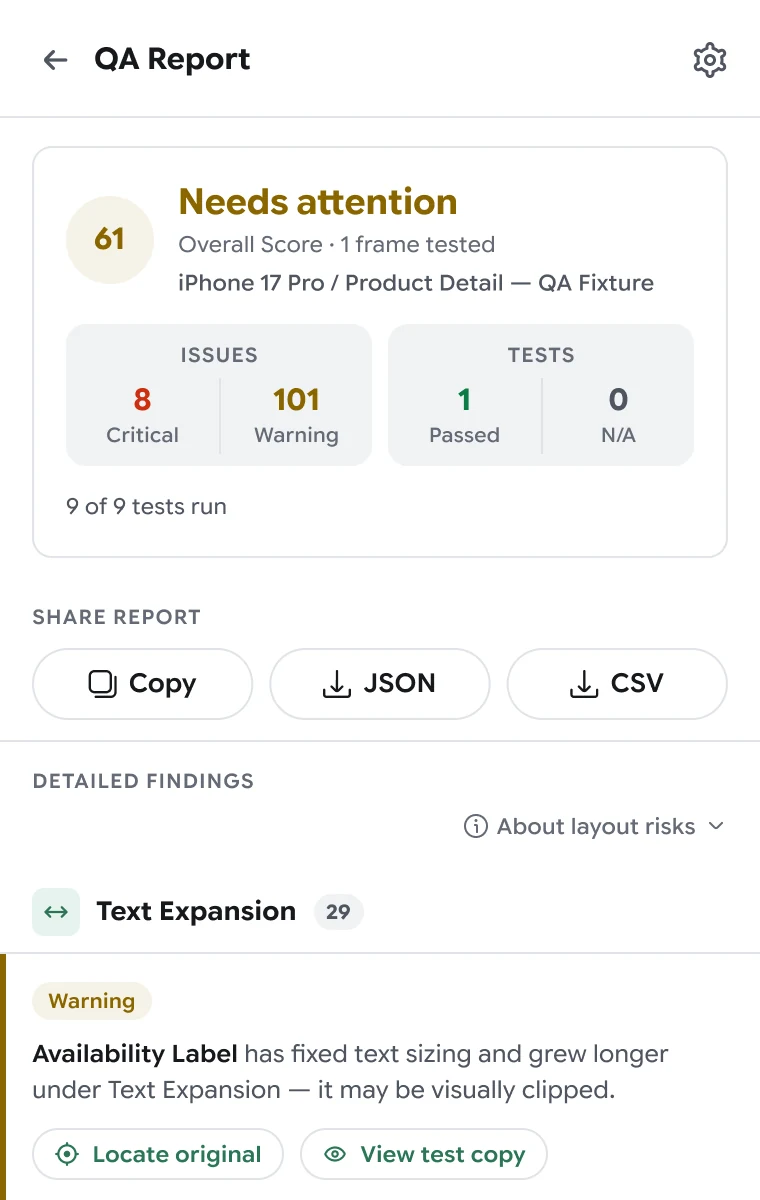
61 / 100: Needs attention, with critical, warning and passed counts.
Review and report
Decide what to fix and share the findings.
Real issues fixed, known ones ignored, and a QA report for the team.
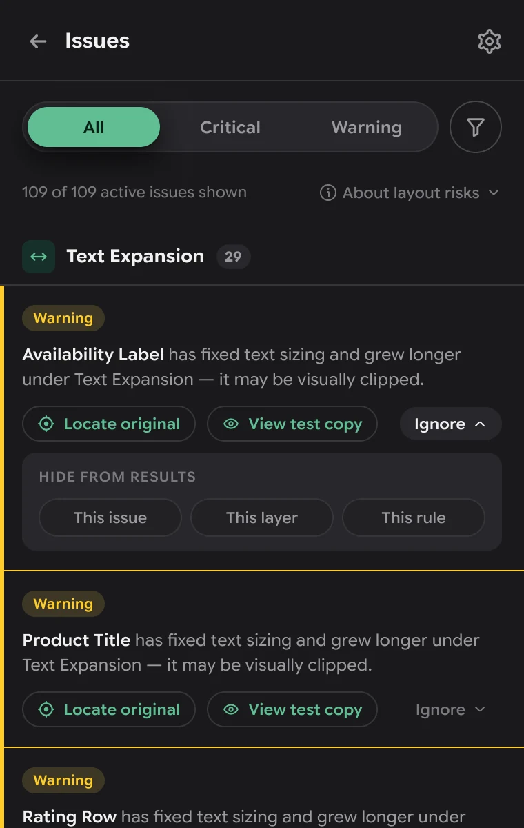
Open the issues
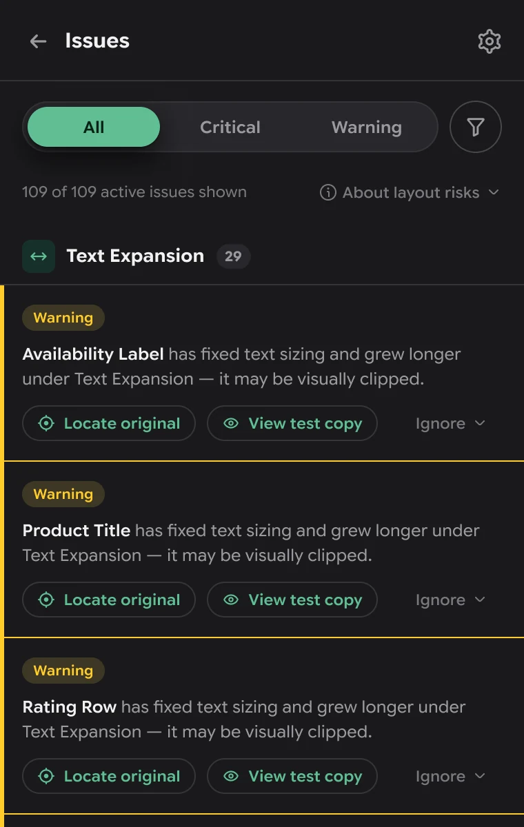
Grouped by test and filterable by Critical or Warning.
Locate or compare
Jump to the original layer, or view the test copy that broke.
Ignore what’s expected
Hide by this issue, this layer or this rule.
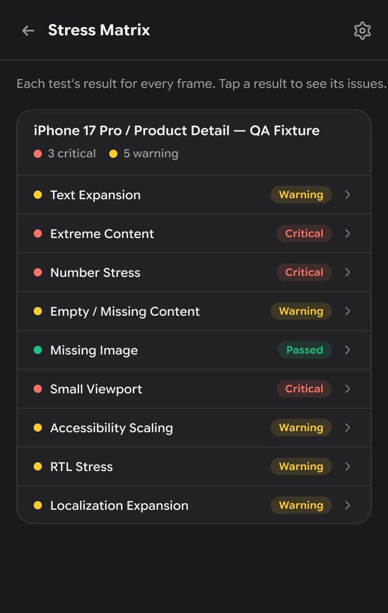
Scan the matrix
Every test’s result for the frame at a glance.
Share the report
Copy it, or export JSON or CSV.
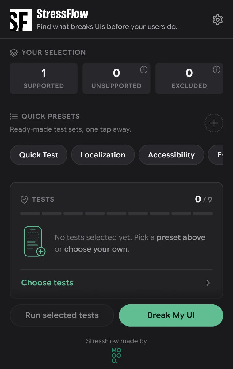
Every state, designed.
Plugin states
From an empty selection to a perfect score: the states a designer actually meets.
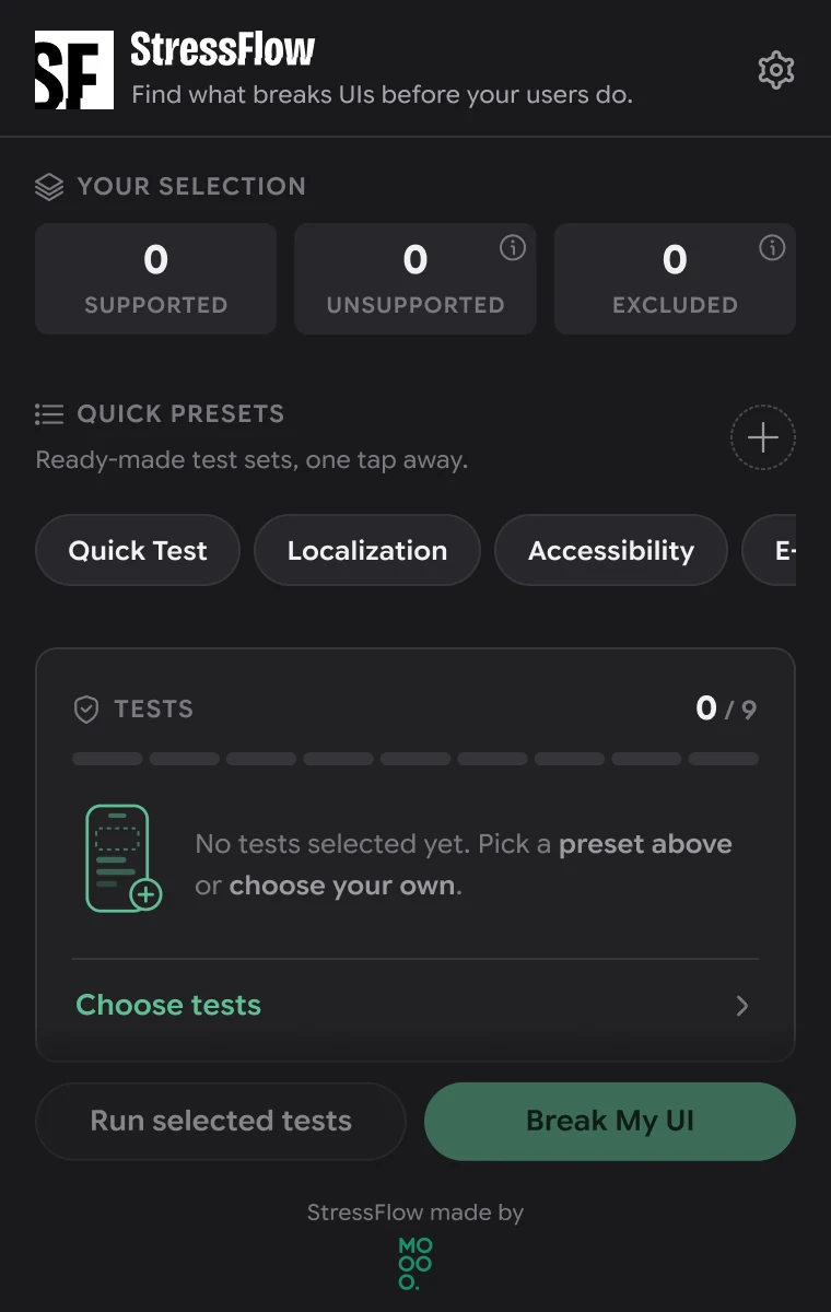
No selection
Before anything is selected, the plugin explains what to do next.
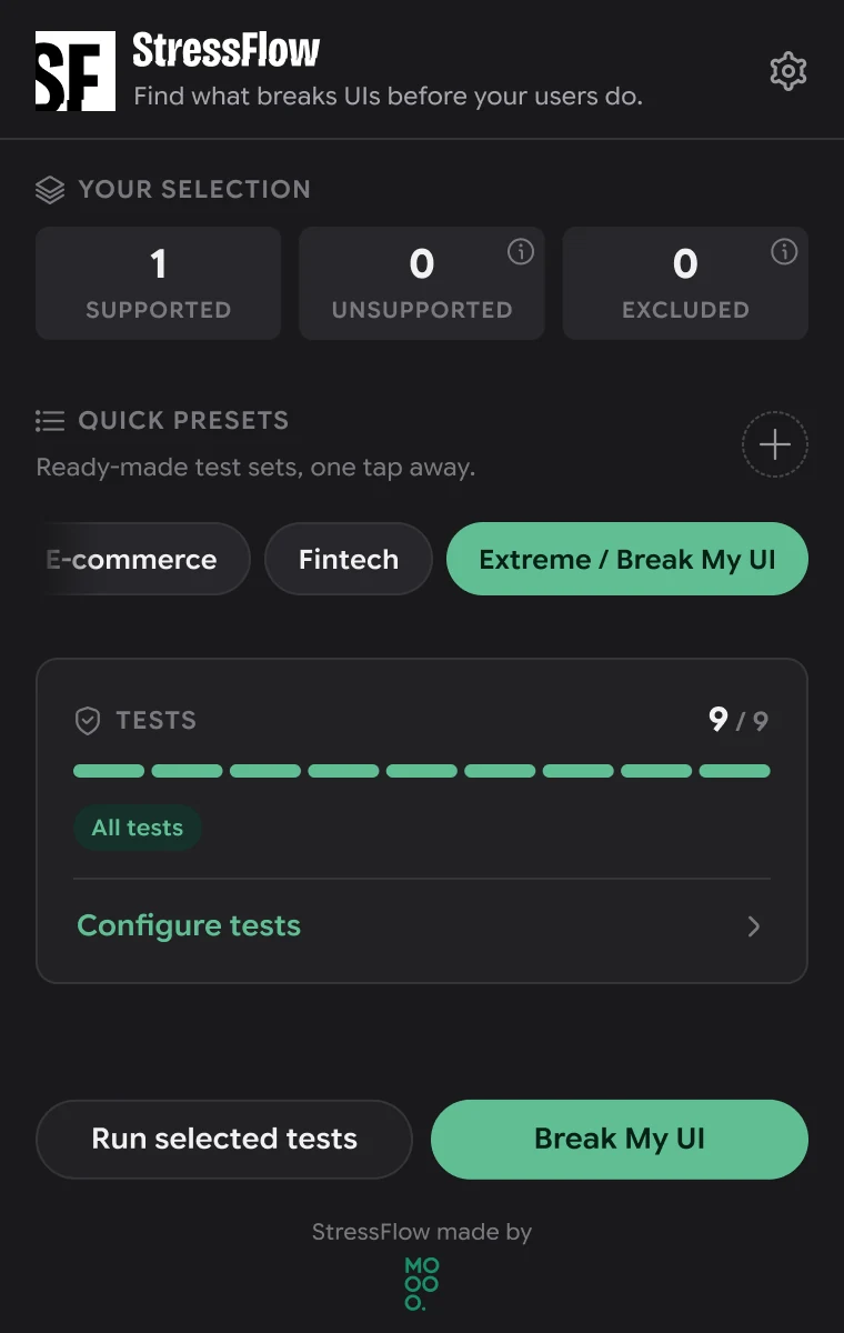
Break My UI
All nine tests selected for the full stress combination.
Running
Live progress, test by test.
Needs attention
Issues found: the score, the counts and the way into the details.
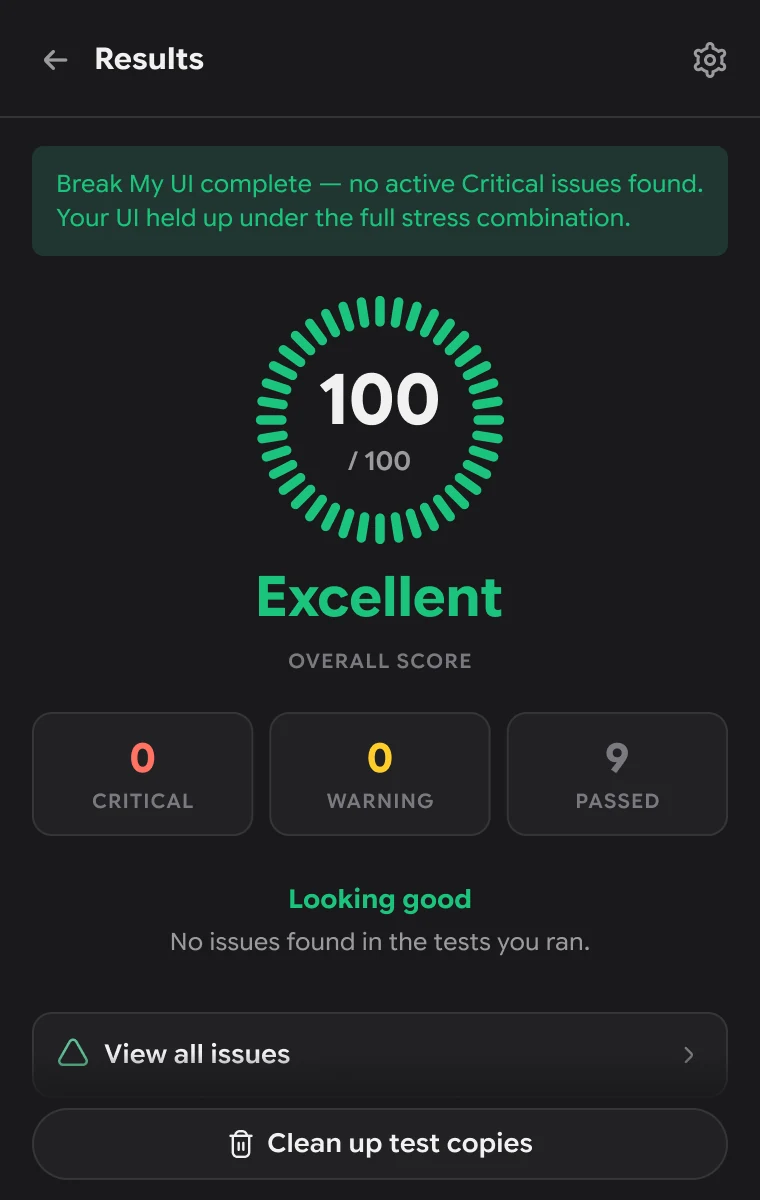
Excellent
No active critical issues: 100 / 100 and “Looking good”.
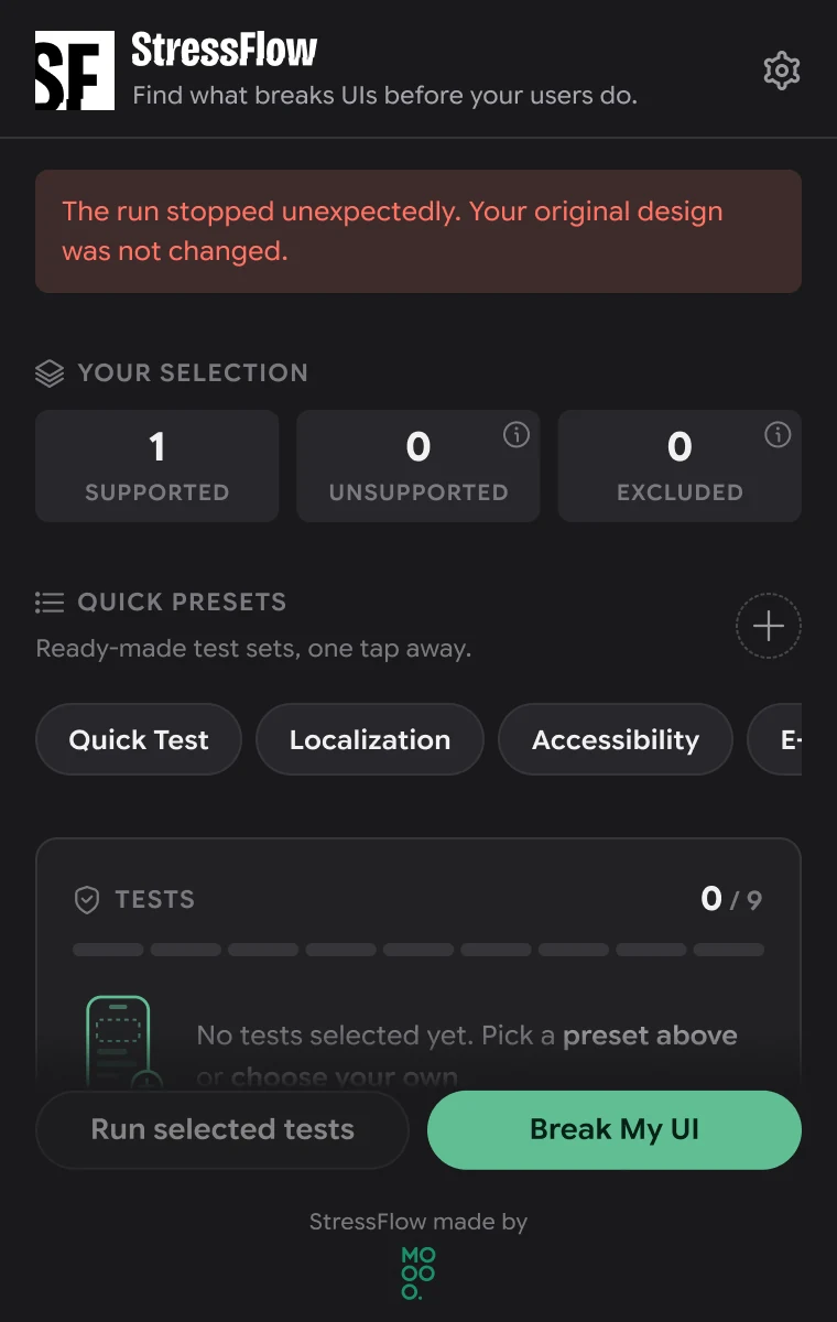
Run stopped
A failed run says the original design was not changed.
Why it works the way it does.
Design decisions
Each part of the plugin answers a specific risk of testing a real design.
Test copies, not the original
Stress tests rewrite text, delete images and resize frames; nobody wants that done to their real design.
Every test runs on a temporary copy placed next to the frame, and a single action cleans all copies up.
Designers can run tests freely and compare broken and original side by side.
One score, explained
A list of a hundred warnings doesn’t tell you whether a frame is ready.
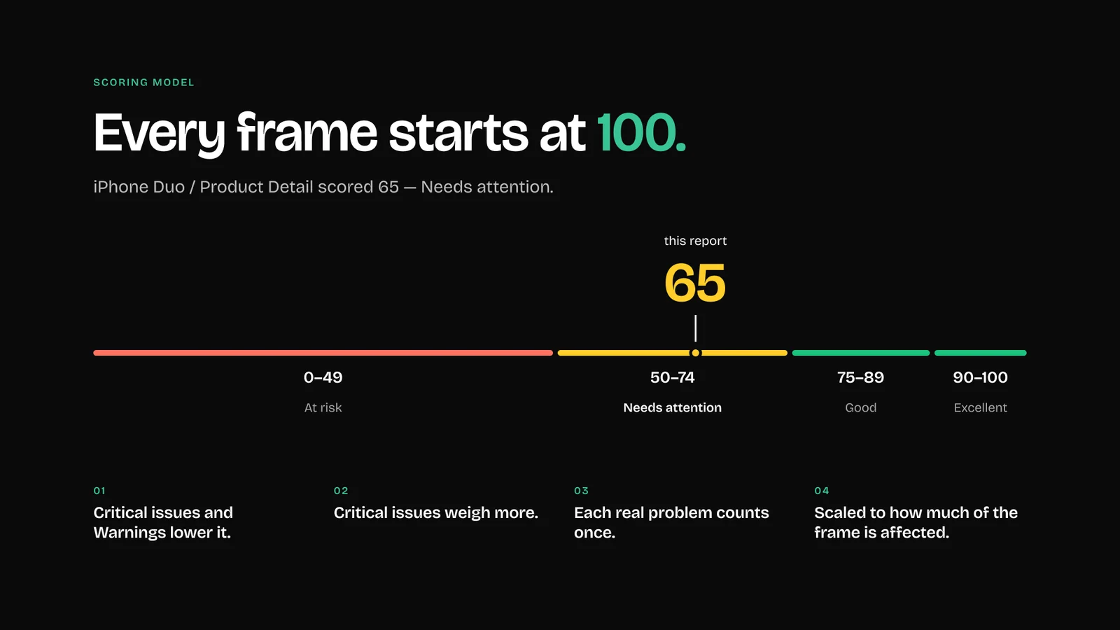
Every frame starts at 100 and loses points (critical issues weigh more, each real problem counts once), mapped to four bands from At risk to Excellent.
One number to act on, with the issues one tap away.
Ignore by issue, layer or rule
Some findings are intentional (a label that is meant to truncate) and would repeat on every run.
Each issue can be hidden for this finding, for the whole layer or for the rule, and restored later in Settings.
The list stays about real problems, run after run.
Private by design
Design files are often confidential; uploading them to a service is a non-starter for many teams.
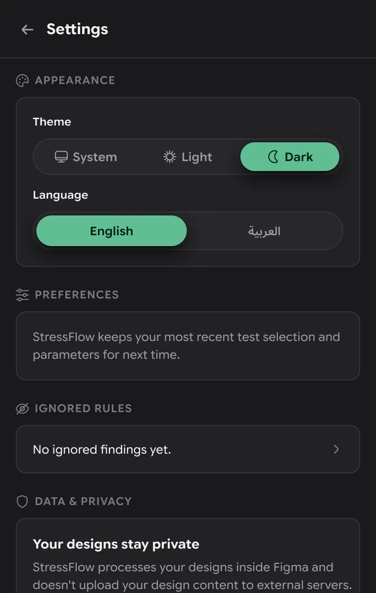
Everything runs inside Figma (no AI, no backend, no network), and Settings says so plainly.
Teams can use it on real work without a security review.
Each risk, answered.
Solution validation
The three reasons layouts break unnoticed, traced through the finished plugin.
Happy-path mockups → nine tests
Text expansion, extreme content, number stress, empty content, missing images, small viewports, accessibility scaling, RTL and localization expansion all run on one frame at once.
Found too late → caught in Figma
Issues appear while the frame is still a design, each linked to its layer and to the test copy that shows it.
Tedious by hand → one click
Break My UI replaces duplicating, pasting and swapping by hand: a score and an issue list in 5 steps, on copies that one button removes.
As quick or as precise as you need.
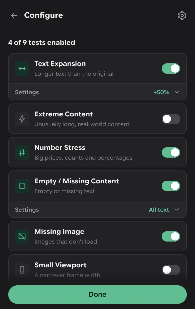
Configure
Presets for the usual questions, and every test switchable and tunable for the rest.
Configure
Each test on or off, with its own settings.
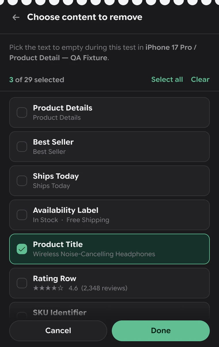
Choose content
Pick exactly which text to empty.
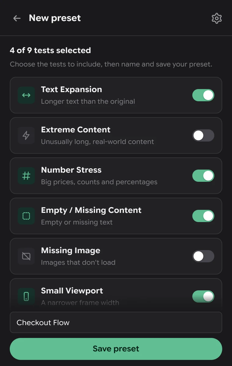
New preset
Save a combination for next time.
Built for the cases it tests.
Two languages, two themes
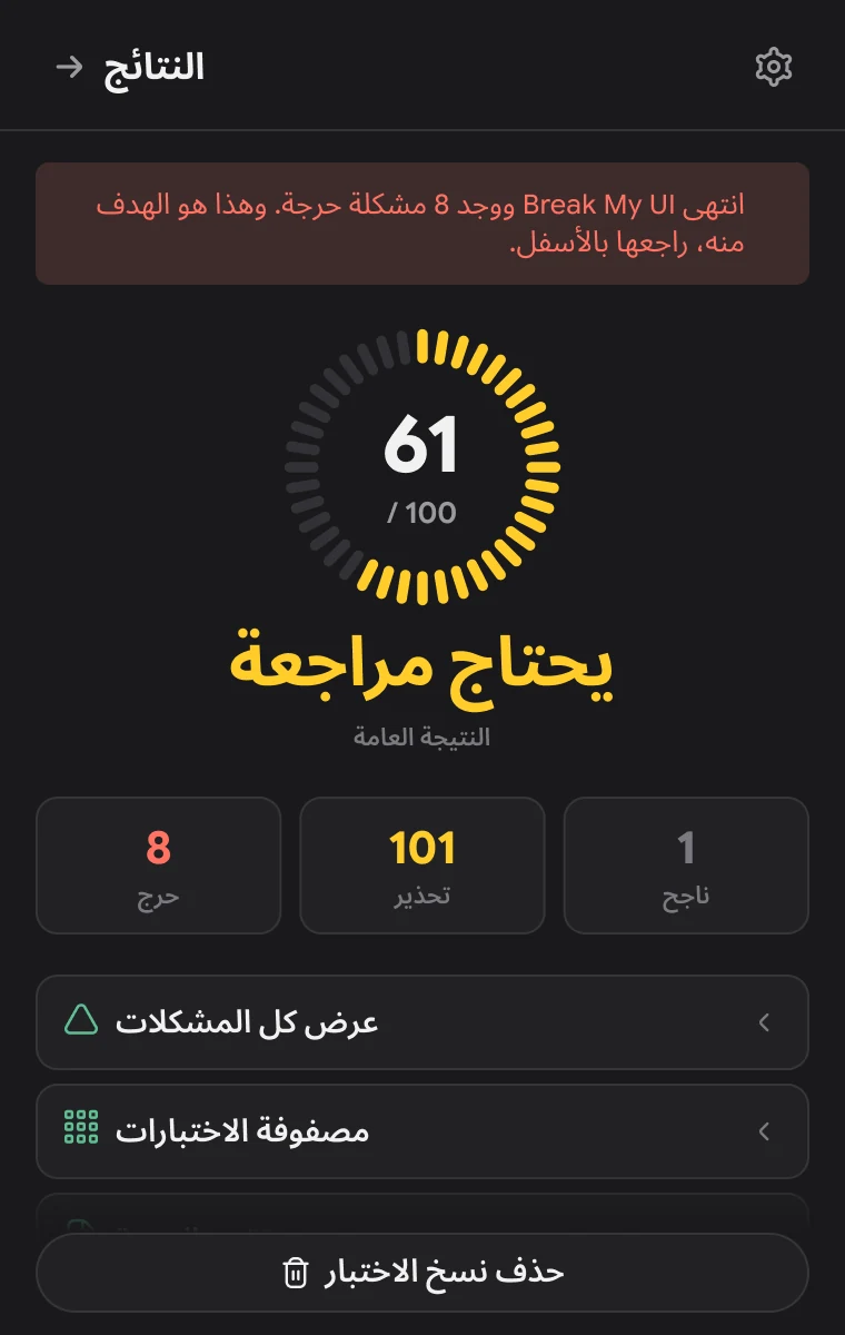
The plugin follows Figma’s theme or your choice, and runs in English or Arabic, right to left, with its own layout.
Light
Results in the light theme.
Arabic · Light
Home, right to left.
Arabic · Dark
Results, right to left.

One price, no subscription.
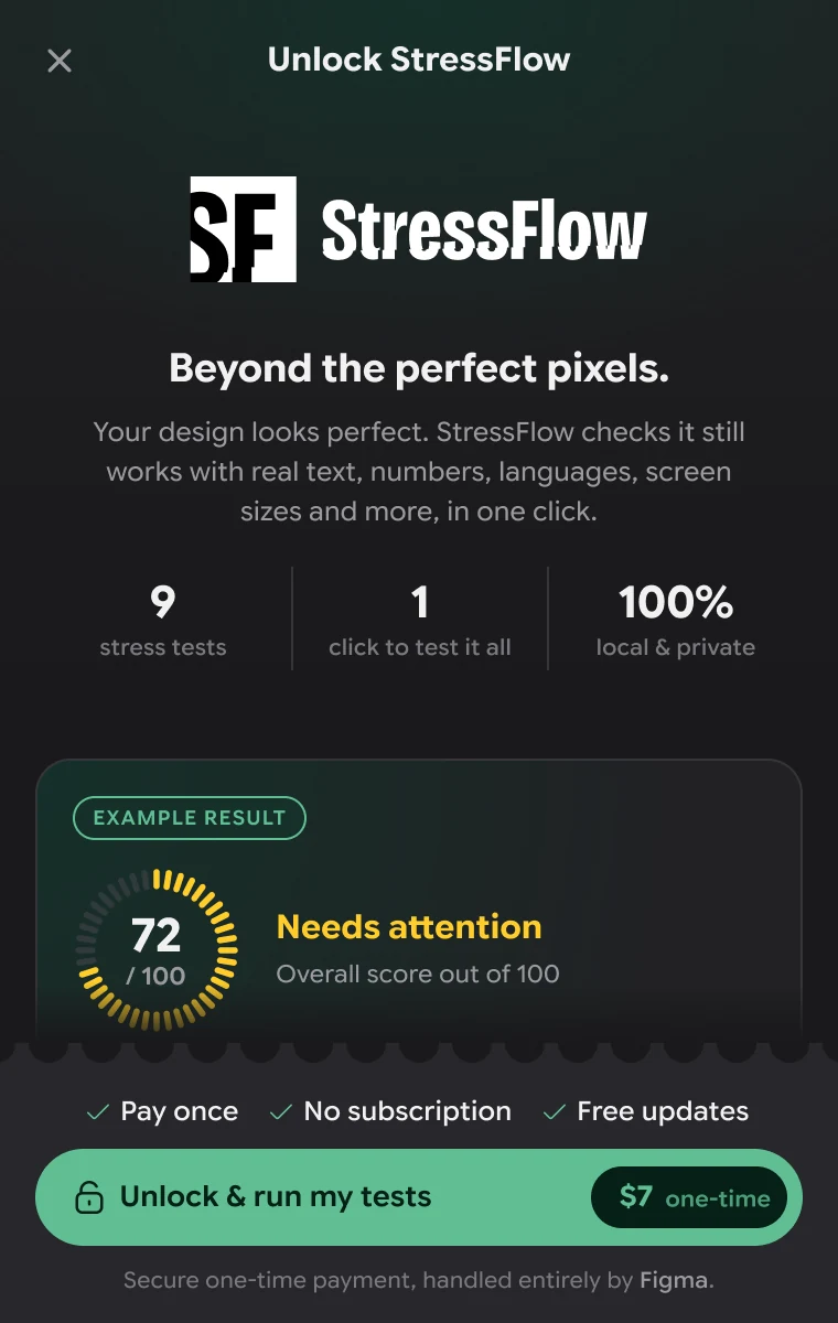
Unlock
A one-time unlock, handled entirely by Figma’s checkout.
Unlock
What you get, with an example result.
Unlocked
Straight back to the test that was waiting.
Settings
Theme, language, ignored rules and privacy.

The plugin, screen by screen.
Every screen
25 screens, grouped by task. Select one to see it larger.
Home & presets
Run & results
Issues & report
Unlock & settings
Light & Arabic

How it’s explained.
Community gallery
The Community gallery slides that introduce the plugin.
Introduction
Every frame starts at 100
Your design stays in Figma
Quiet panel, loud verdict.
Design system
Near-black surfaces and grey text keep the panel calm next to the canvas; green, yellow and red are kept for actions and results.
A condensed, cut wordmark and an SF monogram whose letters run off the edge: the layout breaking, on purpose.
Dark and light, with green, yellow and red kept for actions and results.
Panel
Plugin background in the dark theme.
Surface
Cards, tiles and rows.
Text
Primary text; #16181C in the light theme.
Muted
Secondary text and icons; #646A75 in light.
Action
Break My UI, toggles, selected chips; #2B7655 in light.
Brand Green
The MOOOO. mark and icon badges.
Warning
Warnings and the Needs attention band; #8A6600 in light.
Critical
Critical issues and errors; #CC3011 in light.
One family, Google Sans Flex, from a 35 pt score down to 10 pt labels, sized for a 380 px panel.
Google Sans Flex
Interface
Verdict
Item title + caption
Label
The building blocks of the panel.
Score ring
Segmented ring, coloured by band.
Issue card
Severity, what happened, Locate / View copy / Ignore.
Counts
Critical, Warning, Passed.
Test row
Icon badge, title, toggle and inline settings.
Tests card
Progress bar of 9 and the chosen tests as chips.
Filter
Segmented control with a filter sheet.
Actions
Secondary and primary pill buttons.




The design, counted.
Scope
Stress tests
Plugin screens designed
Languages
Themes
Real content, tested before it ships.
Results & impact
What the finished plugin gives the designers who use it.
One click instead of a routine
Nine tests and six presets run in one pass, on temporary copies placed next to the frame.
A verdict, not a wall of warnings
A score out of 100 in four bands, with every lost point traced to a layer and a test.
Safe on real files
The original frame never changes, and nothing leaves Figma: no AI, no backend, no network.
Findings a team can act on
Ignore by issue, layer or rule, then copy or export a QA report.
How success shows up
Frames that score higher on each run, and layout issues fixed in design rather than in development.
A designer’s tool, for designers.
Closing reflection
StressFlow turns the checks designers know they should do (long text, empty states, Arabic) into one click, and keeps the answer inside the file where the fix happens.
- Working on copies, never the original, is what makes a destructive test feel safe to run.
- A single score is only useful when every point it loses can be traced to a specific layer.
- A 380 px panel forces every screen to say one thing: the verdict first, the details one tap away.
- 91 plugin screens in English and Arabic, dark and light, at 380 × 600.
- Nine stress tests, six presets and a custom mode, scored out of 100.
- An unlock flow and the gallery slides that explain the plugin on the Figma Community.
- The working plugin, designed and built by MOOOO.