STAX App
Mobile App · Product Design · 2025
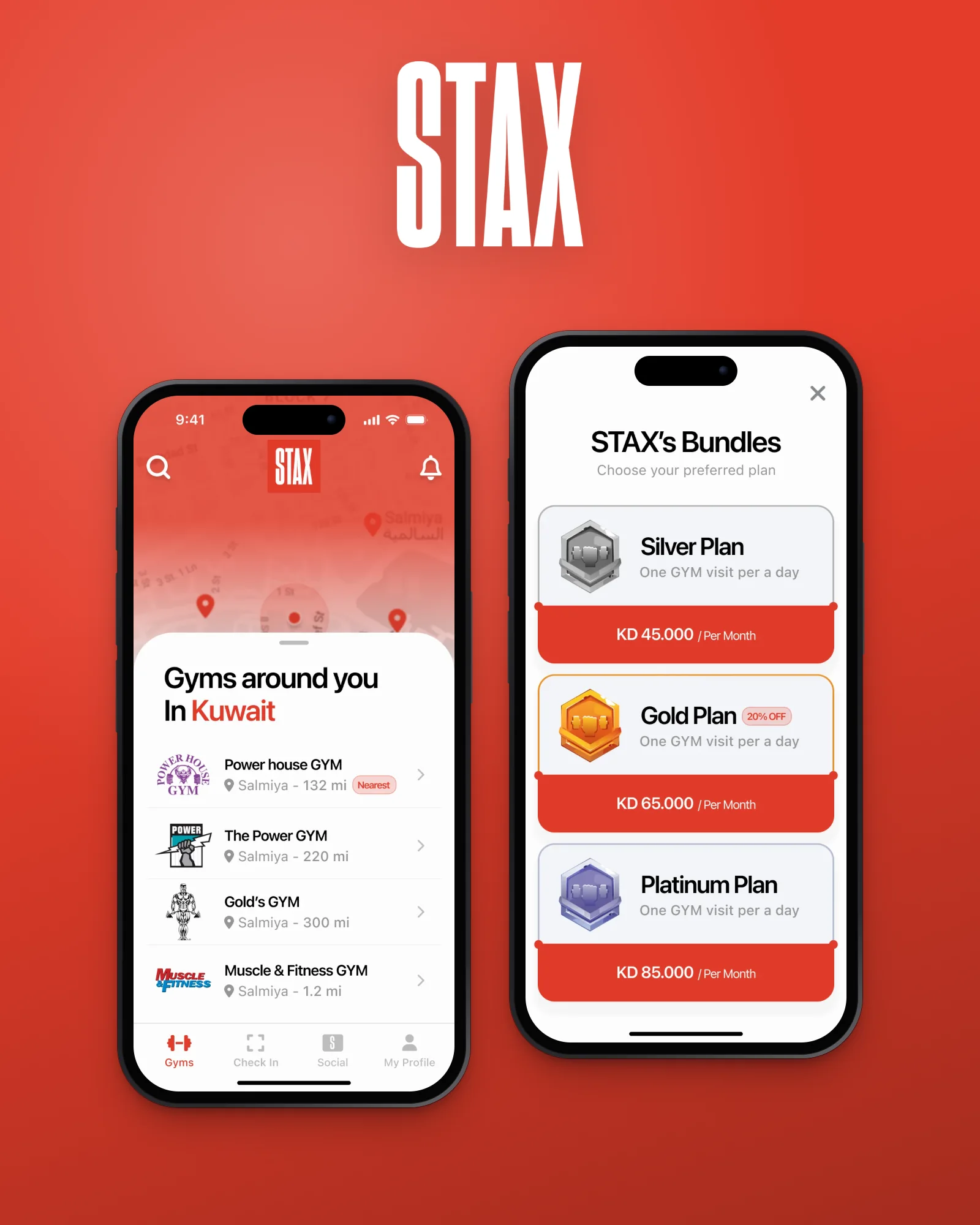
STAX is a gym membership app for Kuwait: one plan for the gyms around you, a map to find them, a QR scan to get in, with a social feed, an AI coach, referrals, a wallet and gifting, in English and Arabic.
One plan, every gym around you. Find a gym on the map, scan in at the door, and keep moving with friends and an AI coach.

Overview
STAX turns a city’s gyms into one membership: choose a plan, find a gym nearby, scan the QR code at the door and train.
It is a subscription app for gyms in Kuwait, designed end to end for iOS and Android, from the first onboarding card to the App Store screenshots.
The file grew epic by epic and kept growing after launch planning: a social layer, an AI coach, referrals, a wallet and gifting. This case study follows that path and the decisions behind it.
Client
STAX
Role
Product Designer
Platform
iOS & Android
Scope
End-to-end UX & UI
Deliverables
204 screens · 12 store screenshots
Tools
Figma
In this case study
Membership, not a single gym.
The idea
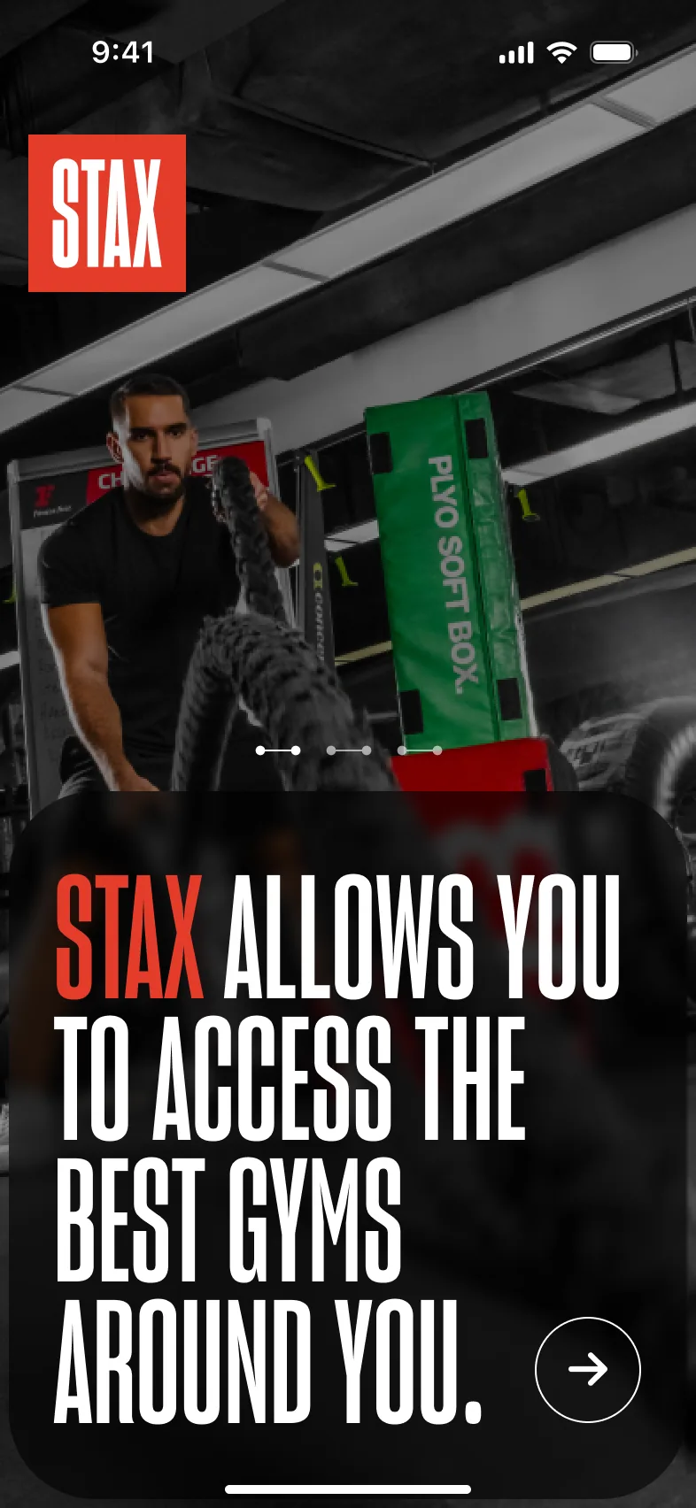
The onboarding cards state the promise in three lines. Each became a part of the product.
01 · Access
“STAX allows you to access the best gyms around you.” → A map of partner gyms, search and filters by area, gender and plan.
02 · One plan
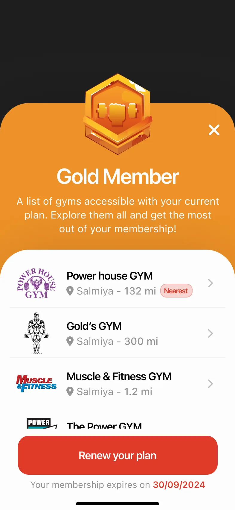
“A solution for all your fitness needs.” → Three tiers (Silver, Gold, Platinum), each listing exactly which gyms it covers.
03 · Convenience
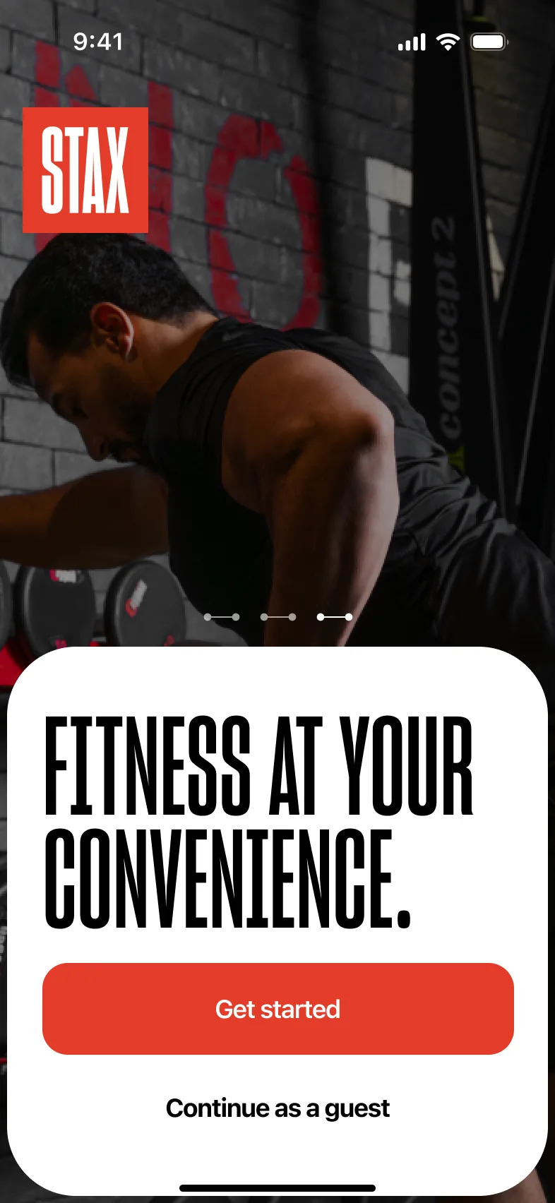
“Fitness at your convenience.” → No cards or front-desk sign-ups: scan the gym’s QR code and you’re in.
Access all the gyms around you. One plan, no limits.
What the product had to get right.
Goals & challenges
STAX is for people in Kuwait who want to train at more than one gym without a membership for each. Success means a newcomer goes from the first card to the gym floor in one sitting, and every “no” at the door explains itself.
Value before sign-up
A guest can browse gyms and bundles before creating an account; “Continue as a guest” sits beside Get started.
Plans people can compare
Three tiers with the same structure: price, visits per day and the list of gyms included, so the difference is the gyms, not the wording.
A door that just opens
Check-in must work at the gym entrance in seconds, and explain clearly when it can’t: a daily limit or a gym outside the plan.
Two languages, one layout
Every screen is designed in English and Arabic, with the layout mirrored right to left rather than translated in place.
From curious to checked in.
The journey
The core path through STAX: a newcomer who wants to train nearby, from the first card to the gym floor. Each stage happens on the screen beside it.
Discover
Understand what STAX is before committing.
An account wall before seeing any gyms.
Three onboarding cards make the promise, then Get started or Continue as a guest, so the map and bundles can be explored first.
Sign up
Create an account quickly, in a familiar way.
Passwords and codes that don’t arrive.
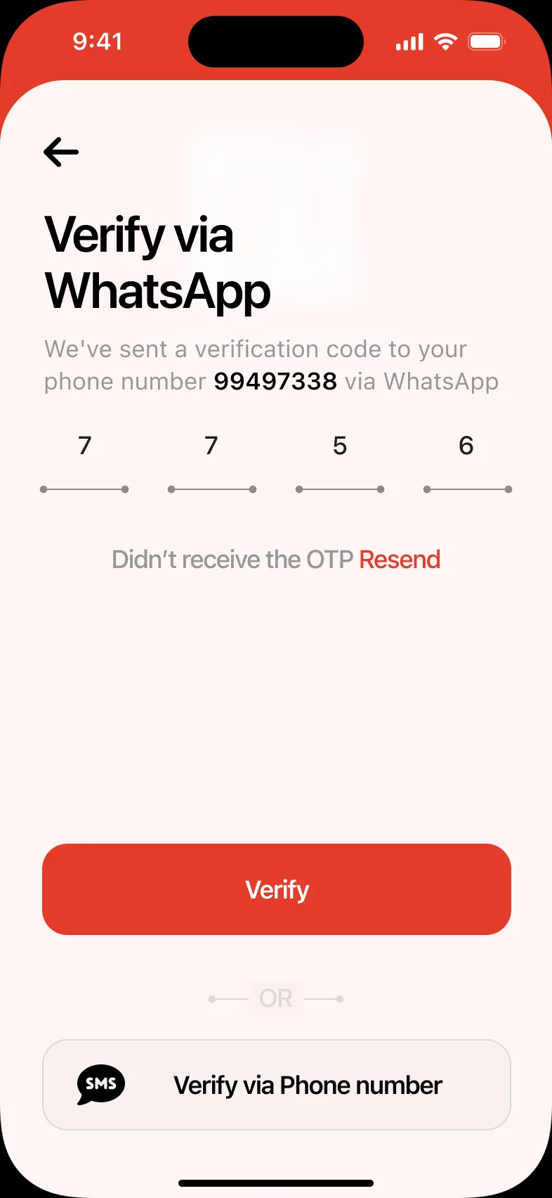
Apple and Google shortcuts, a Kuwaiti phone number with the +965 prefix, and a verification code by SMS or WhatsApp.
Find a gym
See which gyms are close and what they offer.
Location turned off, or nothing nearby.
A map with a pull-up list of gyms and distances; clear recovery states for location off, no gyms nearby and no internet.
Choose a plan
Pick a plan that covers the gyms they want.
Tiers that look alike until after payment.
Each tier opens on its own colour with the gyms it includes; checkout supports KNET and cards, discount codes and clear failure states.
Check in
Get through the gym door without friction.
Queues, cards and unclear rejections.
The Check In tab is the scanner. A successful scan shows the gym and time; limits and plan mismatches each get their own screen with a way forward.
Keep going
Stay motivated after the first visit.
Training alone, without feedback.
Half an hour after a scan, home asks how the session went; friends see check-ins on STAX Social, and the AI coach offers guidance.
Four tabs, one door.
Information architecture
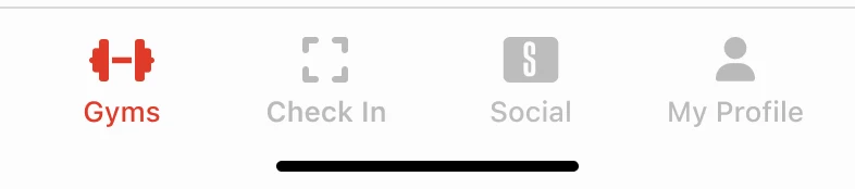
The tab bar puts checking in next to finding gyms. Everything else hangs off friends and your own account, and when STAX AI arrived, it got its own button at the end of the bar.
Gyms
Home
Check In
QR scanner
Social
STAX Social
My Profile
A map that never leaves you stuck.
Home
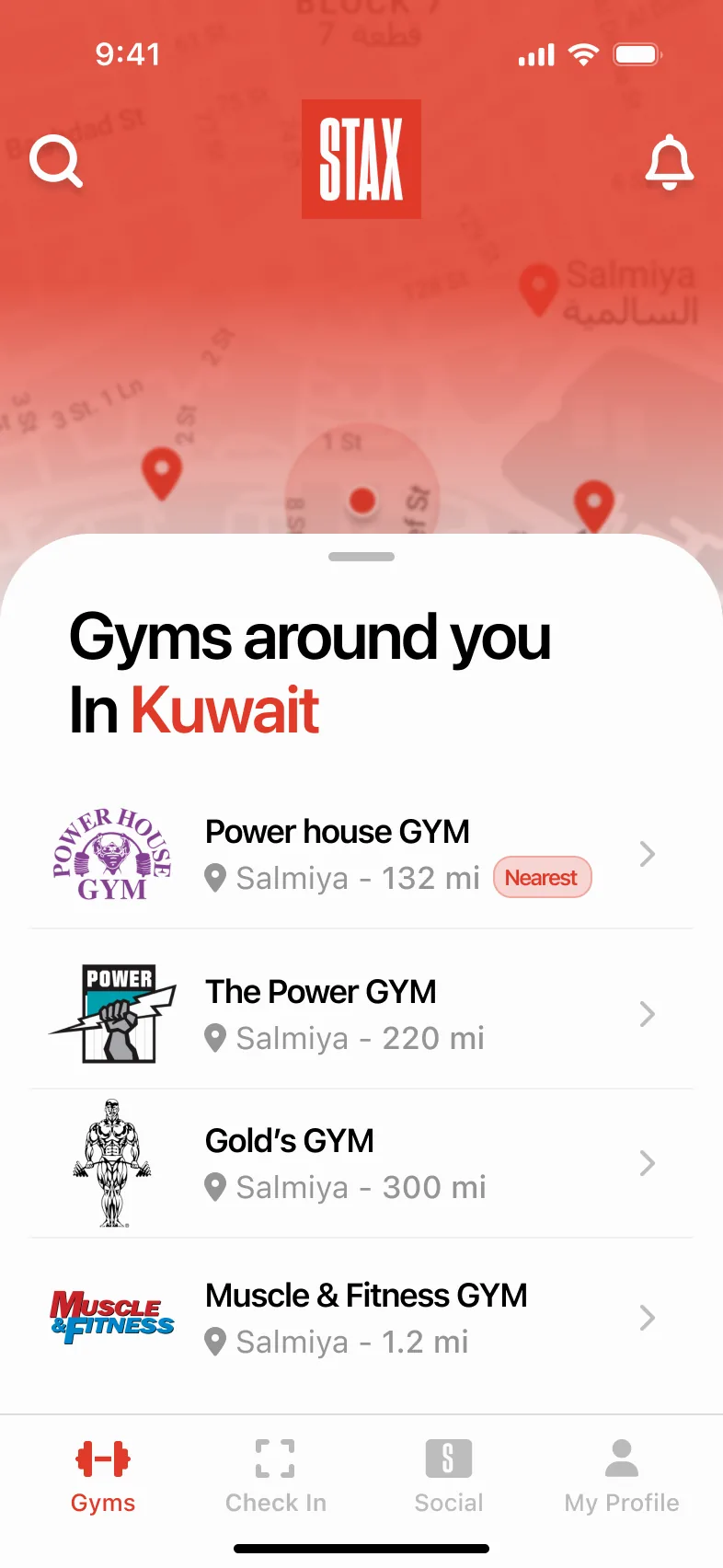
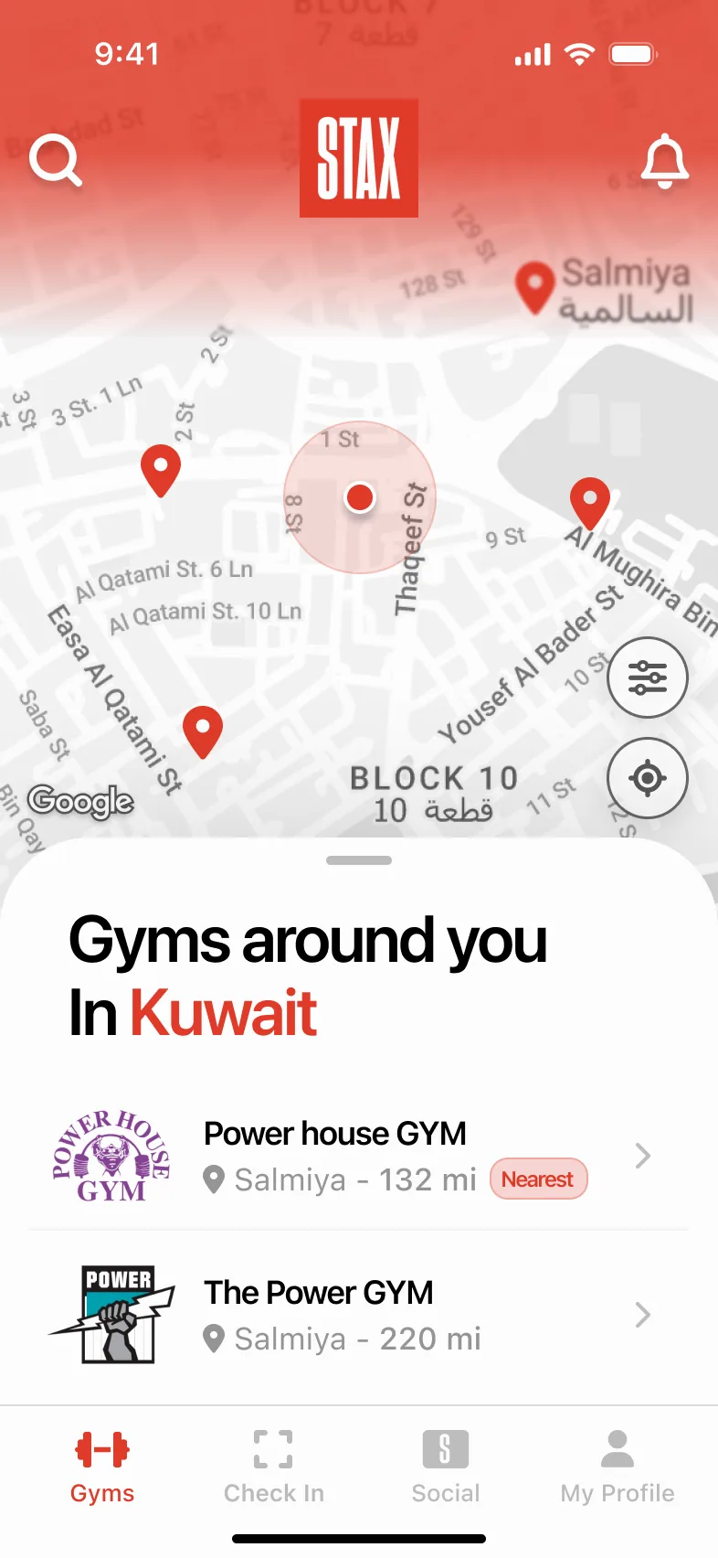
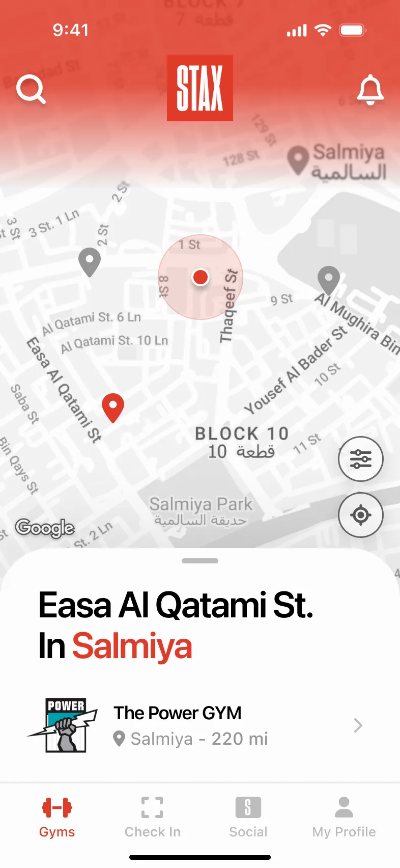
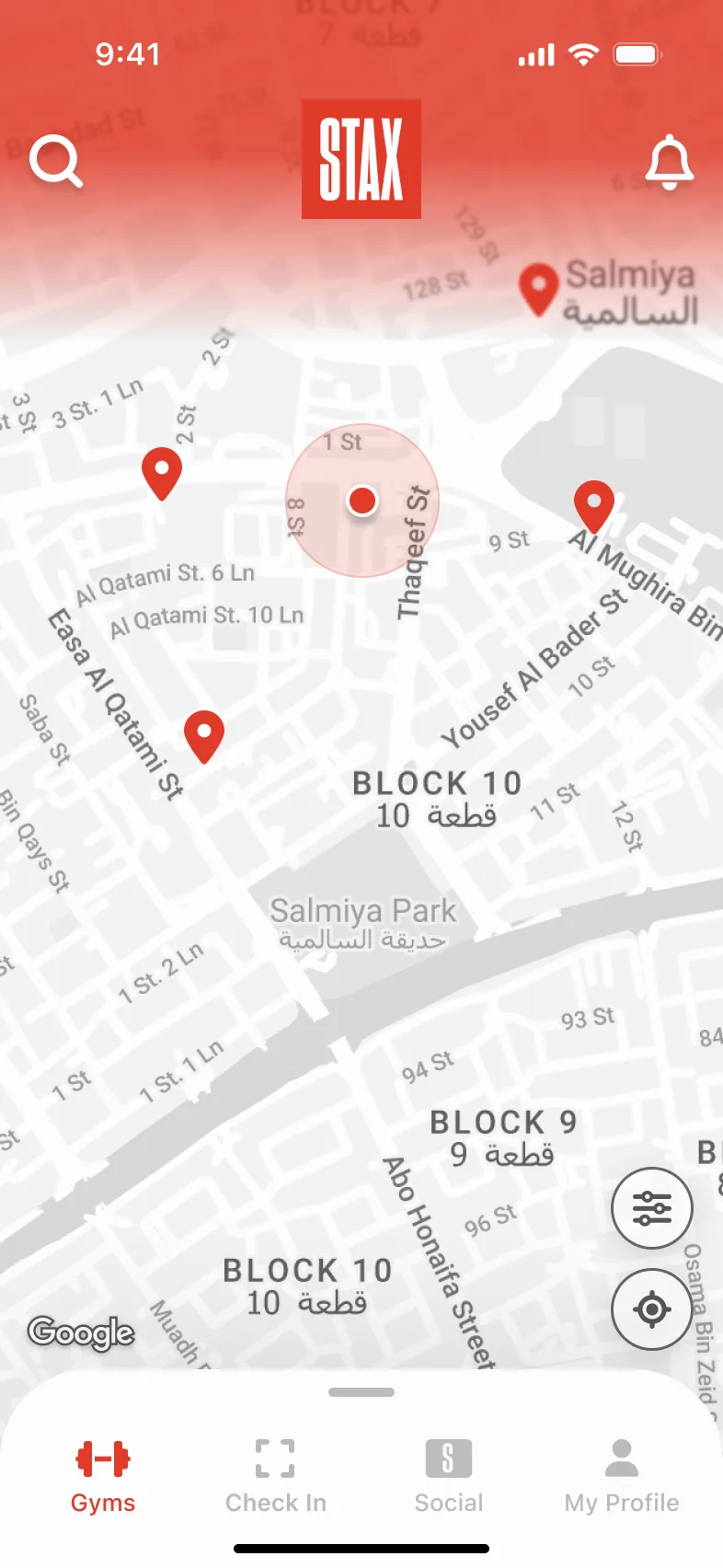
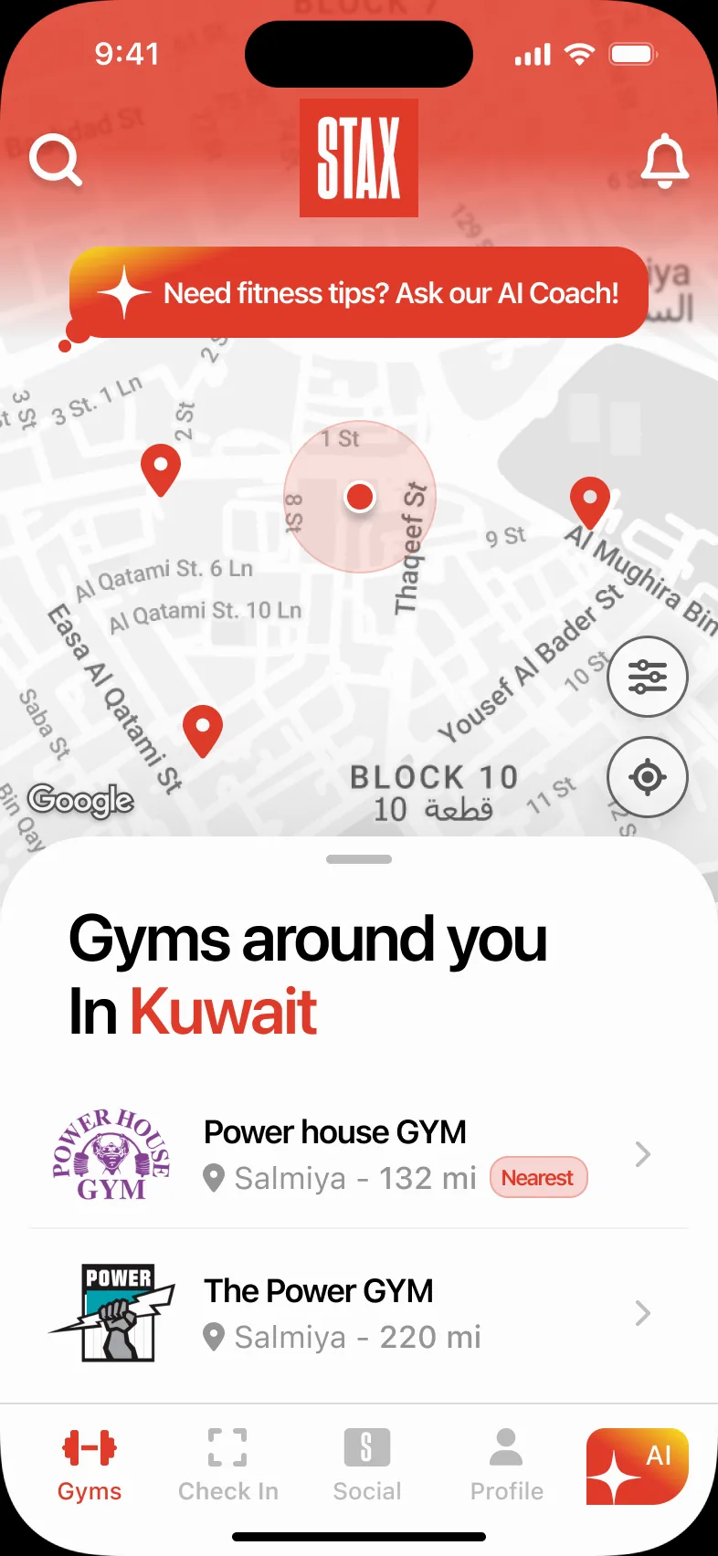
Home is a map with a list that pulls up over it. The file designs every way it can go wrong, so none of them is a dead end.
Gyms around you
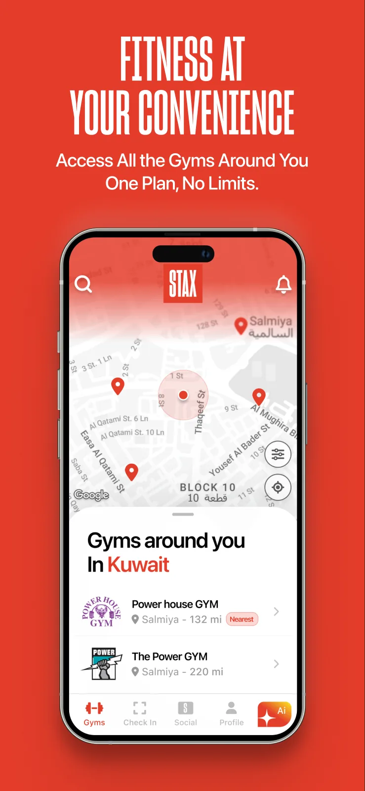
Nearby gyms with distance and a “Nearest” tag, over the map.
Chosen area
Pick any area to see the gyms there, not only where you stand.
Location off
Explains why location helps, with a manual way to pick an area.
No gyms nearby
Says so plainly and offers to pick another location.
Offline
A friendly no-internet state instead of a blank map.
Find the right gym.
Search & gyms
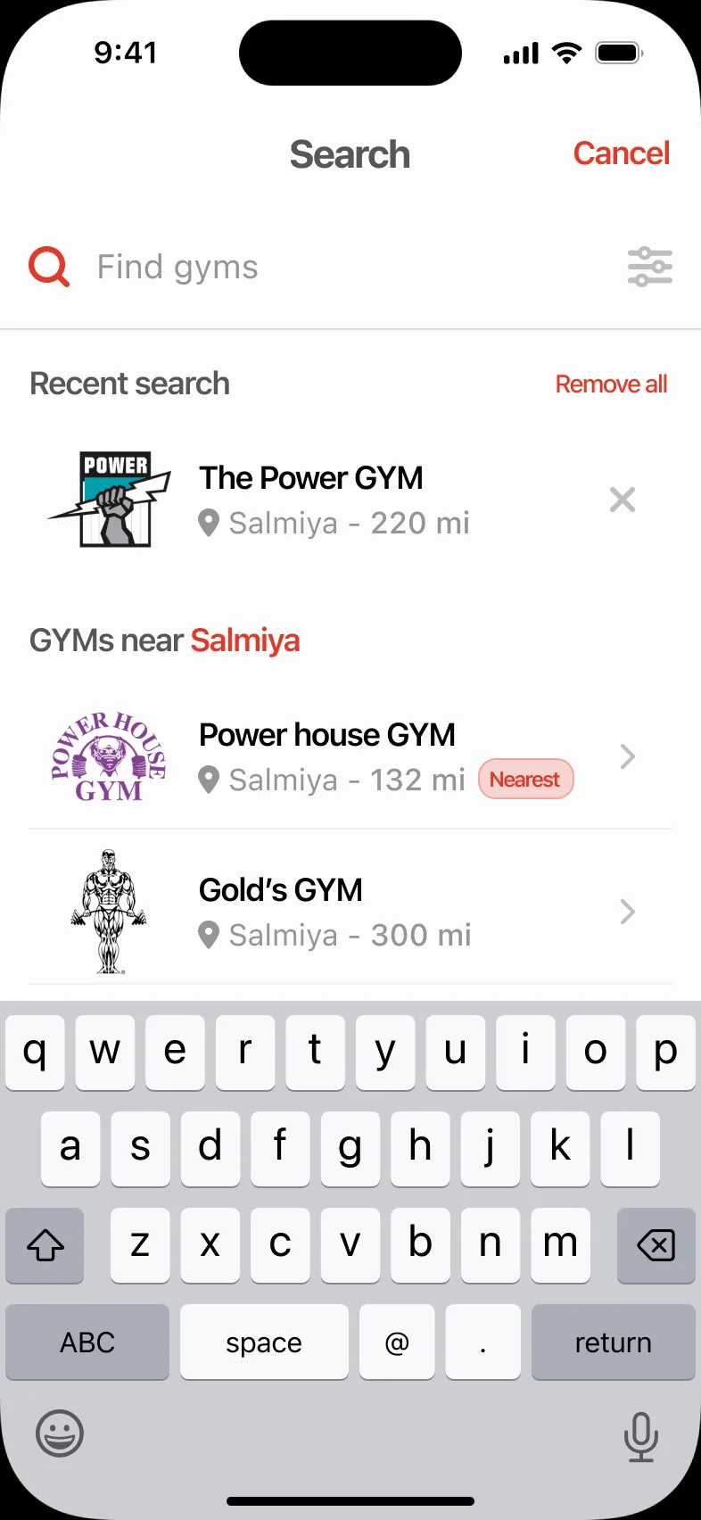
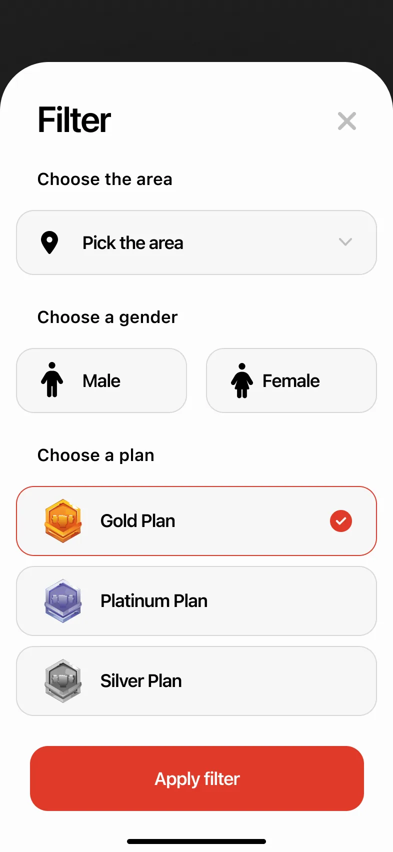
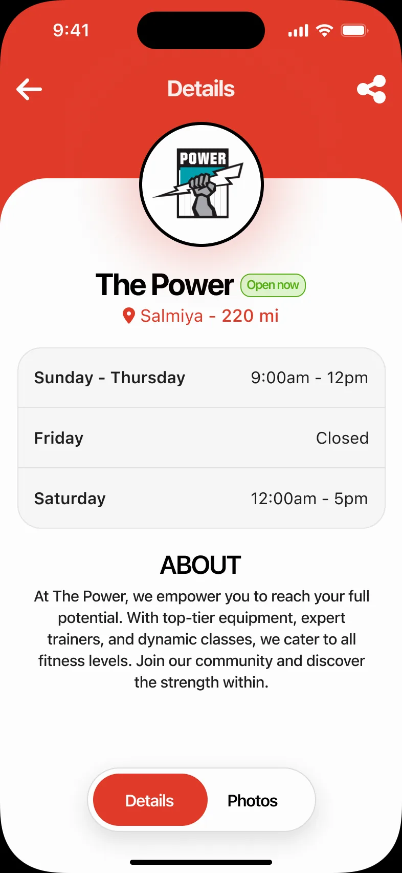
Search remembers what you looked for; filters narrow gyms by area, gender and plan. Each gym has its hours, a description and photos.
- Recent searches and “gyms near Salmiya”
- Filter by area, gender and plan
- Empty states for no results and no photos
Search
Filter
Gym details
Three plans, one structure.
Bundles
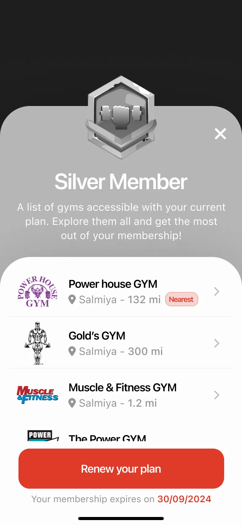
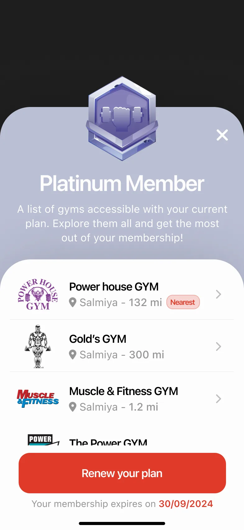
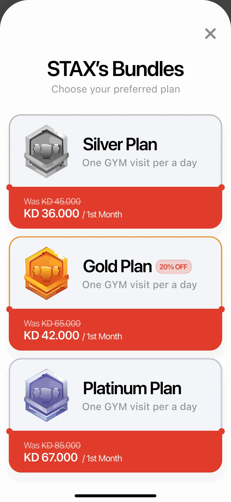
Every tier is built the same way (price, visits per day and the gyms included) and carries its own colour and badge through the app.
Silver
KD 45 a month (sample pricing); one gym visit a day.
Gold
KD 65 a month, shown with a 20% off tag; one gym visit a day.
Platinum
KD 85 a month with the widest list of gyms; one gym visit a day.
Scan, and the door opens.
Check in
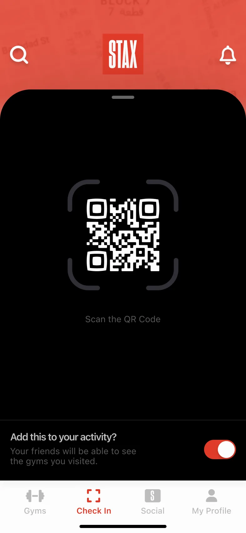
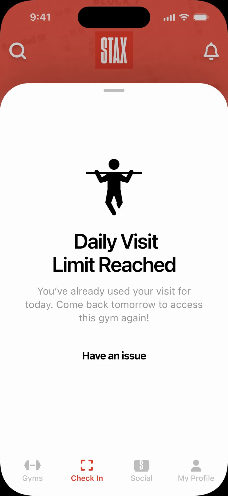
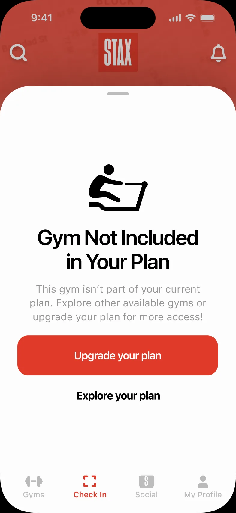
The Check In tab opens straight into the scanner. Every outcome has its own screen, including the ones that say no.
Scan
Point at the gym’s QR code; choose whether friends see the visit.
You’re in
The gym, date and time, confirmed on a full-screen card.
Limit reached
One visit a day, explained, with a way to report an issue.
Not in your plan
Names the problem and offers an upgrade.
Share the burn.
STAX Social
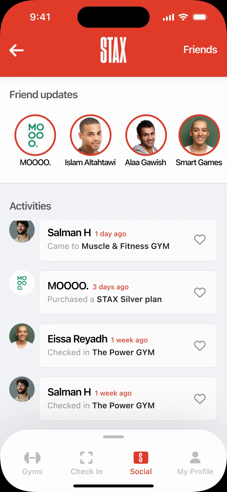
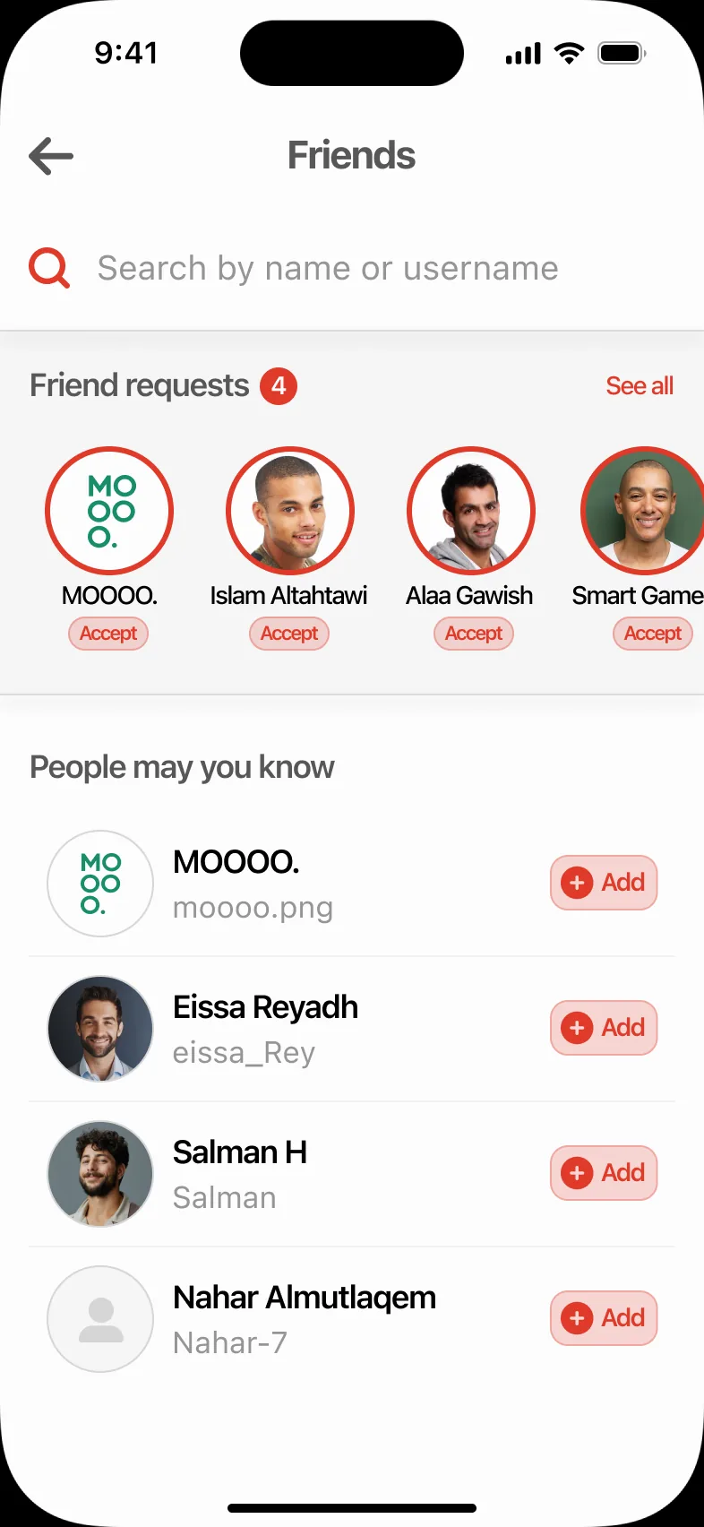
A light social layer, entered from the profile: friends see each other’s check-ins and plan purchases, and can cheer them on.
Feed
Friend updates on top, activities below.
Friends
Requests and people you may know.
Requests
Accept or reject in a sheet.
Empty feed
Points straight to finding friends.

A coach in the chat.
STAX AI
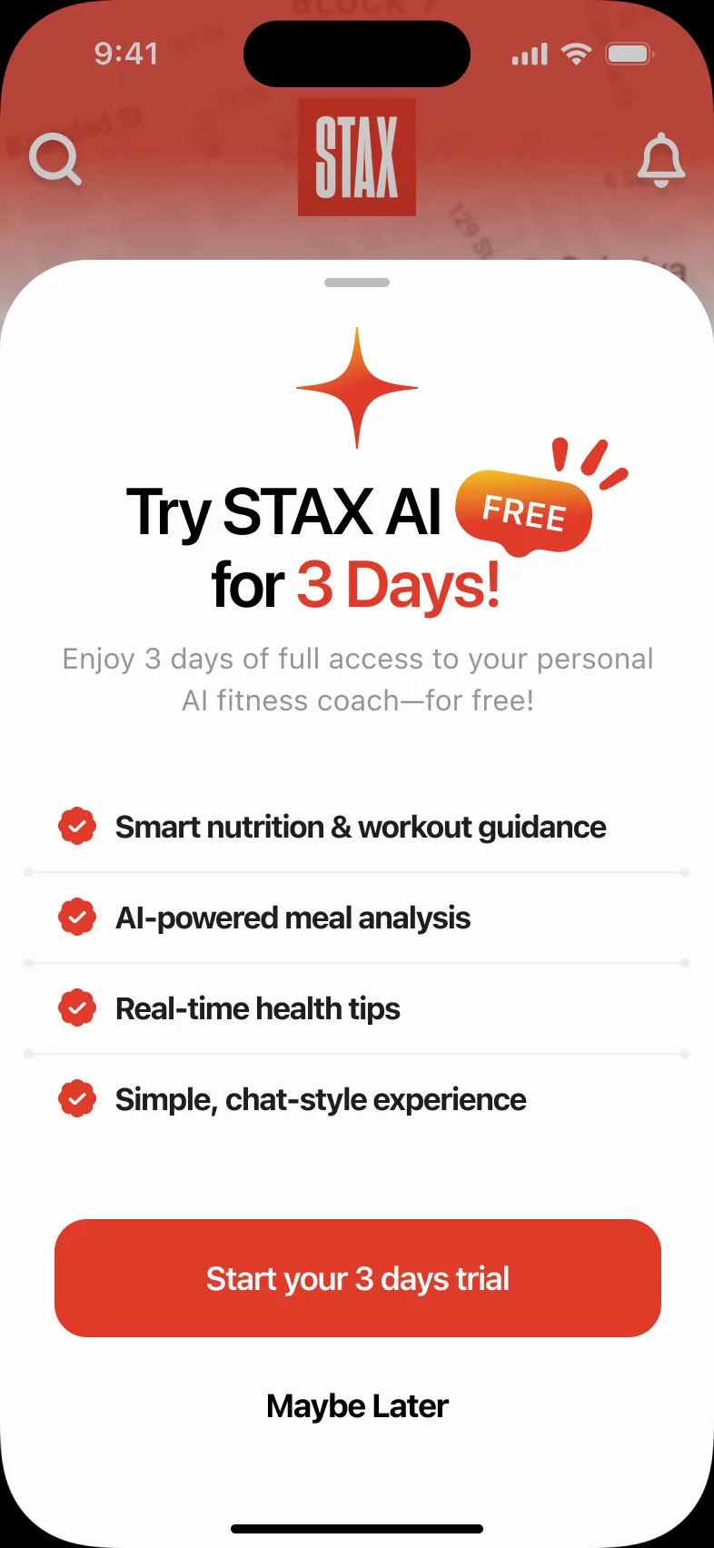
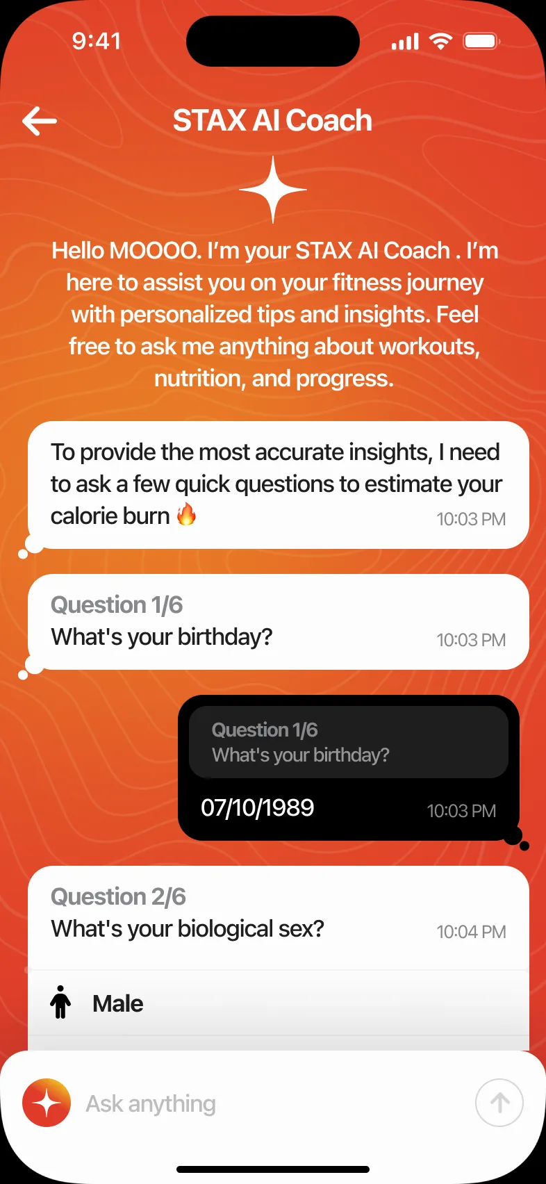
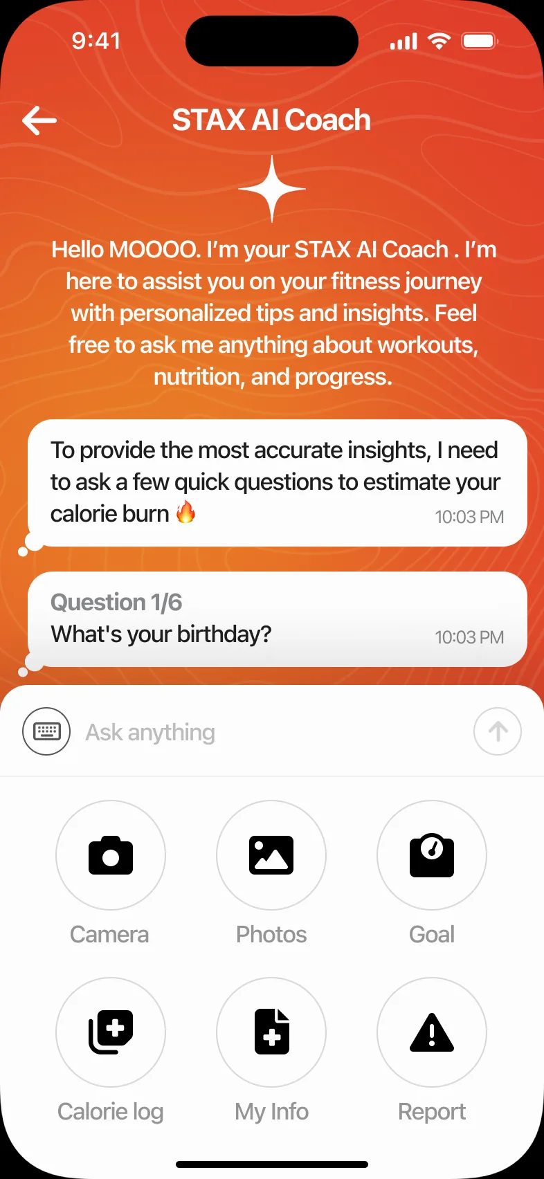
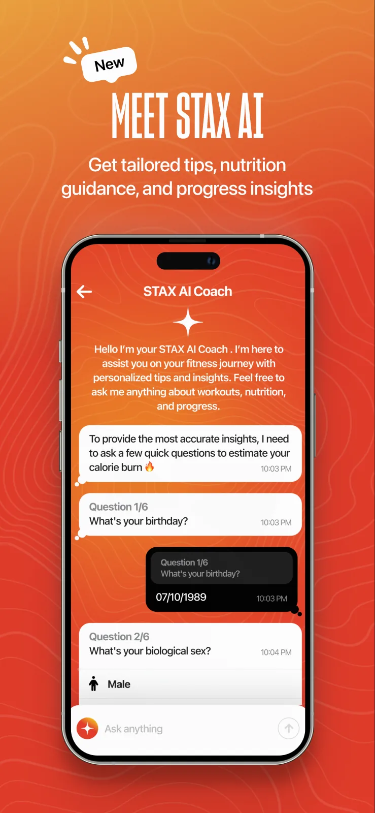
STAX AI Coach starts with a free three-day trial and a short set of questions (birthday, biological sex, height, weight and goal) to estimate calorie needs before giving advice.
- Trial offer only for members who haven’t tried it
- Questions asked one at a time, with icon choices
- Tools for photos, calorie log, goal and report
Free trial
Questions
Tools
Six flows, end to end.
User flows
Pick a flow and step through it on the real screens; arrow keys or swipe work too. Each flow names the goal, the outcome and the paths that branch off it.
Get started
Go from the first card to a ready account.
A verified account with a profile, and a referral discount if they were invited.
Onboarding
Three cards make the promise; the last offers Get started or Continue as a guest.
Sign up
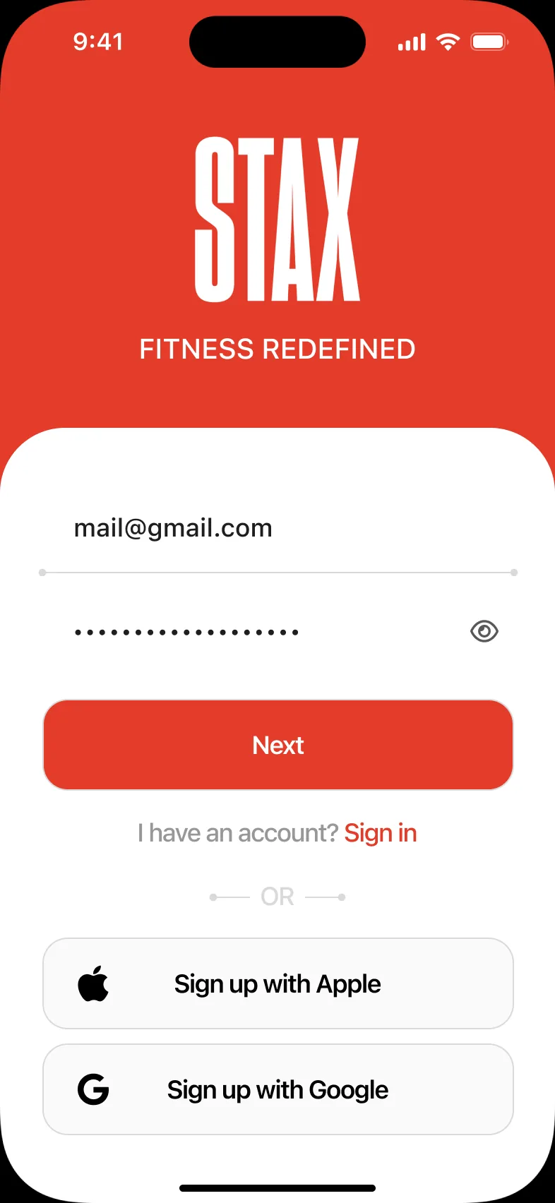
Email and password, or Apple and Google.
Phone number
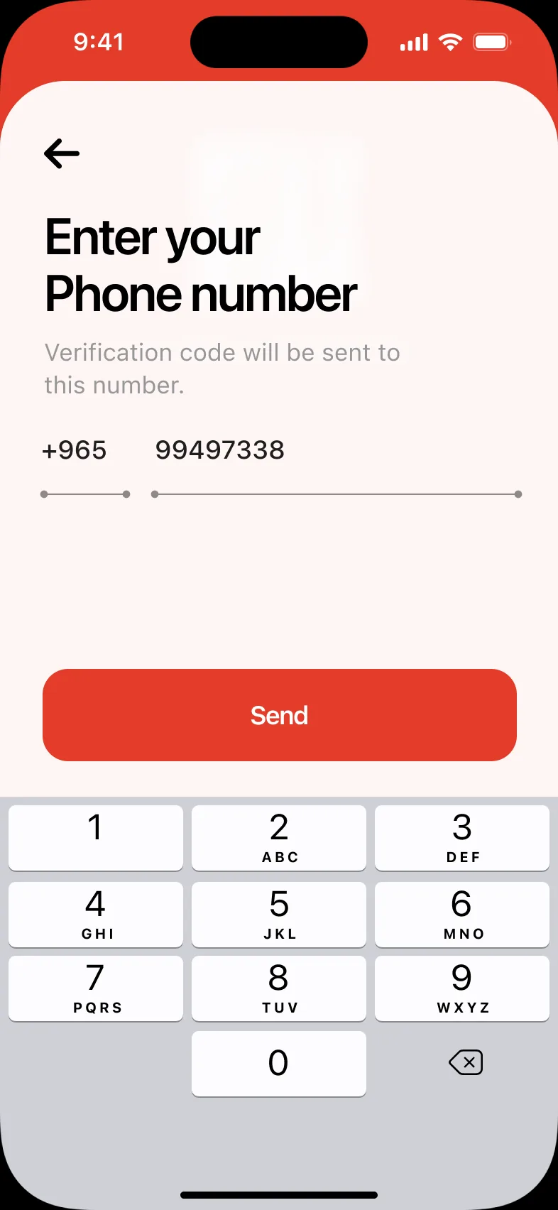
A Kuwaiti number with the +965 prefix.
Verify
A six-digit code by SMS, with WhatsApp as the alternative.
About you
Name, birth date and user name; a referral code is filled in automatically from an invite link.
Welcome
You’re all set: start exploring or go straight to the bundles.
Find a gym
Find a gym nearby that fits.
A gym chosen, with its hours, photos and location.
Allow location
STAX asks for location to find the gyms around you.
Gyms around you
Nearby gyms with distance, over the map.
Search
Recent searches and gyms in the current area.
Filter
Narrow by area, gender and plan.
Results
Only the gyms that match.
Gym details
Opening hours and a description.
Photos
The gym itself, before you go.
Subscribe
Buy the plan that covers the gyms they want.
An active plan, ready to scan in.
Bundles
Silver, Gold and Platinum side by side.
Plan details
The gyms the plan includes, then Renew or Buy.
Checkout
KNET or card, an optional discount code and a clear total.
Card details
A short card form in a sheet.
Confirmed
“Congratulations STAXER!”
Check in
Get into the gym.
A recorded visit and, half an hour later, a question about the session.
Check In tab
Opens straight into the scanner.
Share or not
Choose whether friends see this visit.
Scan
Read the QR code at the entrance.
You’re in
The gym, date and time.
Session feedback
Half an hour later, home asks how it went.
Gift a plan
Buy a plan for someone else.
The recipient gets a link by SMS and claims the plan in the app.
New checkout
Wallet and “Buy as a gift” rows; the summary starts collapsed.
Gift details
Recipient phone, a message and the sender’s name.
Gift on
The switch turns on and the button becomes “Buy & Send Gift”.
Sent
Confirmation that the recipient will get an SMS.
Received
The recipient’s side: claim my plan.
Top up the wallet
Add credit to pay for plans.
Credit in the wallet, applied automatically at the next checkout.
My profile
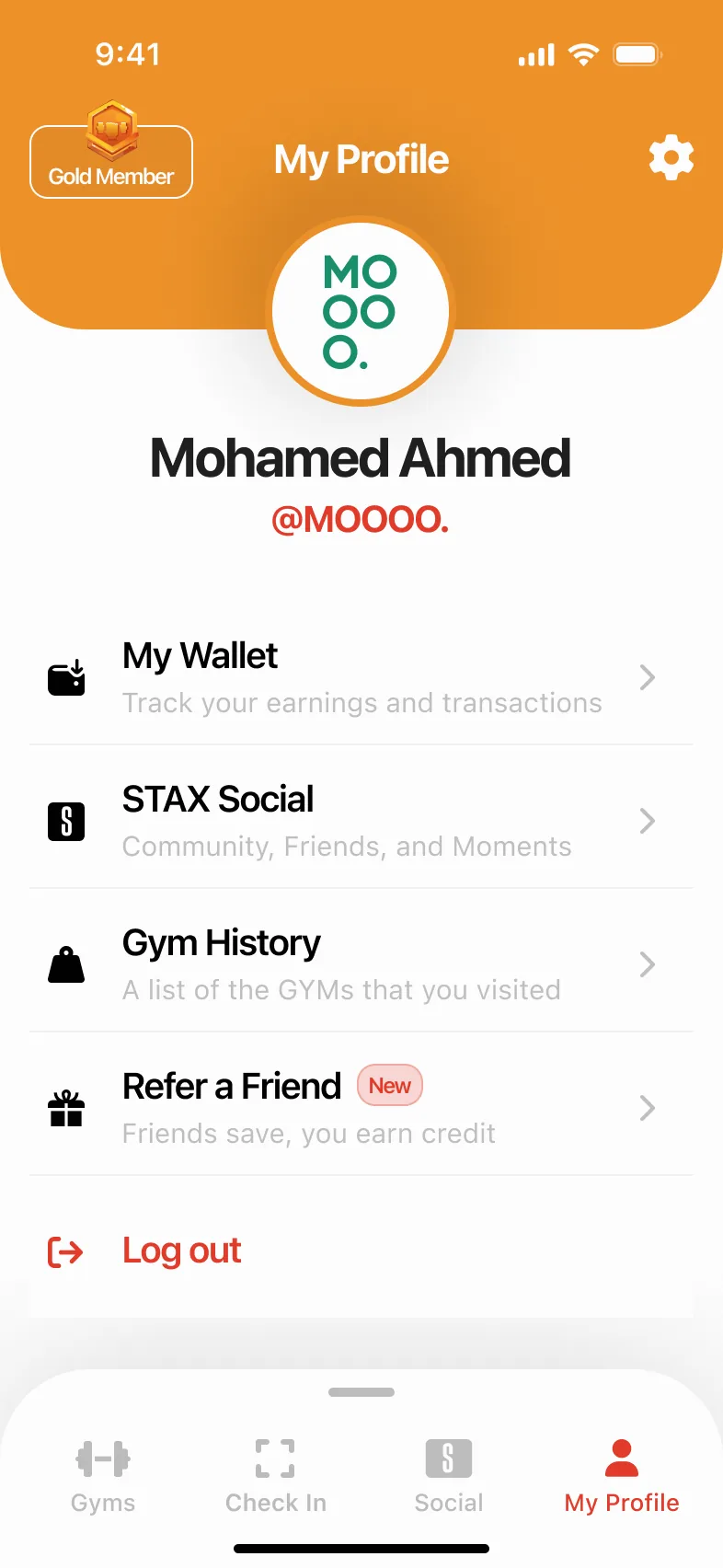
My Wallet sits first in the revamped profile.
Empty wallet
No transactions yet, and a + to add balance.
Add balance
A custom amount or 10, 20 or 40 KD.
Pay
KD 20 with KNET; the total updates as you choose.
Added
Balance added successfully.
Wallet
Credit, referral rewards and subscriptions in one history.
Why it works the way it does.
Design decisions
Seven decisions, each with the screen it shaped, quoted from the dated design notes written beside the screens.
Referral codes fill themselves in
Invited friends shouldn’t have to copy a code, but people who only have the code still need somewhere to type it.
A Referral Code field on the sign-up profile, filled automatically from an invite link and left empty otherwise.
Invites cost the new member nothing extra, and nobody is locked out of the discount.
The discount is in the price
A discount mentioned somewhere in the flow is easy to doubt.
Once a referral code is applied, every plan price shows the discount, and checkout adds a highlighted referral row.
Members see what they will pay before choosing. Referral and discount codes can’t be combined, so the total stays predictable.
The wallet pays first
Credit from referrals and top-ups is wasted if members have to remember to use it.
When a member buys or renews a plan, checkout automatically shows a Wallet row and deducts the balance.
Credit is always spent, and the remaining amount is clear.
A gift is a checkout option
A separate gifting flow would duplicate plan choice and payment.
A “Buy as a gift” switch in the existing checkout. Switching it on opens the gift form and changes the button to “Buy & Send Gift”.
One checkout covers buying for yourself and for someone else.
Check-in explains every “no”
At the gym door, a vague failure is the worst moment to be confused.
Separate screens for a reached daily limit and for a gym outside the plan, each with the next step: report an issue or upgrade.
A refused scan becomes a clear answer instead of a dead end.
The AI offer knows when to step back
A promotion that never goes away turns into noise, and gets in the way of finding a gym.
The “Need fitness tip…” message shows only to members who haven’t tried the AI, and hides while they drag the list to explore gyms.
The coach is introduced without competing with the app’s main job.
Chat cells with clear roles
In a long coaching chat, it must be obvious at a glance who said what.
Coach cells are always white and full width; the member’s cells are black and fit their content. The input grows to three lines, then scrolls.
The conversation reads like a coach and a client, and the input never covers it.
The promise, kept on every screen.
Solution validation
The three lines on the onboarding cards, traced through the finished flows.
Access → Find a gym
From the map to a chosen gym with its hours, photos and location in 7 steps, with recovery screens for location off, no gyms nearby and no internet.
One plan → Subscribe
Three tiers built the same way, and an active plan in 5 steps, with KNET, cards, discount codes and the wallet in one checkout.
Convenience → Check in
The Check In tab is the scanner: a recorded visit in 5 steps. A reached limit and a gym outside the plan each get their own screen with a way forward.
Growth without new journeys
Gifting is a switch inside the existing checkout and the wallet pays first automatically, so new features added options, not new flows.
Designed twice, right to left.
English & Arabic
STAX ships in English with SF Pro and in Arabic with SF Arabic. The Arabic screens mirror the layout (alignment, icons and reading order) instead of only swapping the text.
Onboarding
The same card, mirrored for Arabic.
Sign in
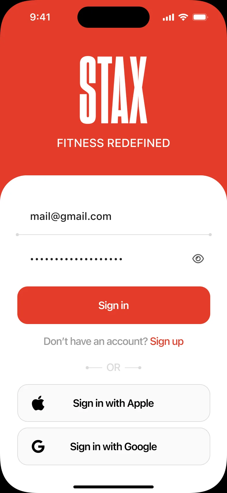
Fields, links and social buttons flip to right to left.
Phone number
The number pad stays; labels and prefix move.
Welcome
Illustration and copy, mirrored.

Ready for the store.
Launch
Six App Store screenshots for 6.7-inch iPhones (with a Google Play set at 1080 × 1920), each pairing one benefit with the real screen behind it.
Fitness at your convenience
Meet STAX AI
Scan and enter
STAX’s bundles
Share the burn
Keep moving
The complete set.
Every screen
Every final screen in this case study, grouped by product area. Select any screen to see it large; use the arrow keys or swipe to move through them.
Welcome & account
Home & map
Search & gyms
Plans & checkout
Gifting
Check in
Profile & wallet
STAX Social
STAX AI
Arabic
App Store

Red, bold and built to repeat.
Design system
A condensed wordmark, one red, a gold accent and three plan colours, on a light interface.
A tall, condensed STAX wordmark. The file uses it white on the brand red: on the cover, the splash and the header of every main screen.
Six core colours, plus a grey for supporting text and a green for success.
STAX Red
Primary buttons, headers, selected states and the brand.
Gold
The secondary button style on the style board.
Light grey
Disabled buttons and dividers.
White
Screens, cards and sheets.
Ink
Text, dark buttons and the member’s chat cells.
Black
Headlines and icons.
Secondary text
Distances, dates and helper text.
Success
Applied codes and credit in the wallet history.
The interface uses Apple’s system faces (SF Pro for English and SF Arabic for Arabic) on the style board’s scale. Store artwork and onboarding headlines use a condensed display face that echoes the wordmark.
SF Pro
Interface · English
SF Arabic
Interface · Arabic
Type scale
Display
The four tab icons (a dumbbell, a scan frame, the S badge and a person) are red when active, grey when not.
Buttons, sign-in options, fields, plan badges and the cards built on them, reused across every flow.
Plan cards
Badge, name, visits per day and the monthly price bar.
Buttons
Red and gold, default and pressed.
Dark buttons
Dark buttons with a red or gold outline.
Plan badges
Platinum, Gold and Silver.
Sign-in options
Apple, Google, WhatsApp and SMS.
Gym list
Logo, name, area, distance and a Nearest tag.
Checkout rows
Payment method, wallet and gift switches.
Chat cells
Coach in white, member in black.
Filter
Select field, gender toggles and plan options.
Wallet
Credit balance and transaction history.
Select field
Default and selected.


The scope of the work.
By the numbers
Phone screens, English and Arabic
Product areas: 8 epics, referral & wallet, gifting
Dated design notes documenting changes
Store screenshots for iOS and Android
How it grew.
Process
Core product
Sign-up and onboarding, the home map, search and gym details, bundles and checkout, and the profile, each as an epic with every state laid out.
Check in
The scanner as its own tab, with limits, plan checks and a follow-up question after the session.
Social & AI
STAX Social for friends and activity, then STAX AI Coach with a free trial, onboarding questions and a full set of chat cells.
Arabic
The account flows rebuilt right to left in SF Arabic.
Referral & wallet
Referral codes across sign-up, bundles, checkout and notifications, a revamped profile and a wallet, documented in dated notes from August and September 2025.
Gifting
Checkout v2 with a collapsible summary and the option to buy a plan as a gift, in notes dated December 2025.
Launch assets
Store screenshots for 6.7-inch iPhones and 1080 × 1920 Android screens.
One plan, one map, one scan.
Results & impact
What the finished design delivers for members, from the first card to the gym floor.
First card to gym floor in one sitting
Get started (6 steps), Subscribe (5) and Check in (5) take a newcomer from onboarding to a recorded visit, with gyms and plans open to guests before sign-up.
No dead ends at the door
Every refused scan names its reason and the next step, report an issue or upgrade, so the most stressful moment of the journey always explains itself.
Prices members can trust
Referral discounts appear in every plan price, wallet credit is applied at checkout automatically, and gifts share the same checkout.
Built to grow
204 screens in English and Arabic, ten product areas and 18 dated notes keep every change traceable as social, AI, referrals, the wallet and gifting were added.
How success shows up
Successful first scans, refused check-ins that always come with a reason, and referral and gift codes that get redeemed.
What kept STAX moving.
Closing reflection
STAX replaces a stack of single-gym memberships with one plan, one map and one scan at the door, and it kept that promise while it grew: social, an AI coach, referrals, a wallet and gifting each had to serve it rather than compete with it.
- Writing a dated note beside every change made new features traceable across sign-up, checkout and the profile.
- Designing the “no” screens (limits, plan mismatches, no gyms nearby) mattered as much as the happy path.
- Building Arabic as a mirrored layout, not a translation, kept both languages first-class.
- 204 phone screens across ten product areas, with the account flows also designed in Arabic, right to left.
- Six end-to-end flows, from the first card to the wallet, with every failure state designed.
- 18 dated design notes documenting each change beside the screens it affects.
- 12 App Store and Google Play screenshots, ready for launch.