Impacts with Khaled Brand
Brand Identity · 2024
Impacts with Khaled is the new identity of an organisational development consultant in the UAE, formerly Dear Khaled: a symbol that reads as a growth chart and as the “i” of impacts, a green palette for success, and 33 pages of guidelines.
A brand identity for an organisational development consultant: a symbol that grows like a chart, a green that means success, and guidelines that keep it consistent.
Overview
Dear Khaled became Impacts with Khaled: a new name and a new identity for a consultant whose work is measured by the growth of the people and businesses he serves.
Khaled is an organisational development consultant. His services reach beyond traditional consulting, to individuals and organisations alike, from CEOs to lifelong learners.
The rebrand marks a new chapter: the identity is built to say “impact” and “growth” at a glance, and the 33-page guidelines make sure it says it the same way everywhere.
Client
Khaled, UAE
Role
Brand Designer
Platform
Print & digital
Scope
Rebrand & brand guidelines
Deliverables
Logo system · 33-page guidelines
Tools
Figma · Illustrator
In this case study
From Dear Khaled to Impacts with Khaled.
The brand
Who it’s for
A consultant whose clients range from CEOs to lifelong learners, so the brand has to feel credible in a boardroom and approachable on a phone.
The change
A personal name became a promise. “Impacts” puts the result first; “with Khaled” keeps the person behind it.
What it stands for
Changing narratives, fostering growth and empowering others to reach their full potential, in the guidelines’ own words.
We don’t mess with success.
What the name, the market and the audience asked for.
Research
Discovery started from three questions: who the brand speaks to, what it competes with, and what the new name promises.
The audience
Two ends of one audience: leaders deciding on organisational change, and individuals investing in their own growth. The identity has to read as serious business and as personal ambition at once.
The category
Consulting identities lean on navy and grey, initials and abstract arrows. A confident green and a mark with its own meaning give Impacts a place to stand apart.
The name
“Dear Khaled” read as a personal letter. “Impacts with Khaled” leads with the result and keeps the person as the guarantee, so the mark had to say “impact” before it says “Khaled”.
What the identity had to do.
The challenge
Three problems the identity had to answer.
Show growth without a cliché
Consulting is full of arrows and upward charts. The mark had to carry growth and still be ownable, and work as a single letter.
Turn a person into a practice
The new name moves from a greeting to an outcome. The identity had to keep Khaled present while letting “impacts” lead.
Stay consistent from favicon to billboard
One system for an app icon, a social profile, business cards and large prints, with rules simple enough to follow without the designer in the room.
A chart that spells “i”.
The concept
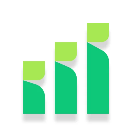
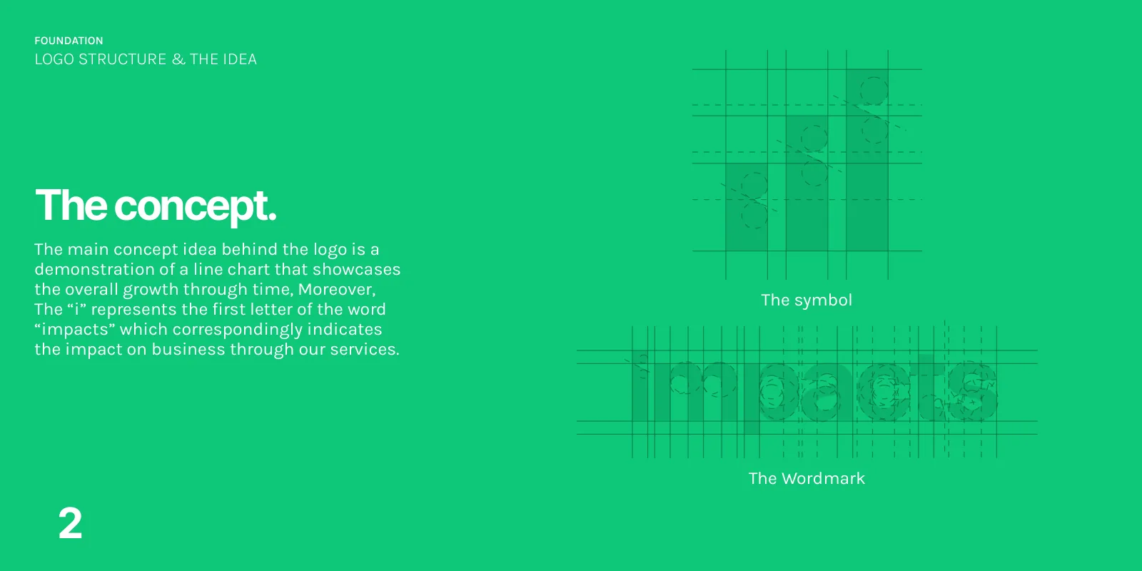
The symbol is a line chart that shows growth over time. Read as a whole, the same shapes form the “i” of impacts: the impact the services have on a business.
- Three bars rise left to right, each a step taller.
- Each bar carries a kiwi-green top, the second green of the palette, built into the mark.
- The wordmark is drawn on its own construction grid, to the same proportions as the symbol.
Symbol and wordmark construction
Both drawn on their own construction grids.

Two lockups, four backgrounds.
Logo
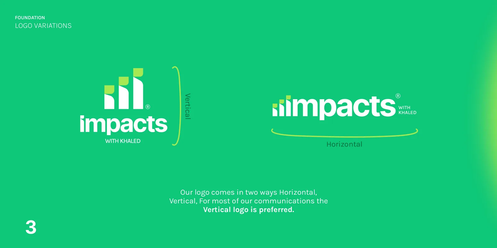
The logo comes vertical and horizontal, in four approved editions. Switch between them. Each edition has its own approved artwork, never recoloured.
White
Black
Dark green
Light green
Vertical first
For most communications the vertical lockup is preferred; the horizontal one is for wide, short spaces.
No changes
No changes to the logo’s colour, form, or the relationship between wordmark and symbol, and no drop shadows.
The symbol alone
Only for social profile images, app icons and similar small formats.


Room to breathe.
Clear space
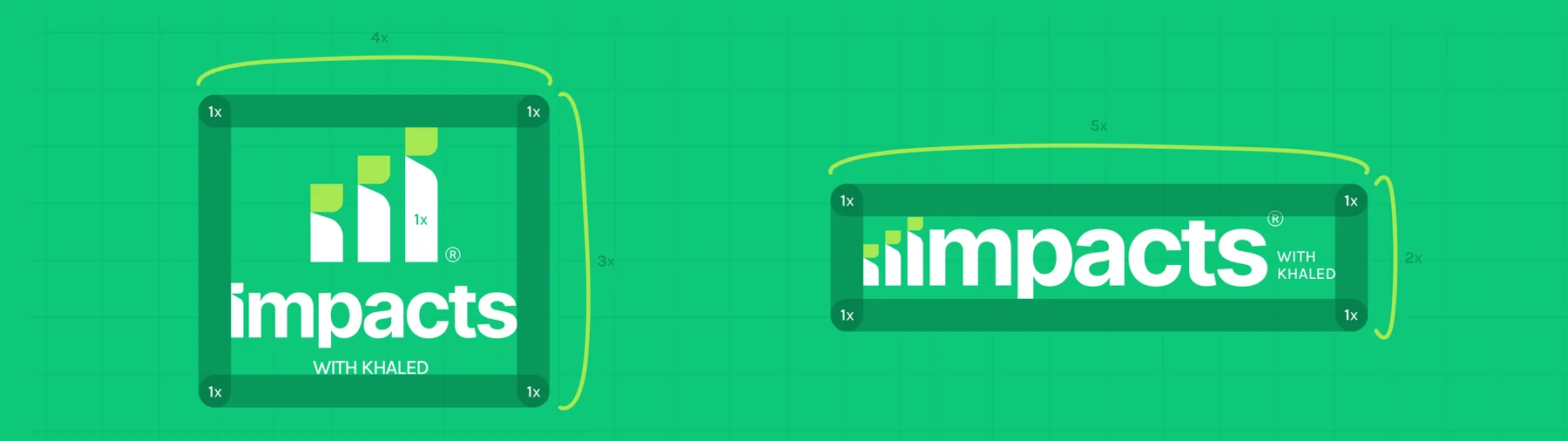
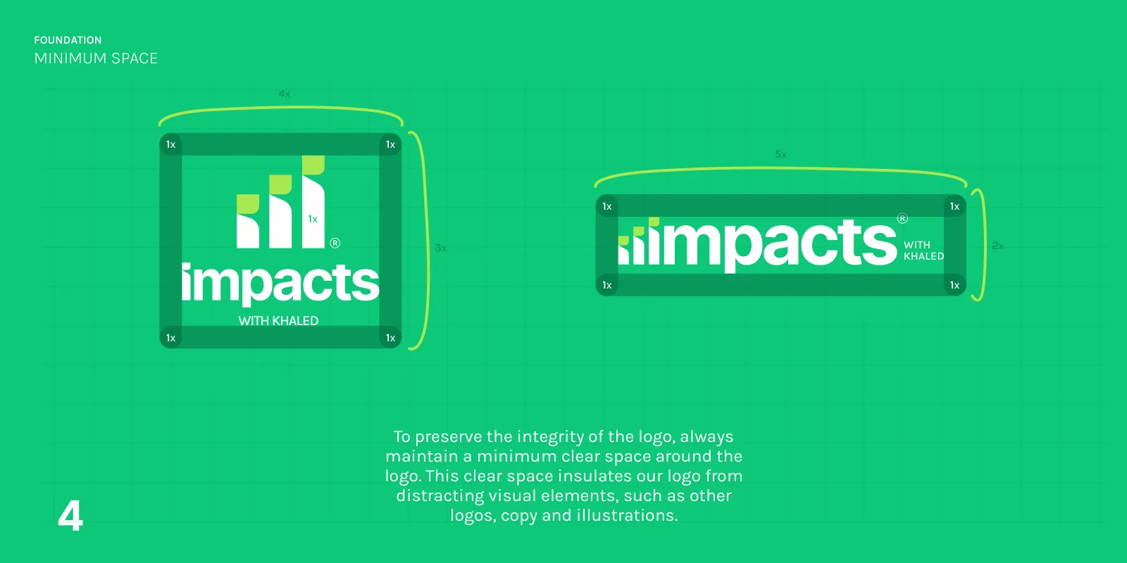
A minimum clear space, measured in a unit x, insulates the logo from other logos, copy and illustrations.
Both lockups keep 1x clear on every side, marked 4x by 3x around the vertical logo and 5x by 2x around the horizontal one.
Green, for growth.
Colour & type
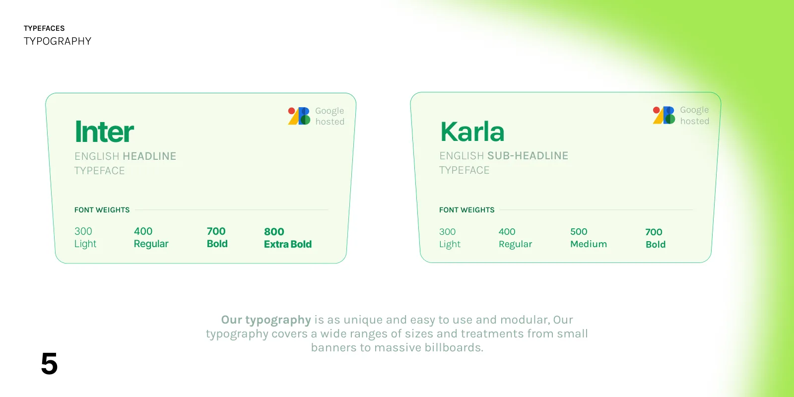
Green is the primary colour: the colour of growth, abundance and success. Two typefaces, both free and Google-hosted, carry every message from a small banner to a billboard.
Six primary colours plus two supporting blues, with the values documented in the guidelines.
Impacts Dark Green
RGB 5 108 65 · CMYK 89 33 89 23
Impacts Light Green
RGB 16 199 122 · CMYK 72 0 72 0
Impacts Kiwi Green
RGB 166 233 82 · CMYK 37 0 86 0
Impacts Orange
RGB 232 162 57 · CMYK 8 40 90 0
Black
RGB 0 0 0 · CMYK 100 100 100 100
White
RGB 255 255 255 · CMYK 0 0 0 0
Shelduck Blue
RGB 161 203 185 · CMYK 38 6 31 0
Morning Sky Blue
RGB 142 175 161 · CMYK 47 19 38 0
Dark Green
1000
900
800
700
600
500
400
300
200
100
Light Green
1000
900
800
700
600
500
400
300
200
100
Kiwi Green
1000
900
800
700
600
500
400
300
200
100
Orange
1000
900
800
700
600
500
400
300
200
100
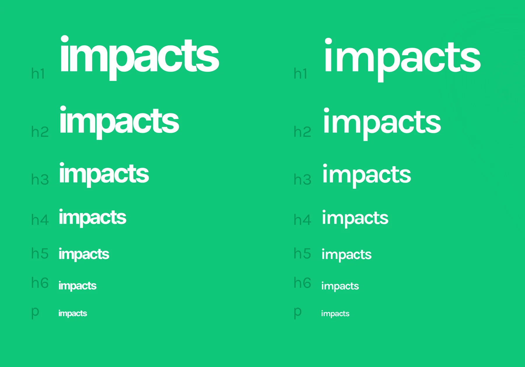
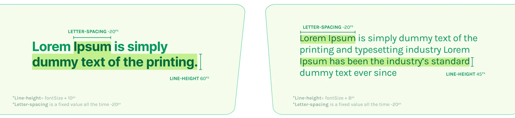
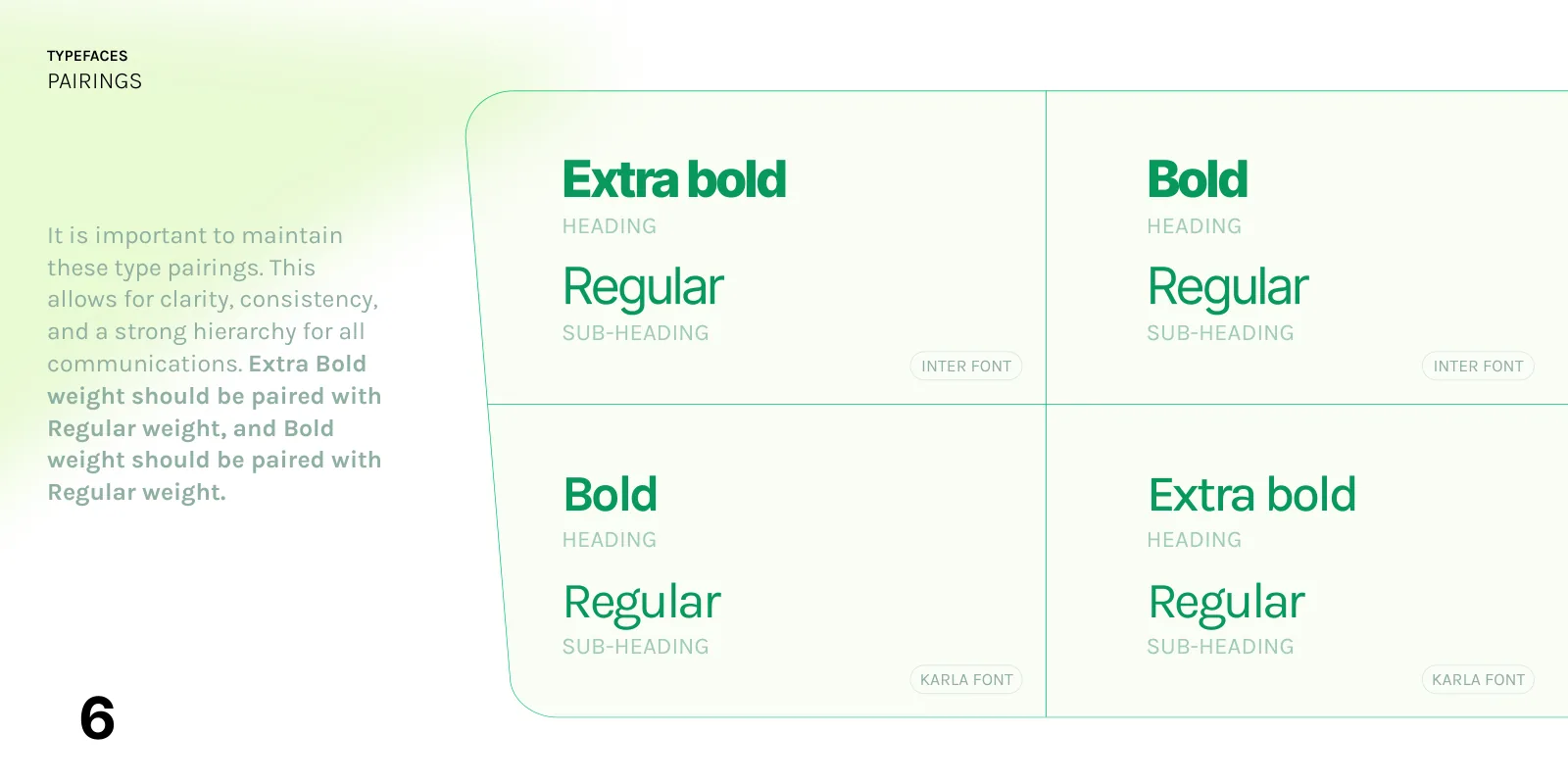
Inter for headlines, Karla for sub-headlines. Extra Bold headings pair with Regular, Bold with Regular. Sizes follow a 1.333 (perfect fourth) scale from a 16 px base; headings take line-height = size + 10 px, paragraphs size + 8 px, letter-spacing −20.
Inter
English headline
Karla
English sub-headline
Type scale
Pairings
Hierarchy
Spacing
A pack of 52 line icons: 48 px, 4 px stroke, rounded ends. Twelve shown here; the full set is on the guidelines page.


Do’s & don’ts.
Usage
Ten rules from the guidelines, each with its own example. Most protect the lockup: the slogan belongs with the full logo, and the logo is never recoloured, re-spaced or shadowed.
do
Use the full slogan lockup (horizontal) for external material.
do
Use the full slogan lockup (vertical) for external material.
do
On business cards, posters and merchandise, use the logo (vertical or horizontal) without the slogan.
do
Use only the symbol for social profile images, app icons and similar formats.
dont
Don’t pair the slogan with the wordmark alone.
dont
Don’t stack the slogan under the wordmark alone.
dont
Don’t pair the slogan with the symbol alone.
dont
Don’t change the colour of the symbol, wordmark or slogan.
dont
Don’t add a drop shadow; the logo is always flat.
dont
Don’t change the spacing between the parts of the logo.


The sparkle and the skyline.
Patterns
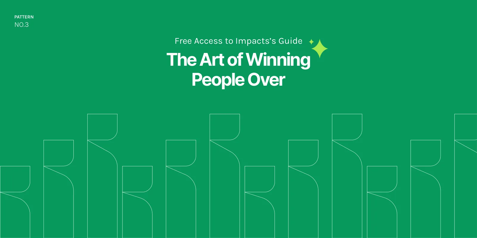
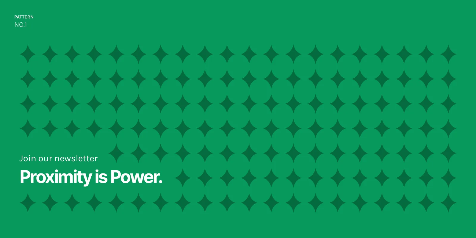
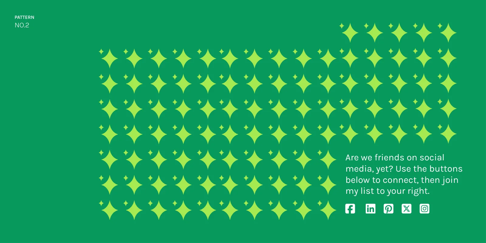
Three patterns come from the identity itself: a four-point sparkle repeated into a field, the same sparkle in kiwi green, and the symbol’s outline repeated into a skyline of rising bars.
No.3 · The skyline
The outlined symbol, repeated at three heights, under a guide cover.
No.1 · Sparkle field
Dark green sparkles on green, for a newsletter.
No.2 · Kiwi sparkles
Kiwi sparkles framing a social call to action.
One person who stands out.
Imagery
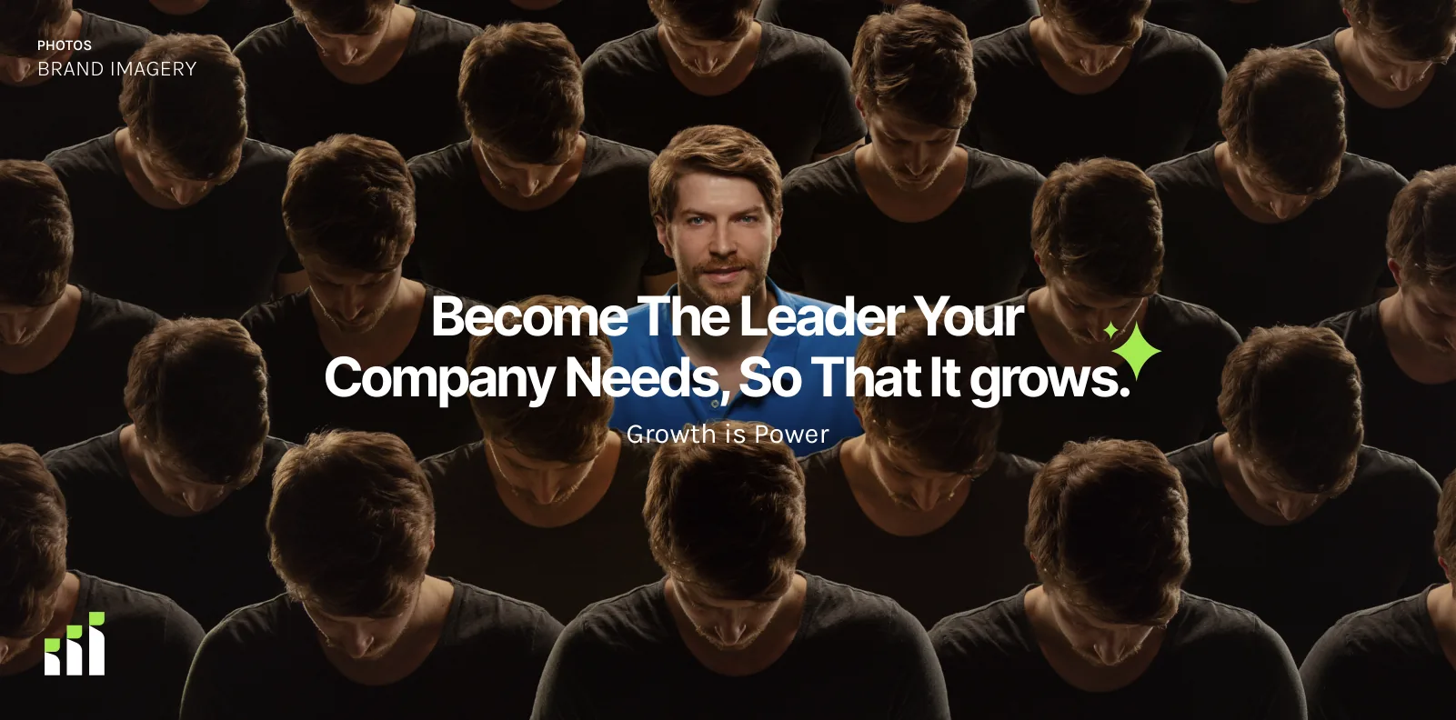
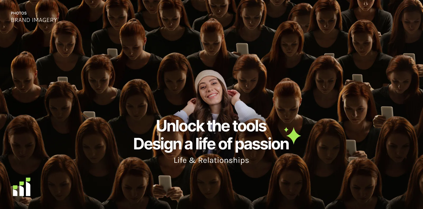
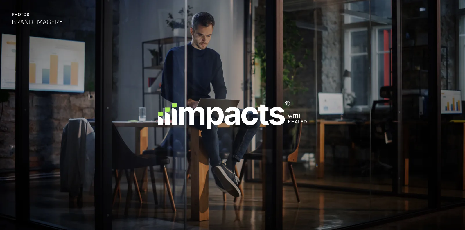
The imagery is warm, real and work-focused: people in conversation, and one face looking up from a crowd looking down: the person who makes the difference. The logo sits on the photo, white, never boxed.
Growth is Power
“Become the leader your company needs, so that it grows.”
Life & Relationships
“Unlock the tools. Design a life of passion.”
The horizontal lockup on photography
From app icon to business card.
Applications
The identity applied, following its own rules: the logo without the slogan on business cards, the symbol alone where space is tight.
Business cards
The logo without the slogan, as the rules ask for business cards; Inter Extra Bold for the name, Karla for the role.
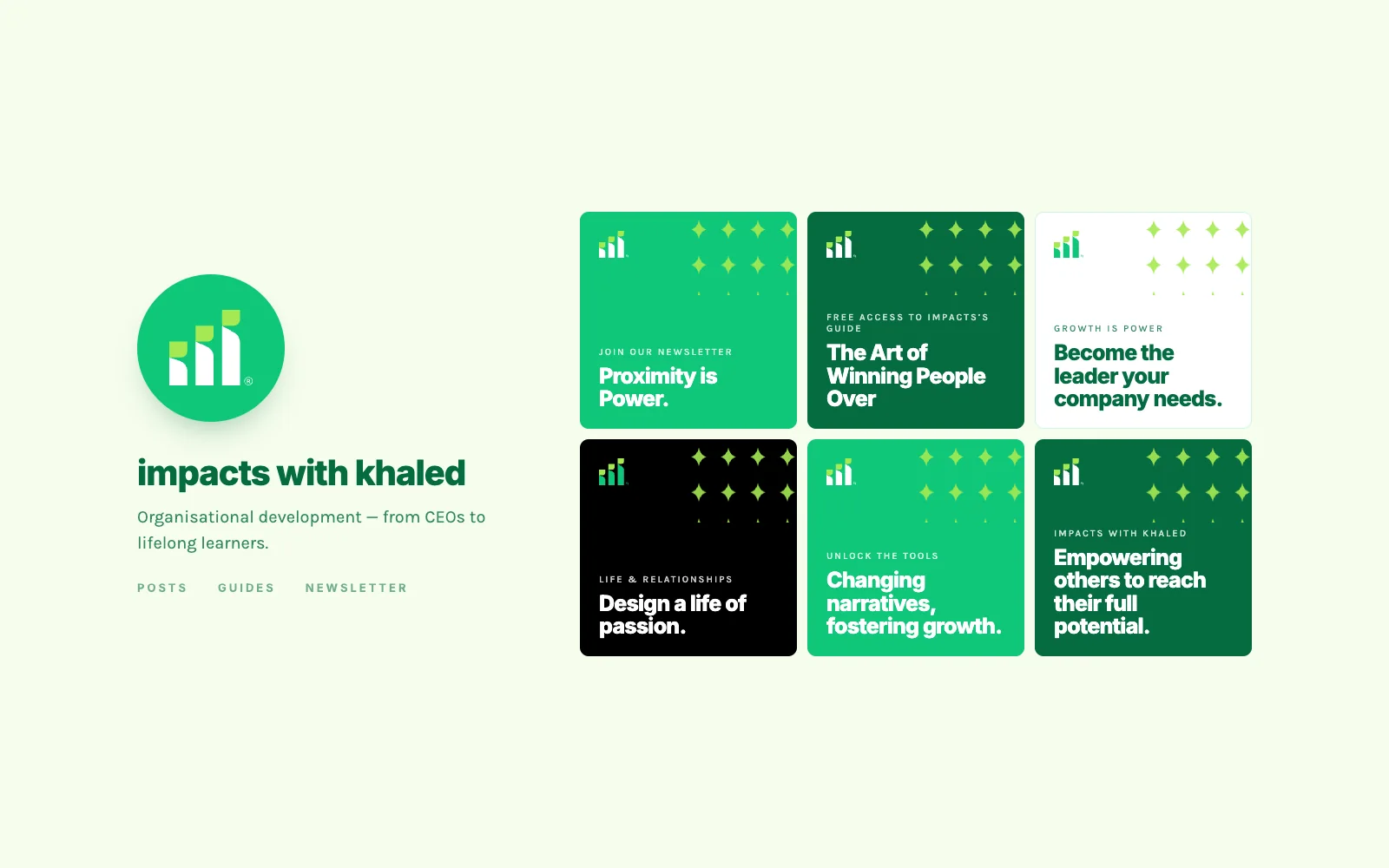
Social profile
The symbol alone as the profile image; posts carry lines from the brand’s own campaigns on the four approved logo backgrounds.

App & favicon
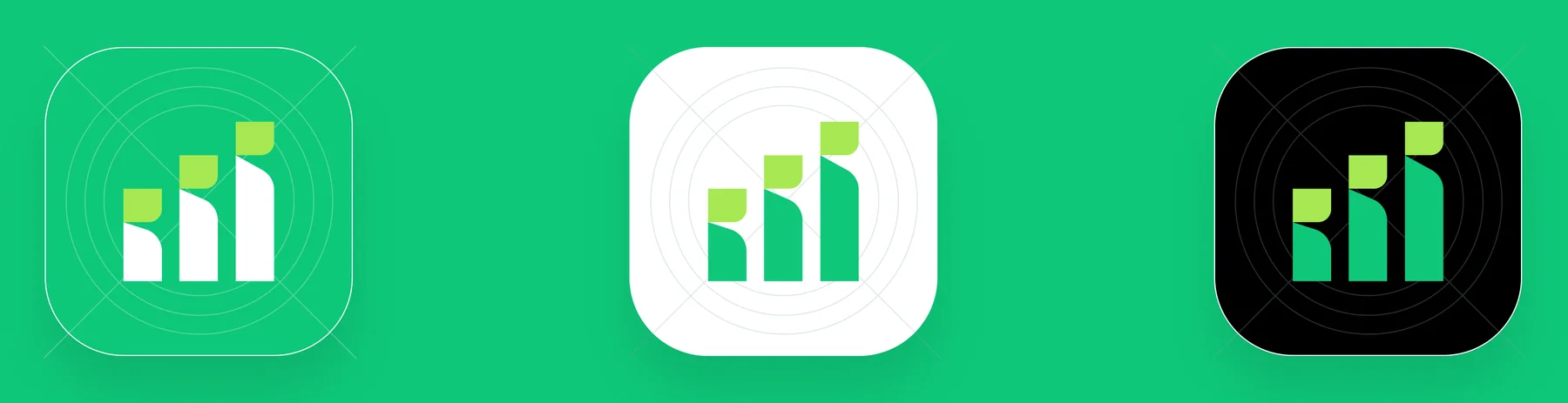
Three app icons on light green, white and black.
Every page.
The guidelines
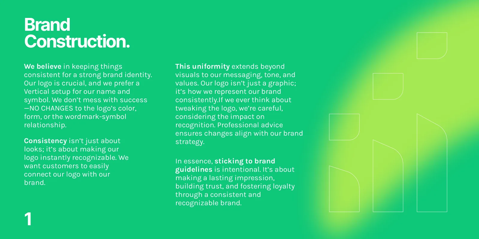
All 33 pages of the brand guidelines, grouped by section. Select a page to see it large.
Foundation
Typefaces
Colour
Logo editions
Usage
Imagery & patterns

From a name to a system.
Process
From the meaning of a new name to a system anyone can apply.
Discovery
Positioning, audience and the meaning of the new name, distilled into three words the identity had to carry: growth, impact, trust.
Concept
Symbol explorations around growth and the letter “i”, narrowed to the rising chart with kiwi-green tops, then the custom wordmark drawn on its own grid.
Refinement
The vertical and horizontal lockups, the slogan, clear space and the four approved backgrounds.
Colour & type
The green palette with orange and two supporting blues, ten tints per family, and Inter with Karla on a 1.333 scale.
System
The 52-icon UI pack, three app icons, three patterns from the sparkle and the symbol, and the imagery direction.
Guidelines
Everything documented in one 33-page guide, with ten do’s and don’ts so the brand can be applied without the designer.
What the rebrand delivers.
Results & impact
A complete identity system, ready to use from the first day, built to make the new name recognisable and to keep it consistent.
A name people can see
One idea, growth you can read as a letter, turns “Impacts” into a mark that works from a favicon to a billboard.
A system, not a logo
Lockups, editions, colours, tints, type, icons, patterns and imagery all come from the same idea, so every touchpoint looks like one brand.
Consistency without the designer
Thirty-three pages and ten illustrated rules let Khaled and any partner apply the brand correctly on their own.
Ready for every format
Four approved logo editions, 40 tints in four colour families, 52 UI icons and three app icons cover print, screen and social from day one.
How success shows up
The symbol recognised on its own as an app icon or profile picture, and partners applying the brand without help.
The system, counted.
Scope
Pages of guidelines
Approved logo editions
Tints across four colour families
UI icons
Built to stay the same.
Closing reflection
The strongest decision in this identity is a quiet one: a single idea, growth you can read as a letter, carried into every rule, so the brand looks the same whoever applies it.
- A mark that works as both a symbol and a letter earns its place in small formats: the symbol alone carries the app icon and the social profile.
- Rules are most useful when each has its own picture: ten do’s and don’ts make the guidelines usable without the designer.
- Building tints from opacity steps keeps four families consistent with each other and easy to extend.
- A new name, symbol and custom wordmark, in vertical and horizontal lockups.
- Four approved editions, a green palette with 40 tints, and Inter with Karla.
- 52 UI icons, three app icons, three patterns and an imagery direction.
- A 33-page guide with ten illustrated do’s and don’ts.