Kait Brand
Brand Identity
Kait is the identity of an AI-powered conversational platform from Kuwait: two speech bubbles in conversation, Kait Dark Purple with warm orange, Jeko and Alexandria for English and Arabic, and 40 pages of guidelines.
A brand identity for an AI-powered conversational platform: two speech bubbles in conversation, a confident purple with warm orange, and one system for English and Arabic.

Overview
Kait is an AI-powered conversational platform. Through easy integration with social media channels, it takes a business to the next level of customer service, marketing and sales.
The identity had to make an AI product feel human: approachable in a chat window, credible in a boardroom, and at home in both English and Arabic.
The 40-page guidelines turn one idea, a conversation, into a logo system, two typefaces, a ten-family palette, icons, illustrations and photography.
Client
Kait, Kuwait
Role
Brand Designer
Platform
Print & digital
Scope
Brand identity & guidelines
Deliverables
Logo system · 40-page guidelines
Tools
Figma · Illustrator
In this case study
Connecting people with brands.
The brand
The challenge: an AI platform that has to feel human, approachable to customers in a chat window, credible to the businesses that buy it, and native in English and Arabic.
The mission
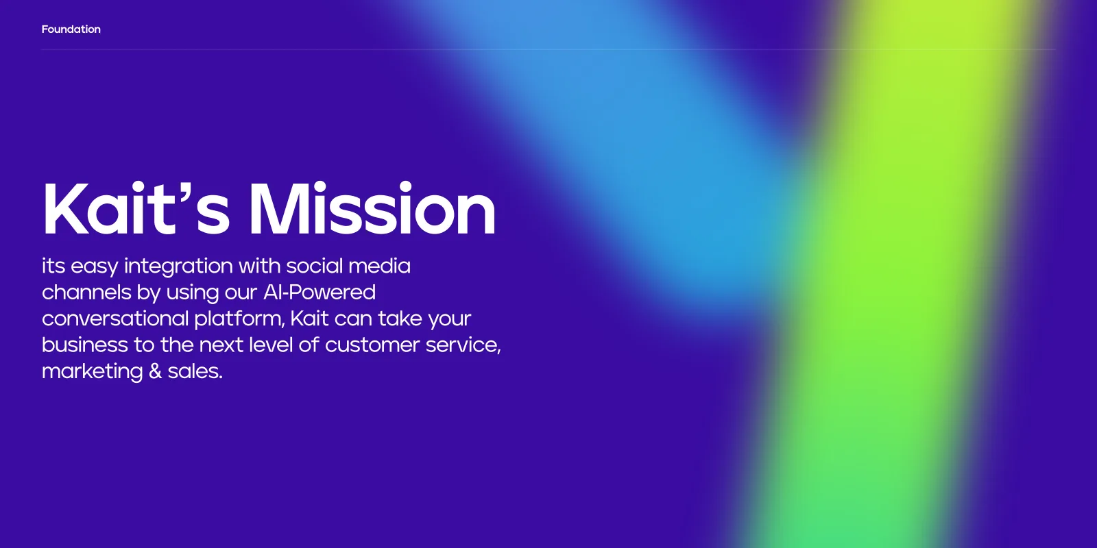
Easy integration with social media channels, through an AI-powered conversational platform, for customer service, marketing and sales.
The name
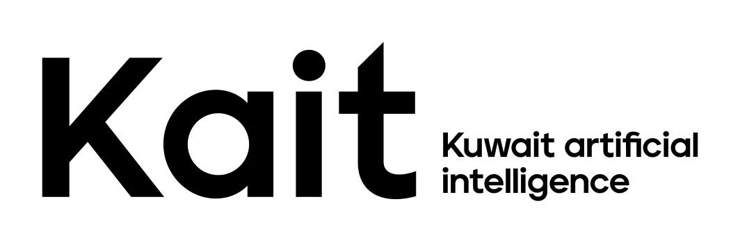
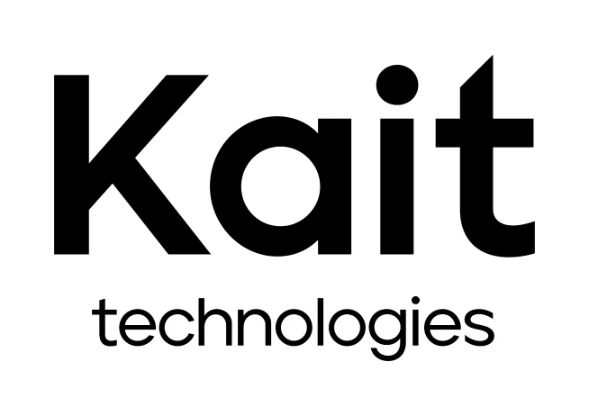
The first slogan spells it out: Kuwait artificial intelligence. The second, “technologies”, frames Kait as a company as well as a product.
The message
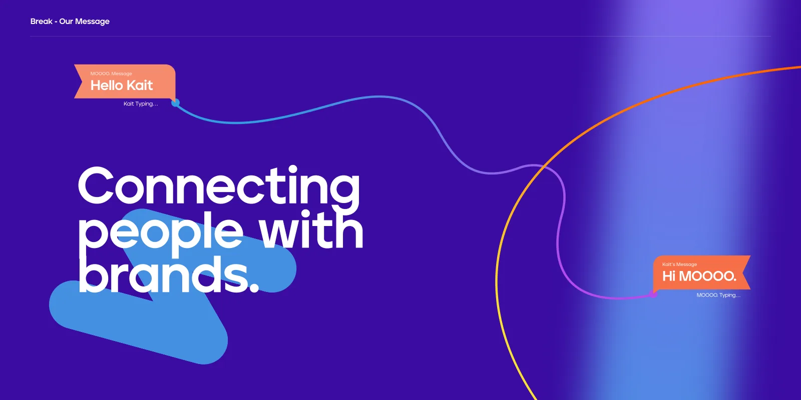
Every touchpoint comes back to one line, connecting people with brands, and to the chat bubble that carries it.
Less is more, do more with less.
Universal, functional, precise.
Design principles
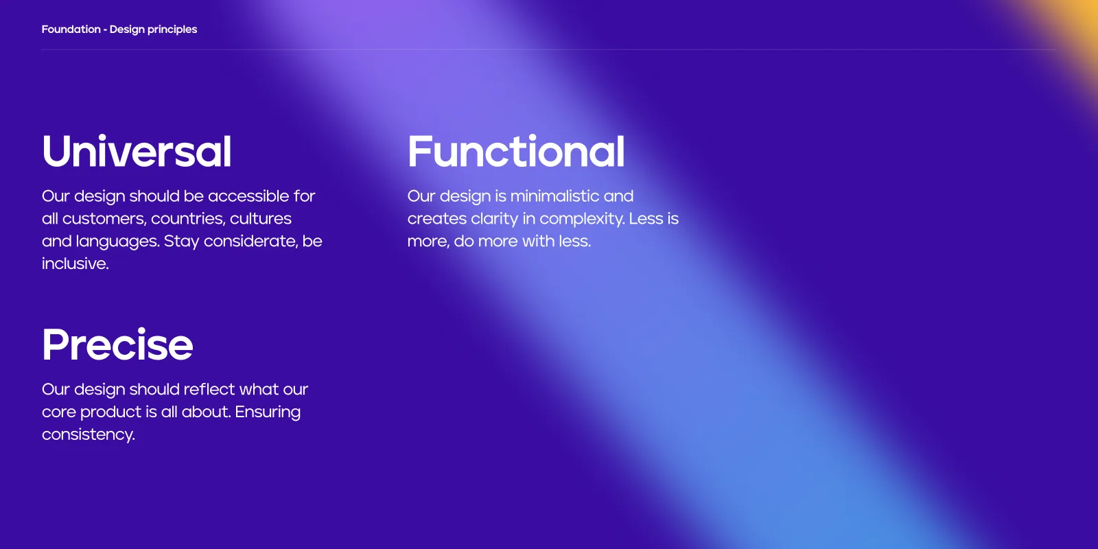
Three principles from the guidelines that every decision answers to.
Universal
Accessible for all customers, countries, cultures and languages. Stay considerate, be inclusive.
Functional
Minimalistic, creating clarity in complexity. Less is more. Do more with less.
Precise
A reflection of what the core product is all about, ensuring consistency.
Two bubbles, one conversation.
The symbol
The symbol is two speech bubbles leaning into each other: one dark orange, one light, with a spark of space between them. Beside the wordmark it reads as a conversation already under way.
- Symbol and wordmark together make the logo; the horizontal arrangement is preferred.
- The two bubbles carry the brand’s two oranges, so the mark works on purple and on white.
- The wordmark is set heavy and geometric, with a ™ mark.
Symbol + wordmark
The logo on its grid.
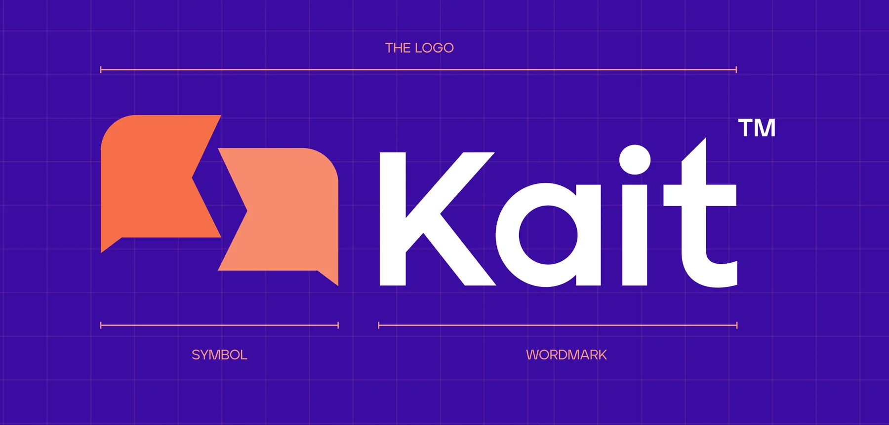
Horizontal first.
Logo
The logo comes horizontal and vertical, on Kait Dark Purple and on white. Switch between them. Each edition has its own approved artwork.
Dark purple
White
Horizontal first
For most communications the horizontal logo is preferred; the vertical one is for tall, narrow spaces.
Never modified
Never change the logo’s colour, form, or the relationship between symbol, wordmark and slogan.
Clear space
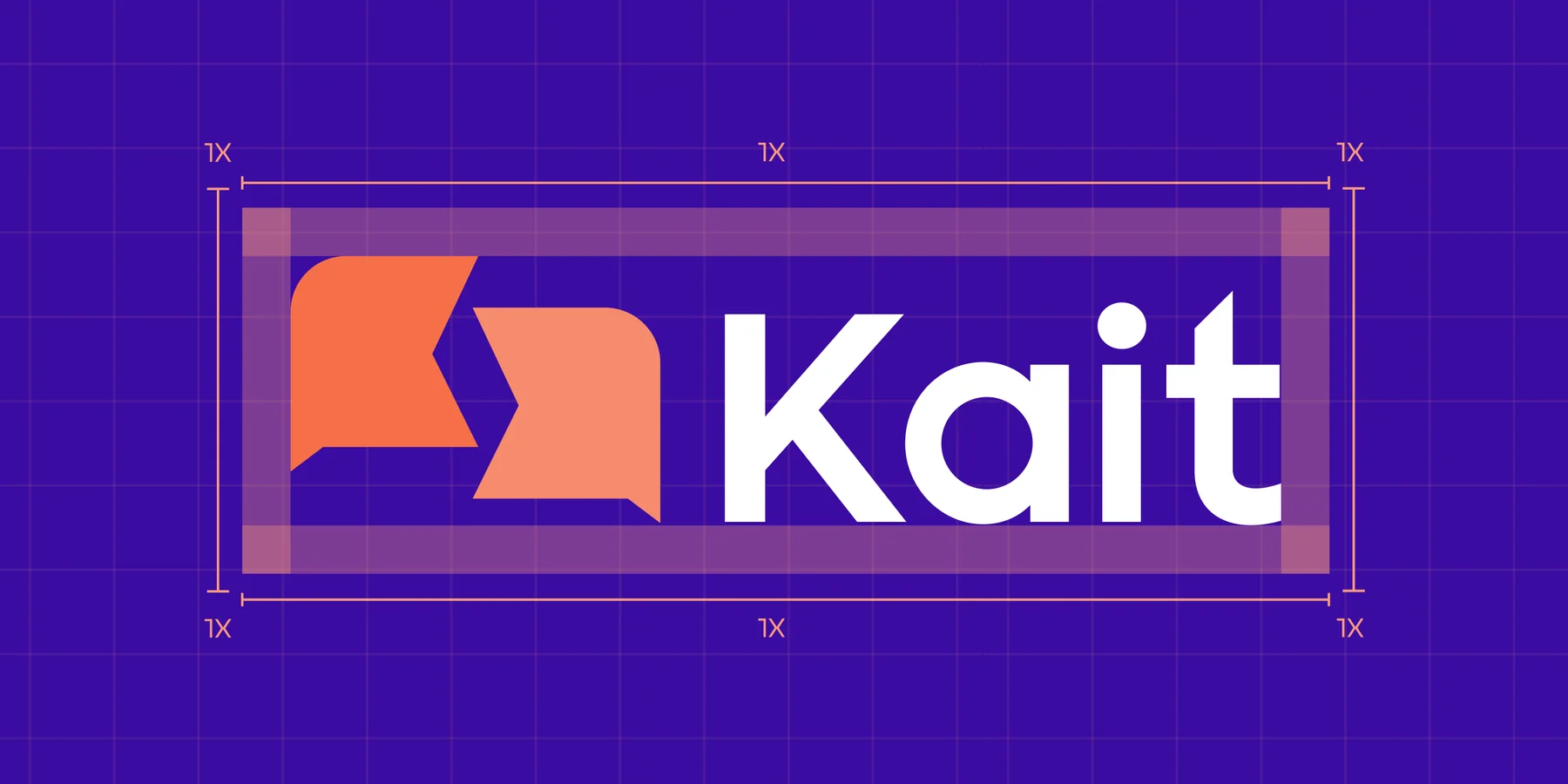
A minimum clear space of 1x on every side insulates the logo from other logos, copy and illustrations.


Room for the conversation.
Clear space
1x of clear space on every side.
Purple to trust, orange to talk.
Colour & type
Kait Dark Purple, white and two oranges provide trust, simplicity and consistency; five secondary families bring energy to illustrations, icons and data. Jeko Sans Serif and Alexandria carry English and Arabic from small banners to billboards.
Four primary and five secondary colours, with the documented values. Every family has ten weighted tints (the higher the number, the darker the colour), so everyone names the same shade.
Kait Dark Purple
RGB 58 12 163 · CMYK 91 100 0 0
Kait White
RGB 255 255 255 · CMYK 0 0 0 0
Kait Dark Orange
RGB 247 111 72 · CMYK 0 71 76 0
Kait Light Orange
RGB 253 154 125 · CMYK 0 49 48 0
Cerulean
RGB 38 166 220 · CMYK 71 18 1 0
Slate B.
RGB 132 102 236 · CMYK 62 66 0 0
Yellow
RGB 254 227 51 · CMYK 2 6 90 0
Eucalyptus
RGB 46 211 156 · CMYK 65 0 55 0
Green
RGB 138 243 60 · CMYK 45 0 100 0
Purple
1000
900
800
700
600
500
400
300
200
100
D. Orange
1000
900
800
700
600
500
400
300
200
100
L. Orange
1000
900
800
700
600
500
400
300
200
100
Black
1000
900
800
700
600
500
400
300
200
100
Cerulean
1000
900
800
700
600
500
400
300
200
100
Slate B.
1000
900
800
700
600
500
400
300
200
100
Yellow
1000
900
800
700
600
500
400
300
200
100
Eucalyptus
1000
900
800
700
600
500
400
300
200
100
Green
1000
900
800
700
600
500
400
300
200
100
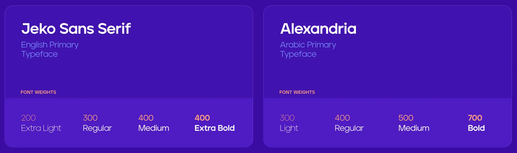
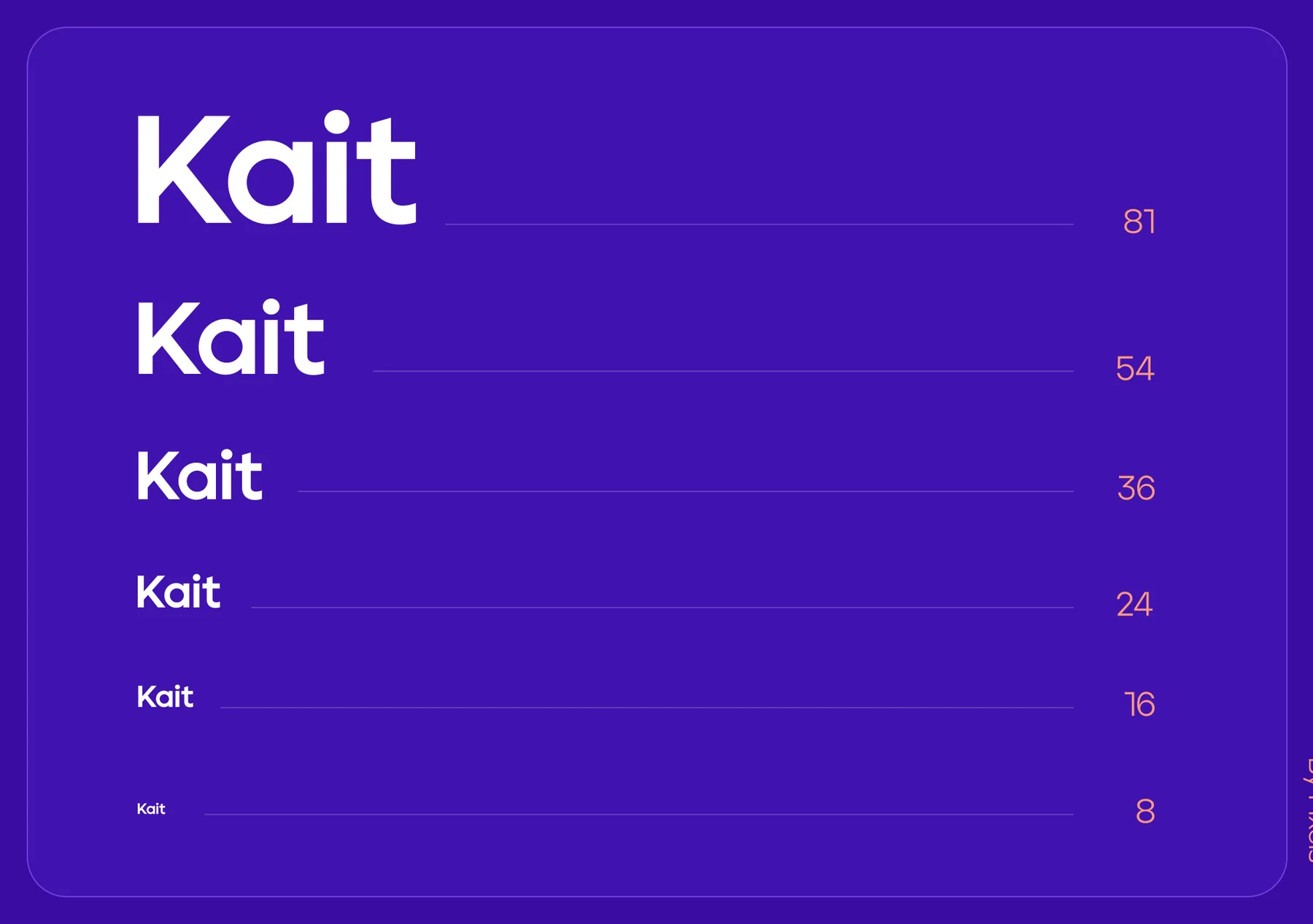
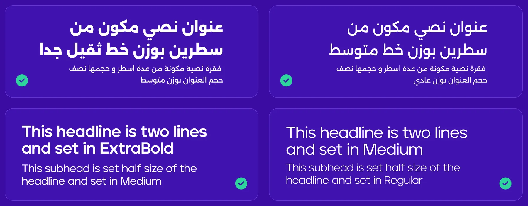
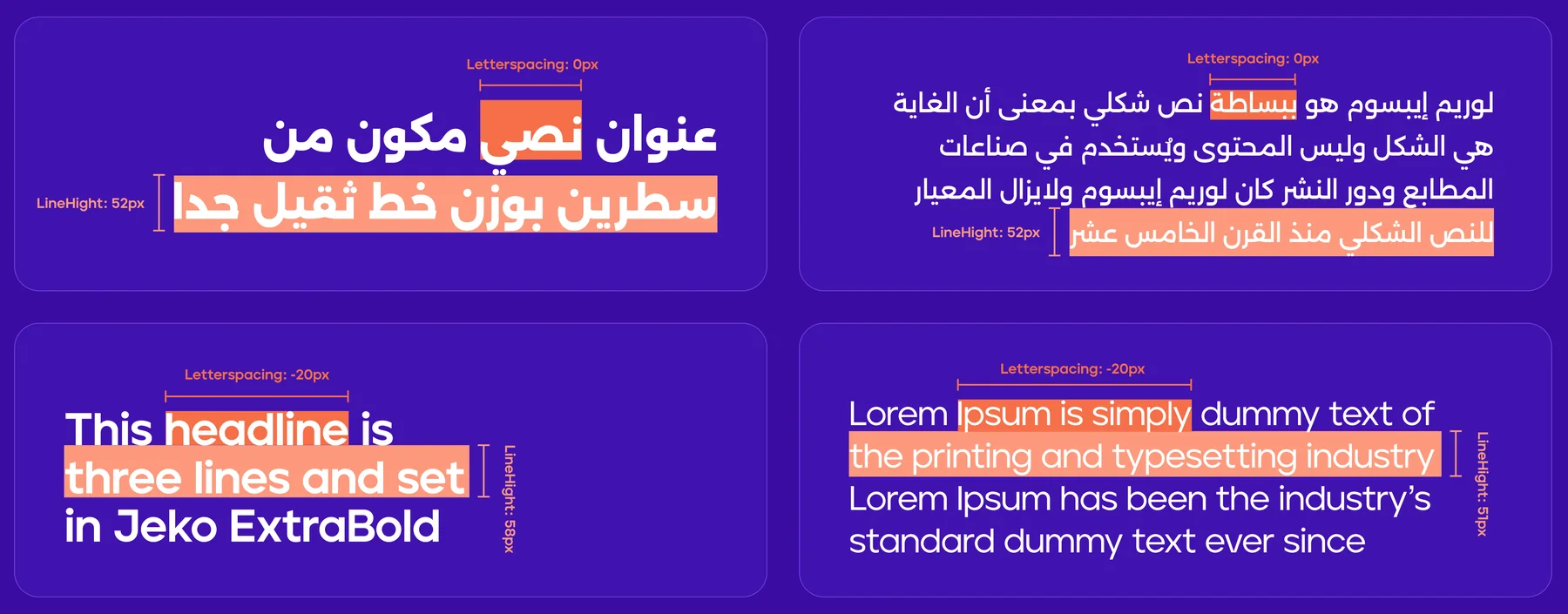
Jeko Sans Serif is the English primary typeface and Alexandria the Arabic one. Extra Bold headers pair with Medium subheads, Medium with Regular. Sizes follow a 1.3 scale (8 → 81 px); headings and paragraphs each have their own line-height formula, with −20 letter-spacing in English and 0 in Arabic.
Jeko Sans Serif
English primary
Alexandria
Arabic primary
Typefaces
Type scale
Pairings
Hierarchy
Line height
Forty-eight filled UI icons, many of them built on the chat bubble. Twelve shown here; the full set (including the social platforms Kait connects to) is on the guidelines page.

Two colours at a time.
Gradients
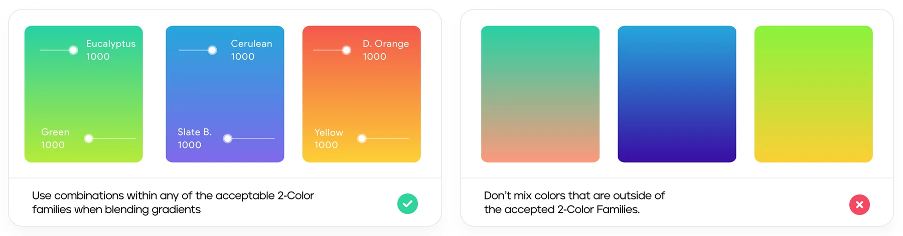
Gradients blend values between 900 and 500 within an approved two-colour family (Eucalyptus with Green, Cerulean with Slate B., Dark Orange with Yellow), so they stay vibrant on dark and light backgrounds.
The approved families, and what happens when colours outside them are mixed.
Logo, symbol, slogan.
Usage
Eight rules from the guidelines. The logo with its symbol is the default; a slogan belongs only with the wordmark; and no lockup is shadowed, recoloured or used as an app icon.
do
Use the logo with the symbol, the preferred presentation.
do
Pair the wordmark with the first slogan, “Kuwait artificial intelligence”.
do
Or with the second slogan, “technologies”, set beneath it.
dont
Don’t add a slogan to the logo with the symbol.
dont
Don’t use a slogan with the symbol alone.
dont
Don’t use the wordmark alone, without the symbol or a slogan.
dont
Don’t use the slogan lockup for app icons, social media or any other format.
dont
Don’t add a shadow, change the wordmark’s colour, or pair a slogan with the horizontal logo.
Characters who talk back.
Illustrations
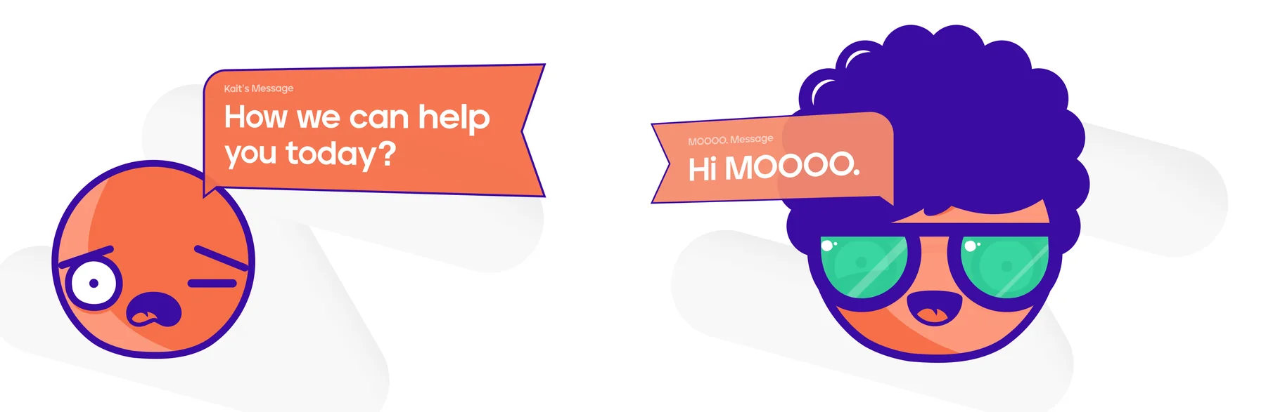
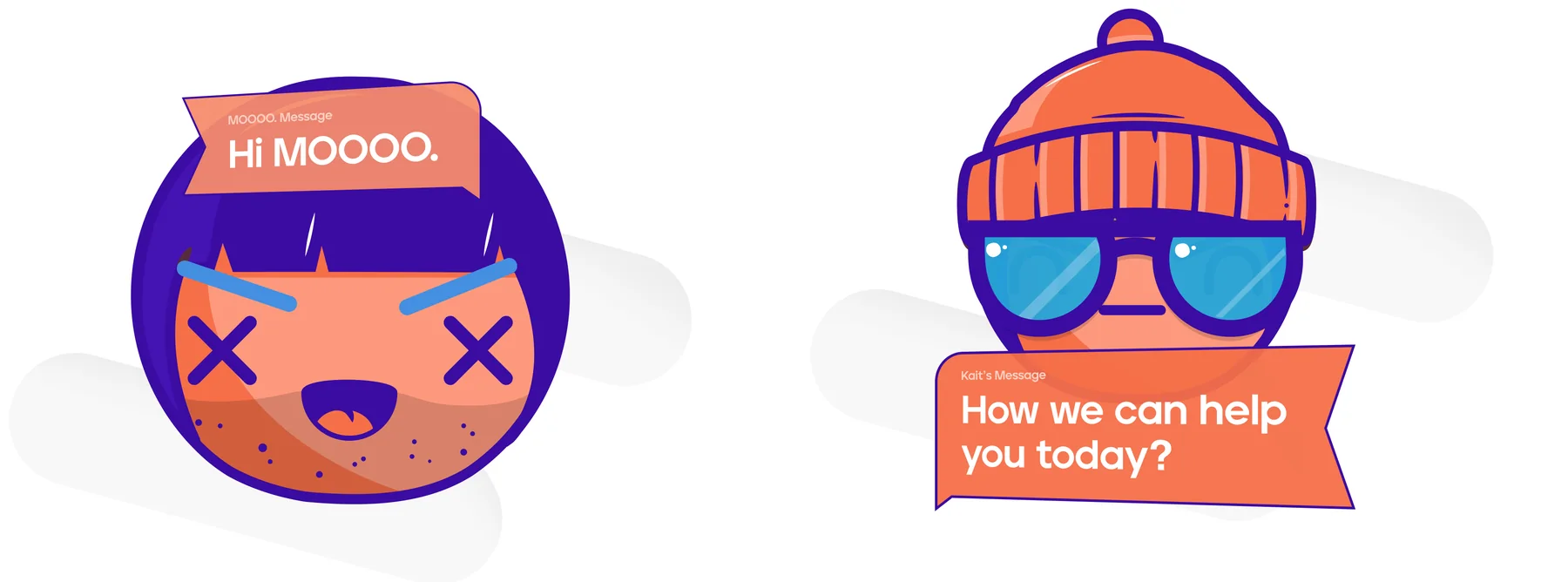
Four round characters in purple and orange, each carrying a message tag (“Hi MOOOO.”, “How we can help you today?”), so even the illustrations are part of a conversation.
A wink and a hello
Ready to help
Real people, mid-conversation.
Photography
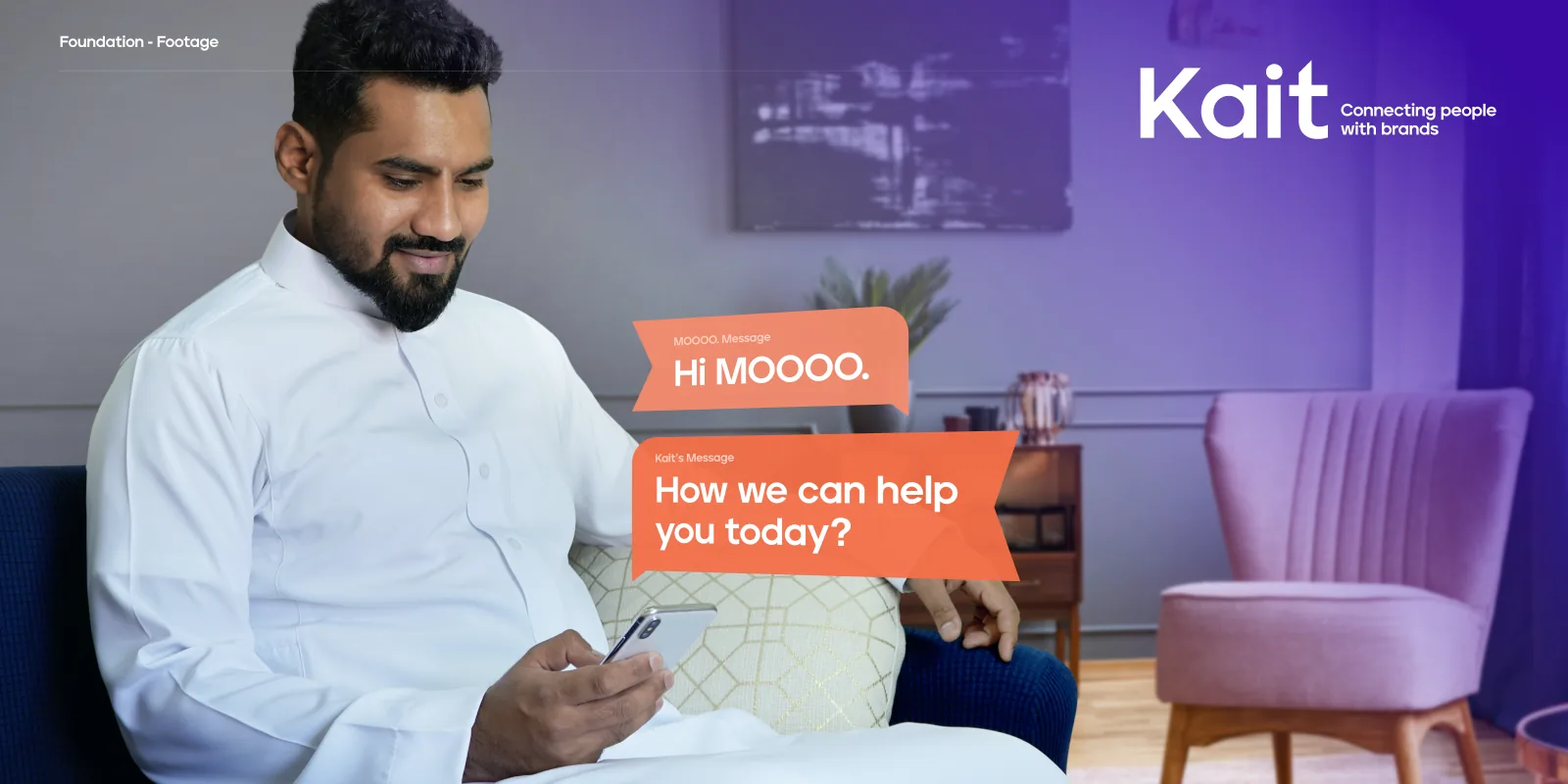
Warm, local photography of people on their phones and laptops, with the brand’s message bubbles and the white logo laid over the image.
Hello Kait
Two bubbles linked by a single curve: the conversation drawn into the photo.
Connecting people with brands
How we can help you today?


A rhythm of back and forth.
Patterns
Zigzag bands, like a conversation going back and forth, in a dark and a light version, for backgrounds behind the logo and the message.
Dark pattern
Light pattern


From the chat window to the business card.
Applications
The identity applied, following its own rules: the logo with its symbol as the default, the slogan only with the wordmark, the symbol alone as an avatar.
The app
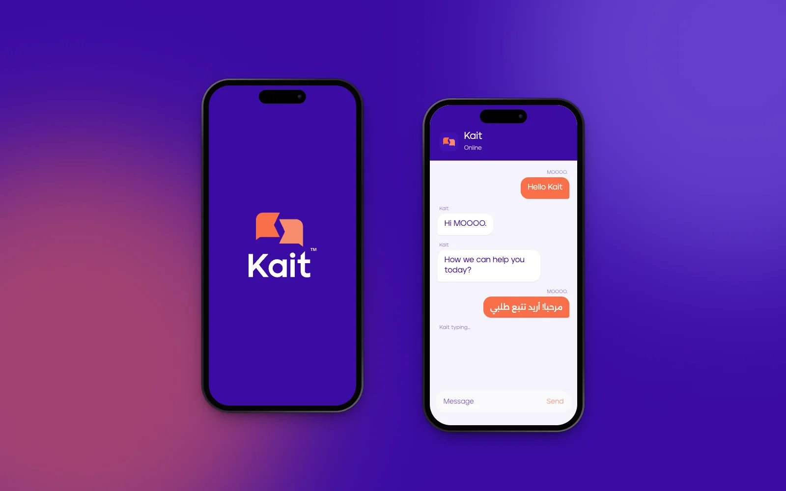
A splash screen with the vertical logo, and a chat that uses the guidelines’ own lines (“Hello Kait”, “Hi MOOOO.”, “How we can help you today?”), with an Arabic reply in Alexandria.
Business cards
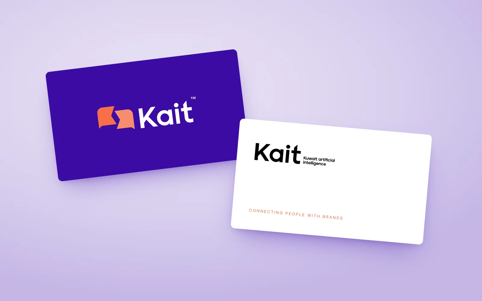
Logo with symbol on the front; the wordmark-and-slogan lockup on the back, as the rules allow for external material.
Social posts
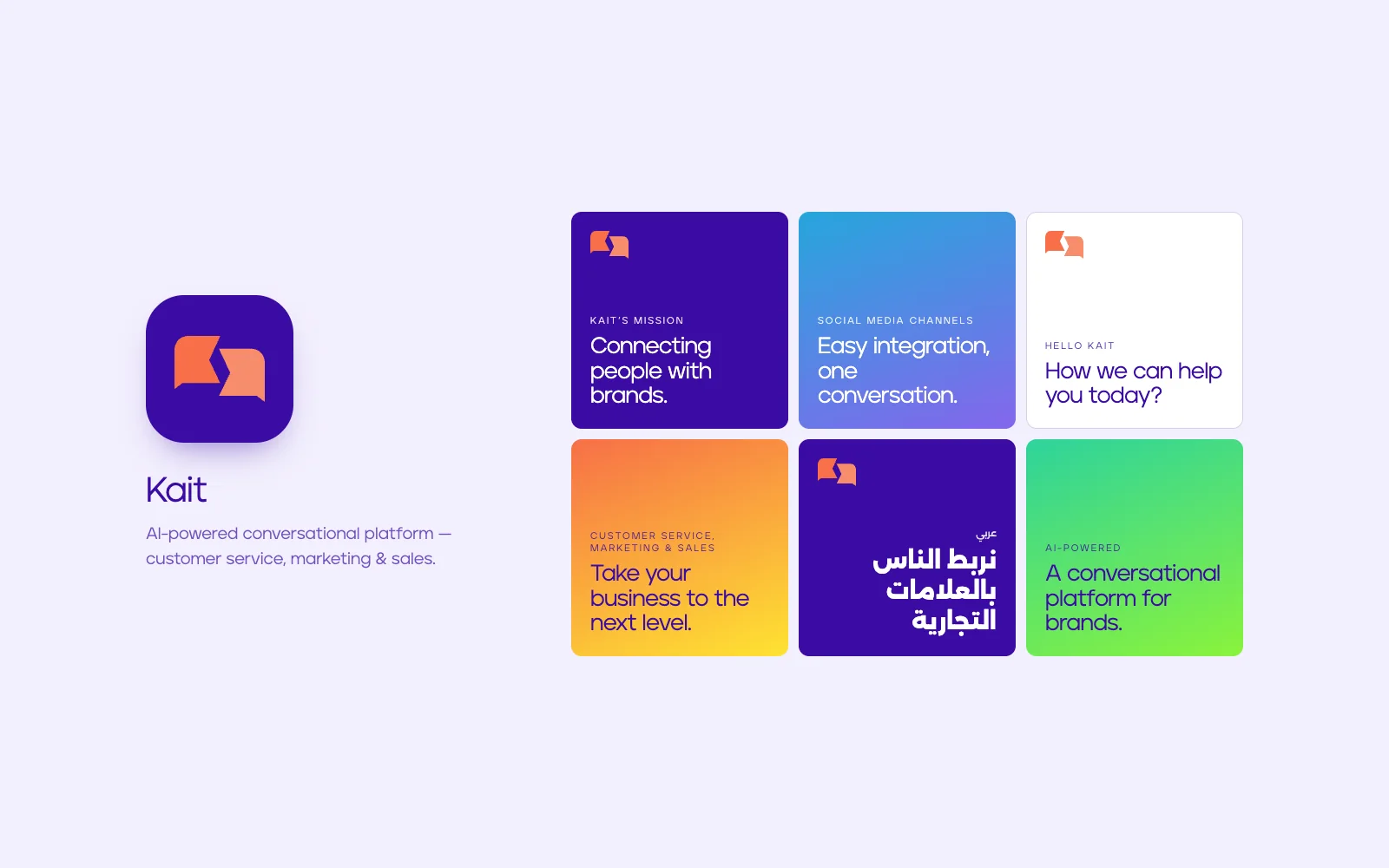
The symbol alone as the avatar; posts on purple, white and the approved gradients, in English and Arabic.
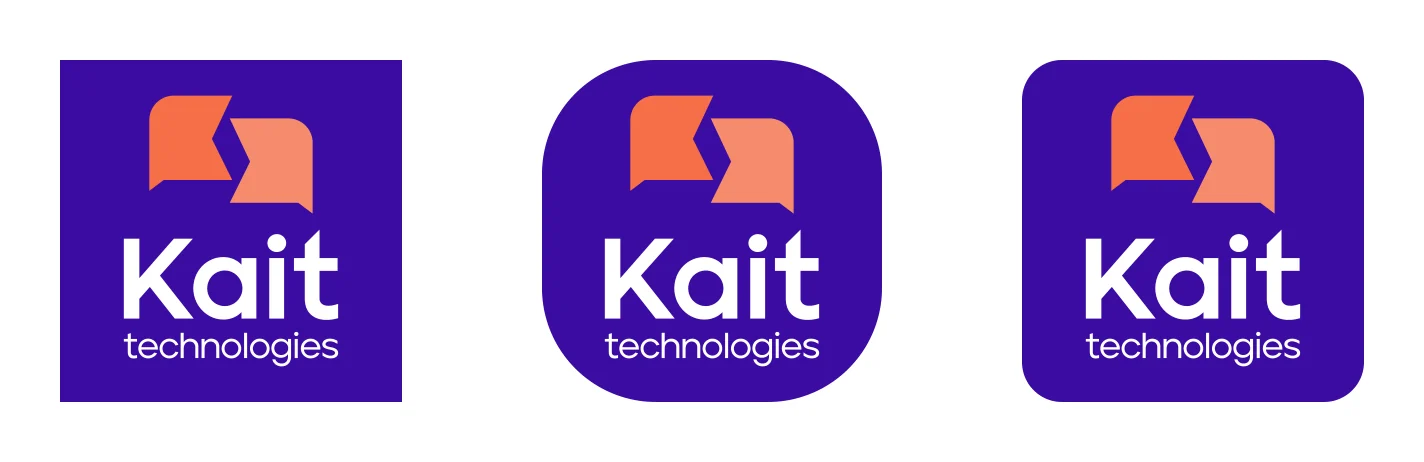
App icons
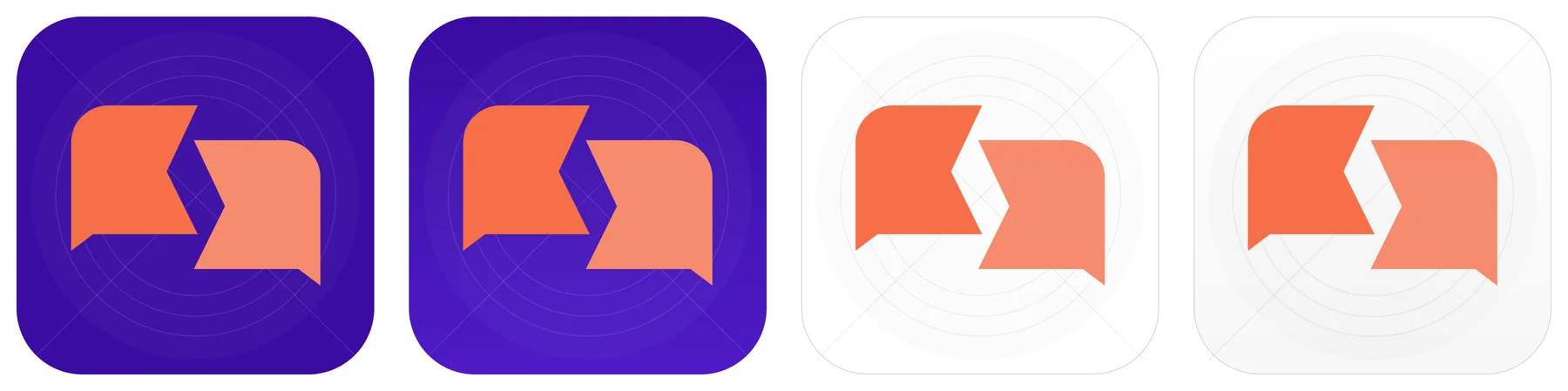
Four app icons: two with solid purple backgrounds, two with gradient backgrounds.
Every page.
The guidelines
All 40 pages of the Kait brand guidelines, grouped by section. Select a page to see it large.
Foundation
Logo
Typography
Colour
Icons & illustration
Footage & patterns

What the identity delivers.
Results & impact
An identity that makes an AI product feel human, in two languages, with the tools to stay consistent.
An AI that feels human
One idea, a conversation, runs through the symbol, the characters and the photography, so an AI product reads as approachable in a chat window and credible in a pitch.
One voice, two languages
Jeko and Alexandria, set side by side, let Kait speak English and Arabic with the same character.
A system teams can extend
Numbered colour weights, approved gradients, eight usage rules and a 48-icon set give designers and developers one shared language for the brand.
Ready for every channel
Ten colour families with ten tints each and four app icons cover the chat window, the app and print from day one.
How success shows up
The two-bubble symbol recognised on its own in chat channels, and every new touchpoint built straight from the guidelines.
The system, counted.
Scope
Pages of guidelines
Colour families, ten tints each
UI icons
App icons
A brand that talks.
Closing reflection
Kait’s identity works because one idea, a conversation, runs through everything: the symbol, the message tags on the characters, the bubbles over the photography and even the icons.
- Building the icon set on the same chat bubble as the logo makes small UI feel unmistakably on-brand.
- Numbered colour weights replace vague names like “deep dark purple”, so designers and developers talk about the same colour.
- Designing Arabic and English side by side (Alexandria with Jeko, each with its own spacing) keeps the brand universal, as its first principle asks.
- A horizontal and vertical logo system on Kait Dark Purple and white.
- Ten colour families with numbered weights and approved gradients.
- Jeko and Alexandria for English and Arabic, 48 icons, characters, photography and patterns.
- A 40-page guide, version 1.1, with eight usage rules.