RH25 Website
Website · UI/UX Design · 2025
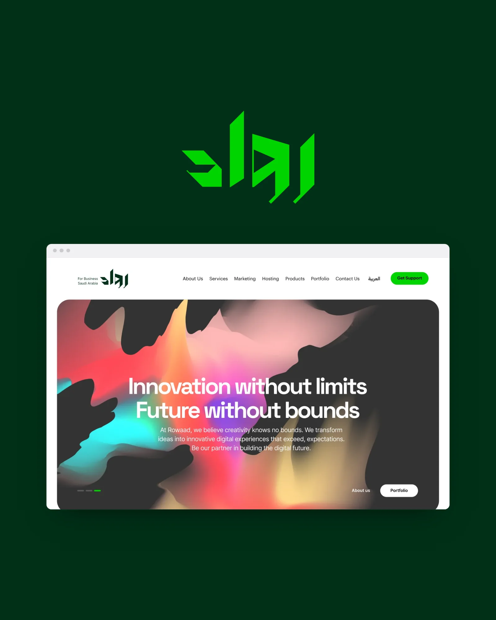
RH25 is the new website for Rowaad, a Saudi digital agency: one modular page system for more than fifteen services, mega menus, service modals and mobile designs, Arabic first, with English alongside.
A bilingual website for Rowaad, a Saudi digital agency: one modular page system for more than fifteen services, designed Arabic-first with English alongside.


Overview
Rowaad is a Saudi digital agency: web and app design and development, hosting, marketing and its own products. RH25 is its new website: one place to explain every service, in Arabic and English, and turn a visit into a project.
Rowaad Hosting and Commerce Establishment was founded in 2012 in Riyadh. Its offer had grown into many services and products, and the website had to make all of them findable, comparable and easy to ask about.
The design covers 19 desktop pages in both languages, the service modals, the mega menus and the mobile layouts.
Client
Rowaad, Riyadh
Role
UI/UX Designer
Platform
Desktop & mobile web
Scope
Website UX & UI, Arabic & English
Deliverables
19 pages · 7 modals · 5 menus · 4 mobile screens
Tools
Figma
In this case study
Many services, one clear website.
The challenge
Breadth
Design, development, apps, identity, UX, e-commerce, hosting, SEO, social media, motion, support, plus Rowaad Store, Rowaad App and a startup programme. Each needed its own page without the site feeling like many sites.
Two languages
Most of Rowaad’s clients read Arabic, but the site also had to work in English: the same structure, mirrored, not a second design.
From reading to asking
A visitor should be able to understand a service, compare plans, see the work and get in touch from any page, without hunting for the next step.
What the design set out to do.
Goals
For businesses looking for a digital partner in Saudi Arabia: mostly Arabic readers, some English. A successful visit ends with a visitor who understands the service they need and knows how to start.
Make every service findable
Any of more than fifteen services within two clicks of any page.
Help people choose
Answer “which one is for me?” on the page itself: plans, comparisons, sectors served and frequent questions.
Arabic first, English equal
Both languages should feel native, not translated.
Show the work
Proof (work, clients and stories) close to every decision.
Always one step from contact
A visitor who is ready should never have to look for the next step.
Grow without a redesign
A new service should be new content, not new design work.
Five menus, one site.
Information architecture
The navigation from the final mega menus: four groups of services and products, and the company. Contact, Portfolio and the language switch sit beside them in the header.
Services
خدماتنا
Marketing
التسويق
Hosting
الاستضافة
Products
منتجات رواد
About
عن رواد
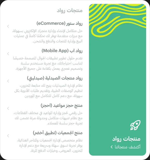
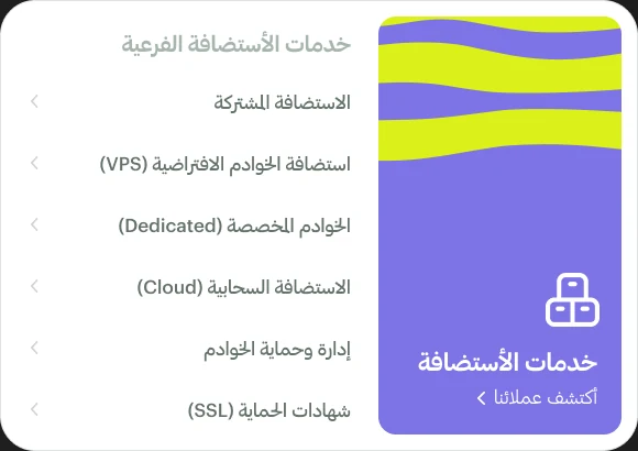
Every service, one hover away.
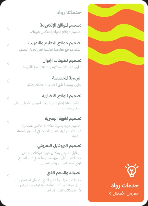
Mega menus
Each menu pairs a coloured panel with its list of pages; the colour tells you which part of the site you’re in.
Services
Products
Hosting
From a visit to a project.
User journey
How the pages connect (navigation, calls to action and modals), from the first visit to a project. Select a step to see its page.
Visitor arrives
Home (Arabic / English)
Switch language
Service cards
Every service on the home page is a card with a + button.
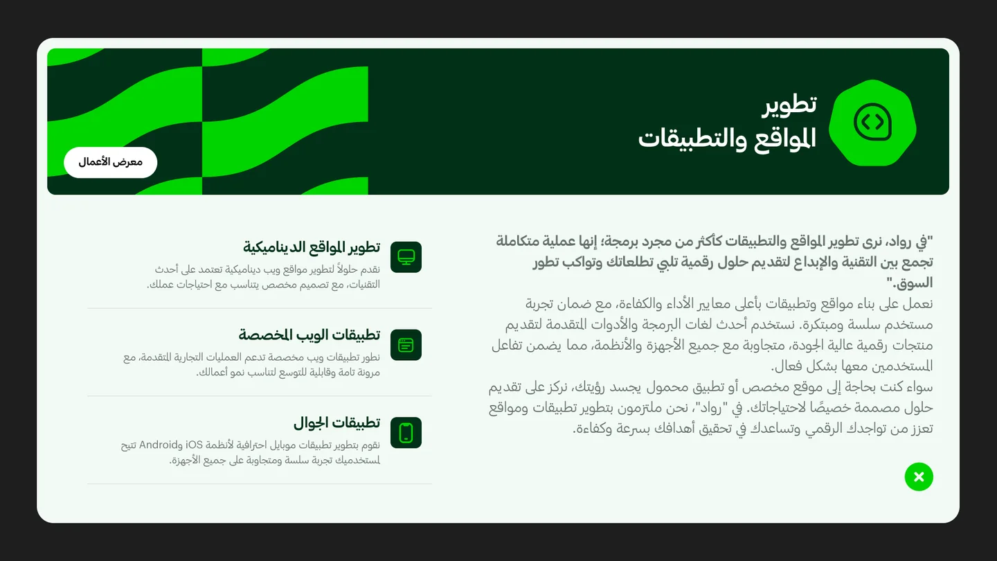
Service modal
Sub-services, a short explanation and a link to the work.
Mega menu
Services, Marketing, Hosting, Products, About.
Service page
Plans & comparison
Portfolio & testimonials
Questions
Ready to start?
Contact / Get Support
Payments
Startup programme
10% upfront, 100% cashback as service credit.
Yes
Pay
Not yet

One sequence, fifteen services.
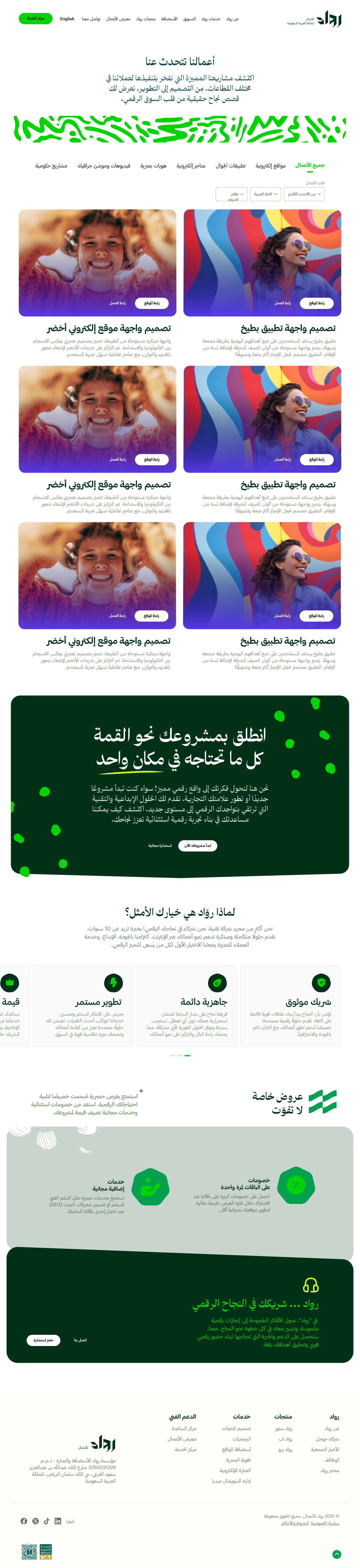
The page system
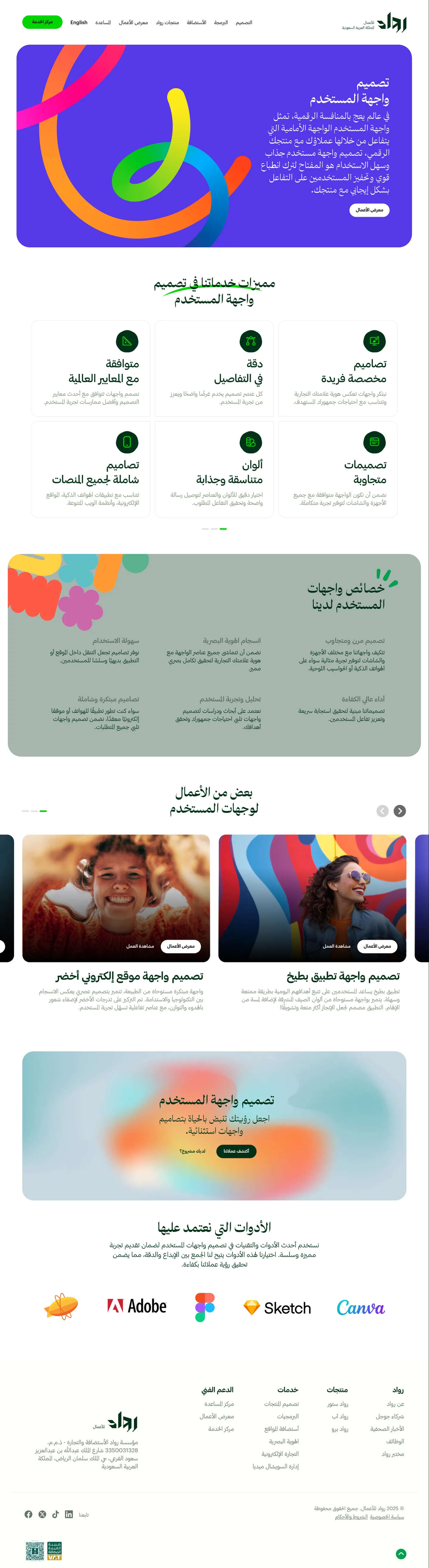
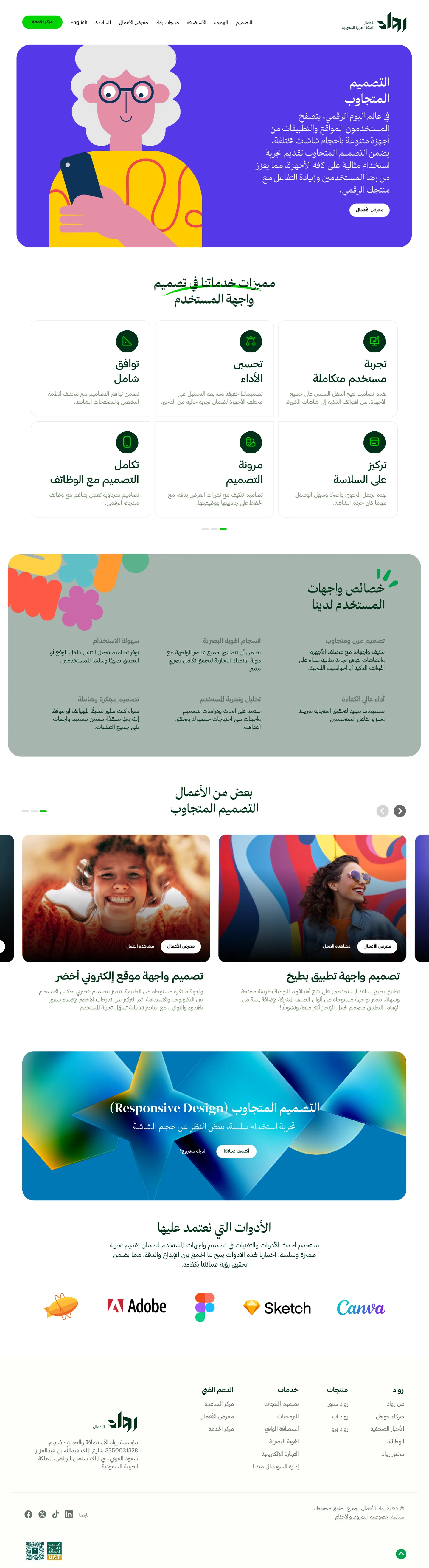
Every service page follows the same order, so the site scales by content and visitors always know where they are.
- An illustrated hero card in the service’s own colour, with a call to action.
- Why this service: a grid of benefits with green icon badges.
- A tilted panel of sectors served, then plans or a comparison table.
- Portfolio carousel, testimonials, questions, and a dark-green closing call to action.
Website design service
Scroll inside the window to read the whole page.
Each service, its own colour.
Same system, different services
The structure stays fixed; the hero illustration and its colour change, so services feel distinct without breaking the system.
Mobile apps
Visual identity
SEO
Social media
Motion & video
Custom software





Problem, decision, benefit.
Design decisions
The calls that keep a broad offer simple to read, in two languages.
One page system for every service
Fifteen services would have meant fifteen designs. Every service page follows one section order, with its own colour and illustration, so a new service is new content, and visitors learn the pattern once.
Colour-coded mega menus
A long list of services is hard to scan. Each menu pairs a coloured panel with its pages, so visitors always know which part of the offer they’re in.
Modals before pages
Opening a full page for every service slows exploring. The + on each home-page card opens a short modal with its sub-services and a link to the work, so visitors compare without losing their place.
Arabic first, mirrored for English
Translating an English layout breaks Arabic reading order. Pages are designed right to left with Arabic type, then mirrored for English with its own pairing, so both languages read natively.
The next step on every page
Visitors who are ready shouldn’t have to hunt. Plans, work, frequent questions and a closing call to action sit on every page, with Get Support always in the header.
Three challenges, three answers.
Solution validation
The challenges from the brief, traced through the finished pages.
Breadth → one page system
More than fifteen services share one section order across 19 desktop pages. Colour and illustration change; the structure never does.
Two languages → mirrored pages
Every page is designed in Arabic first and mirrored for English, each language with its own type pairing at the same sizes.
Reading to asking → a step on every page
Five colour-coded mega menus reach every service from any page, seven service modals compare sub-services in place, and every page closes with plans, work, questions and contact.
The whole offer, at a glance.
The home page
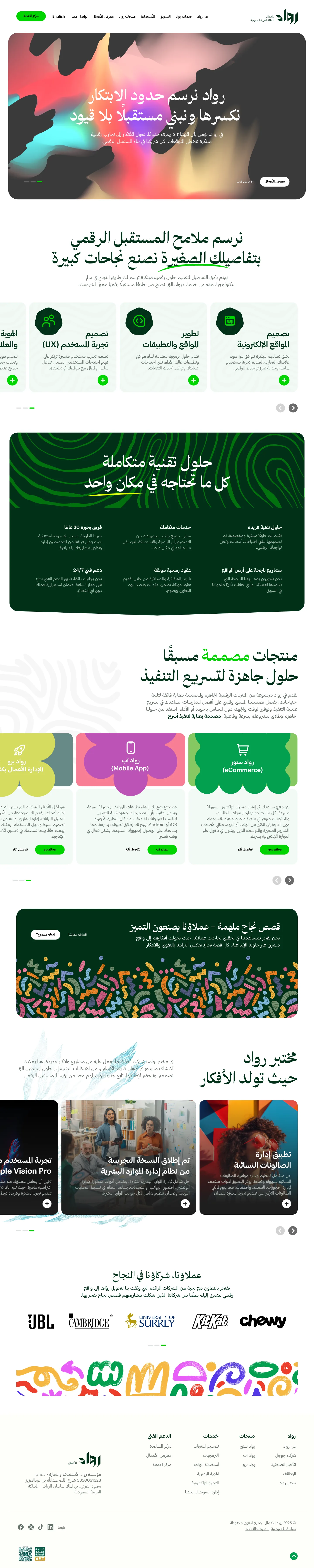
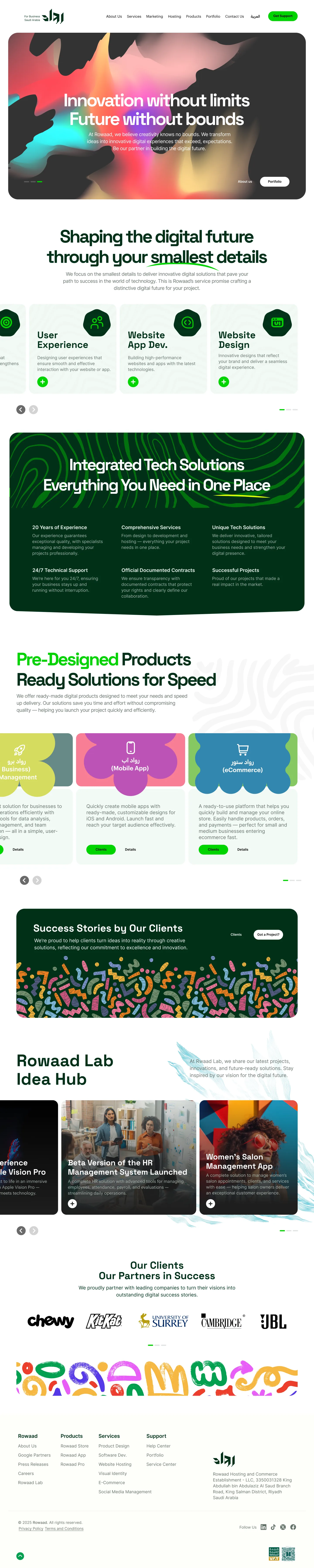
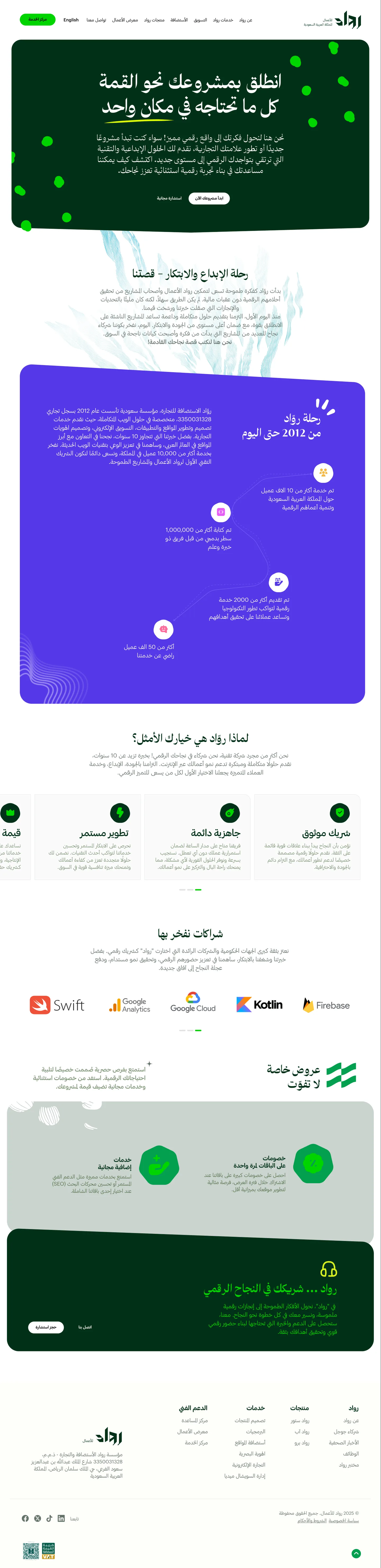
A bold hero, every service as a card, the reasons to choose Rowaad, ready-made products, success stories, Rowaad Lab and client logos: the home page is a map of the company.
Home · English
“Innovation without limits, future without bounds.”
Home · Arabic
The same page, right to left.
Service cards
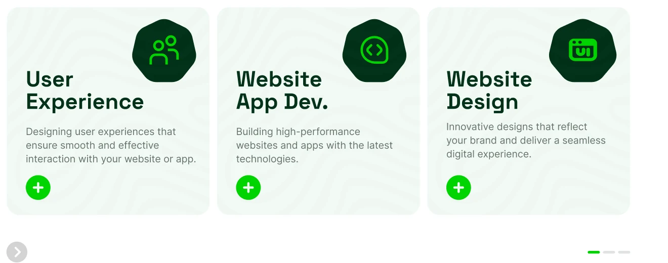
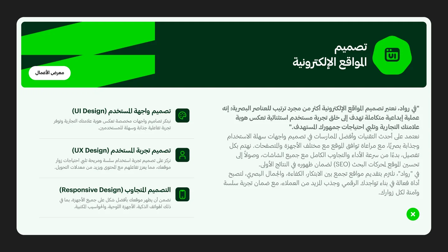
A closer look, without leaving the page.
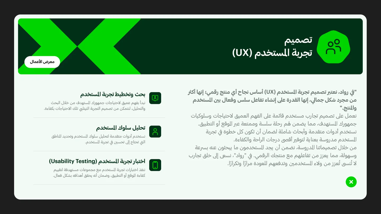
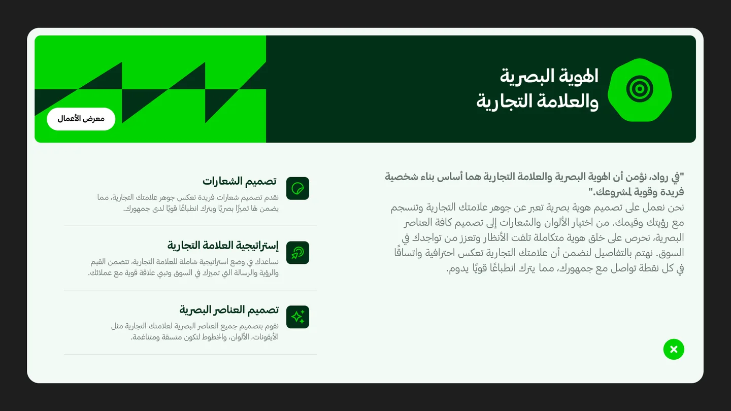
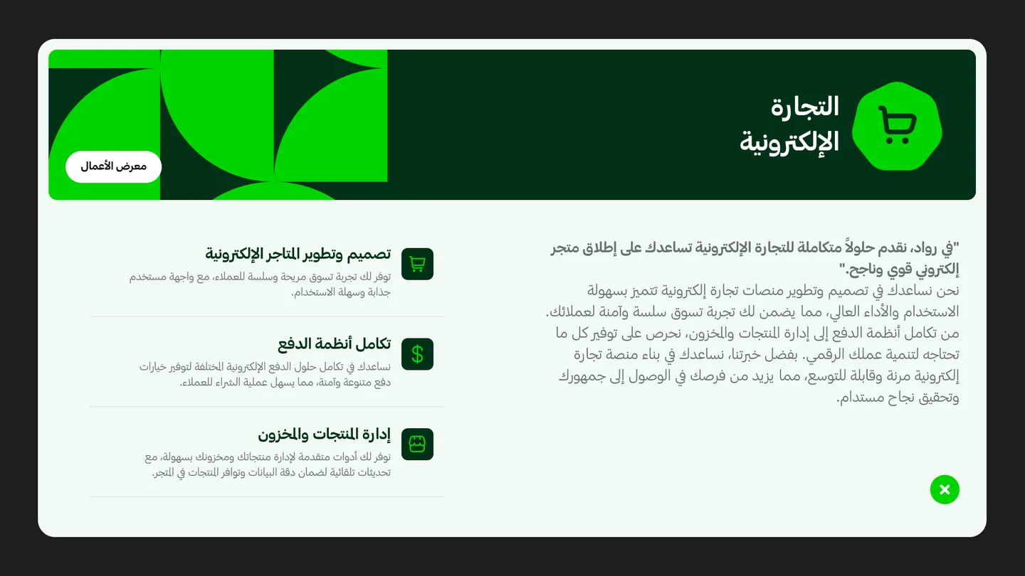
Service modals
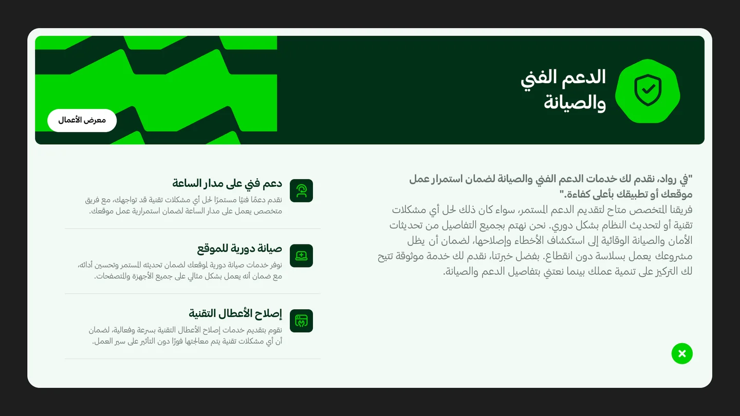
The + on every home-page service opens a modal: the service in a few lines, its sub-services, and a link to the work.
Website design
Web & app development
UX design
Visual identity & branding
E-commerce
SEO
Mirrored, not translated.
Arabic & English
Hosting in both languages: the same sections, mirrored for reading direction, with Arabic and English type pairings of their own.
Hosting · Arabic
Hosting · English

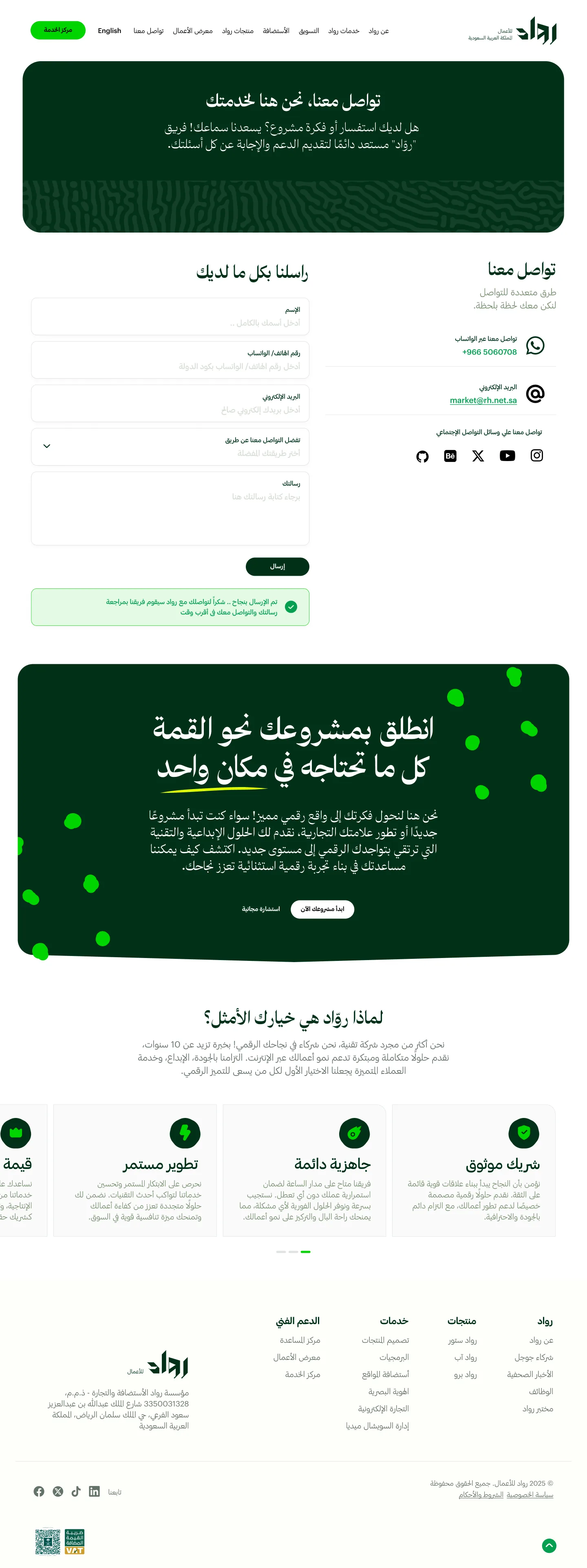
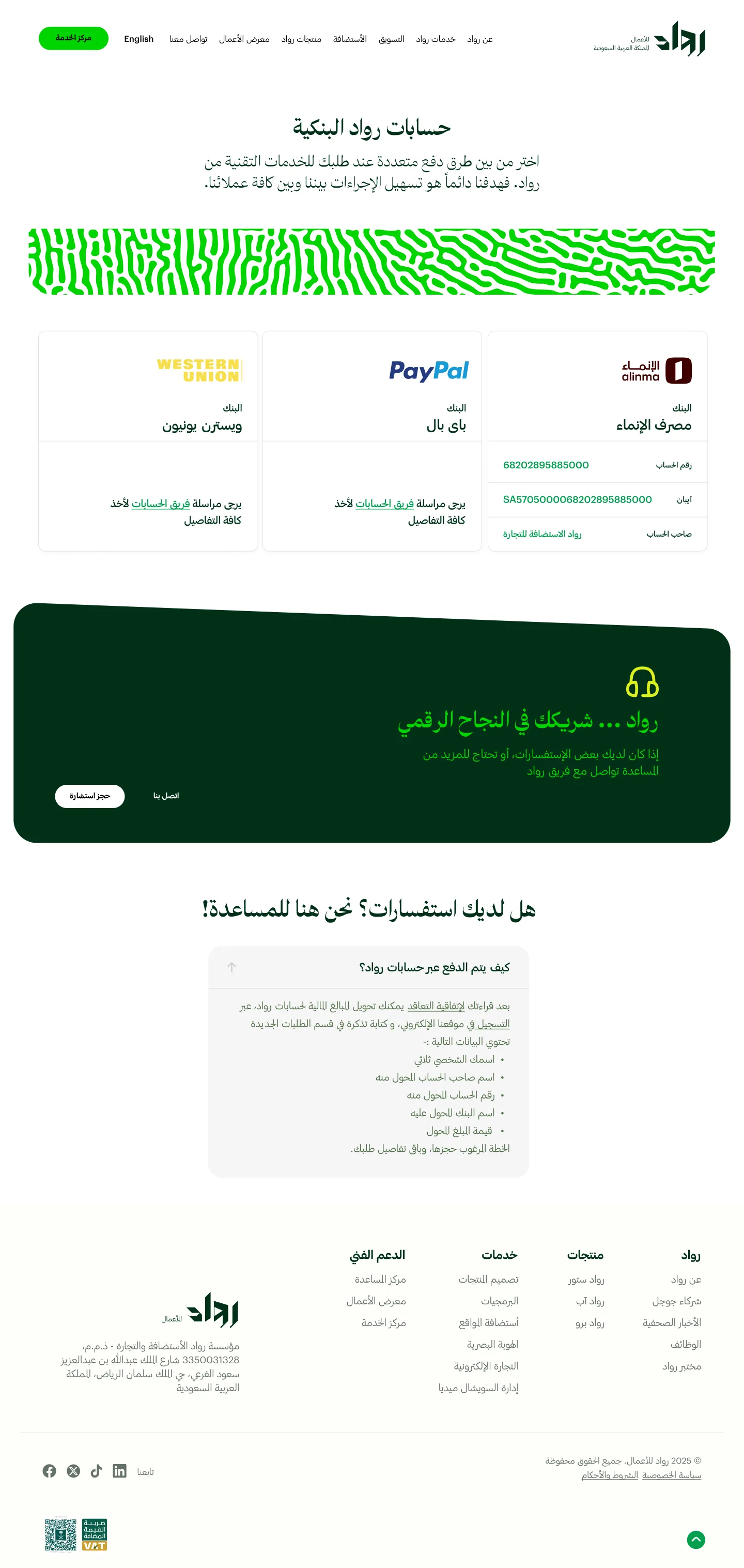
Compare, then talk to someone.
Choose and act
Plans compared feature by feature, a startup programme that lowers the risk, and a contact page with several ways to reach the team.
Rowaad Store
Plans compared feature by feature.
Startup programme
Contact

The same site, in the hand.
On mobile
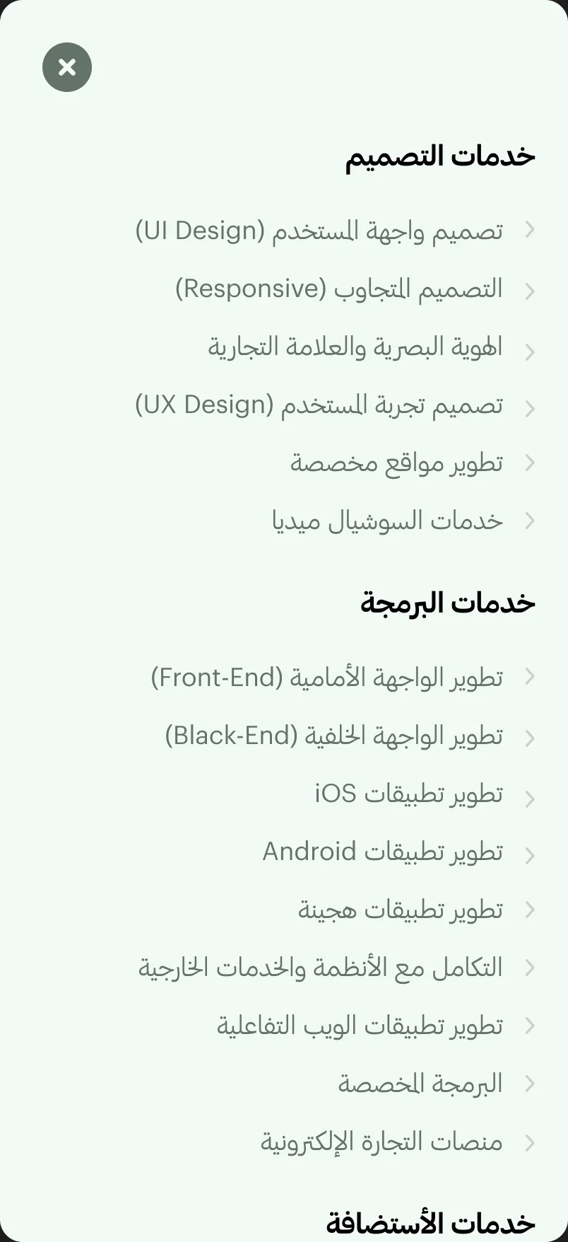
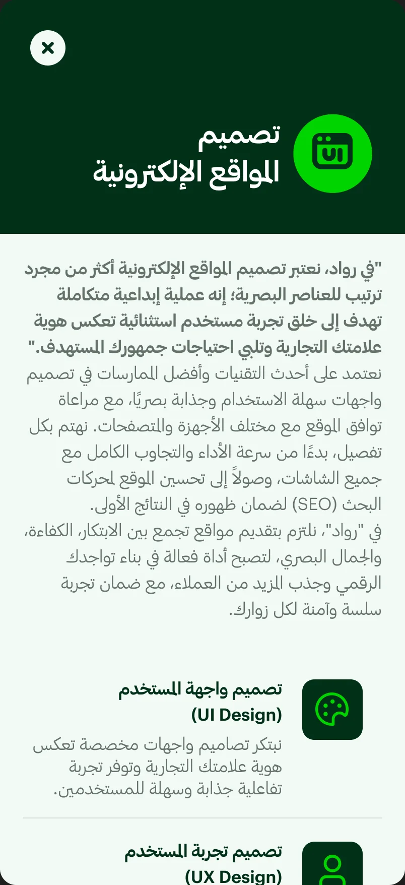
The home page, a service page, the full-screen menu and a service modal. The other modals follow the same pattern.
Home
Hero, services and stories, stacked.
Service page
The page system in one column.
Menu
Every group, expandable.
Service modal
Full screen, with the same content.


All 19 desktop pages.
Every page
The final desktop design, grouped by area. Select a page to read it in full.
Home
Design & development
Marketing
Hosting & products
Company
Service modals
Deep green, bright green.
Design system
A dark forest green carries the brand, a vivid green marks every action, and soft sage surfaces hold the content, with an Arabic and an English type pairing.
The Rowaad wordmark, built from angular, cut strokes, in vivid green on dark green, and dark green on white in the header.
Forest green for the brand, a vivid green for actions, sage for surfaces.
Forest
Headings, the closing panels and the logo background.
Action Green
Get Support, + buttons, underlines and the logo.
Emerald
Plan headers and sector panels.
Moss
Secondary headings.
Slate
Body text.
Sage
Muted text and the tilted panels.
Mint
Card and section backgrounds.
Violet
Service illustration colours, with pink #E85DF8, amber #F5B740 and red #ED3E2B.
Arabic in The Year of The Camel (display) and Graphik Arabic (text); English in Space Grotesk (display) and Inter (text), each language with its own pairing at the same sizes.
The Year of The Camel
Arabic display
Graphik Arabic
Arabic text
Space Grotesk
English display
Inter
English text
Section heading · Arabic
Section heading · English
Body · Arabic
Body · English
Reused on every page.
Header
Logo, menus, language switch and Get Support.
Feature panel
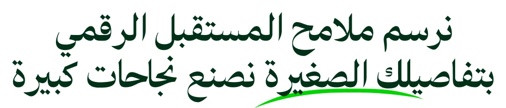
Dark green, with a hand-drawn underline on the key words.
Plans table
Green headers and alternating rows.
Benefits
Numbered benefits on a sage panel.
Questions
An accordion with one answer open.
Footer
Four columns, the company details and the VAT and business-registration badges.



The design, counted.
Scope
Desktop pages
Languages
Service modals
Mobile screens
A broad offer, easy to read.
Results & impact
What the finished website delivers for Rowaad and the businesses that visit it.
Every service one menu away
Five mega menus put more than fifteen services and Rowaad’s own products in the header of every page.
Comparing without leaving the page
Seven service modals open from the home page cards, so visitors explore sub-services and work without losing their place.
Two languages, both native
Arabic and English share one mirrored structure, so neither reads as a translation of the other.
A site that grows with the offer
A new service is new content in the page system, not a new design.
How success shows up
Visitors who open a service and go on to contact or Get Support, and new services published on the existing system.
A system, not a set of pages.
Closing reflection
The decision that made RH25 work was to design one service page and let every service use it: a website that can grow with Rowaad’s offer instead of being redesigned with it.
- A fixed section order lets each service feel different (its colour, its illustration) while visitors learn the pattern once.
- Designing Arabic first, then mirroring for English with its own type pairing, kept both languages first-class.
- Putting the next step on every page (plans, work, questions, contact) shortens the path from reading to asking.
- 19 desktop pages in Arabic and English, built on one service-page system.
- Five colour-coded mega menus and seven service modals.
- Mobile designs for the home page, a service page, the full-screen menu and a service modal, setting the pattern for the rest.
- A design system with Arabic and English type pairings, colour and components.